Sometimes travel is bliss.
I've been on the road using the Flickr iPhone app, which a beautiful on all accounts. Now back home, I fired up my Mac and noticed that Yahoo had added an ugly, purple Yahoo Nav bar to the top of my Flickr page.
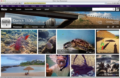
This is a step backwards.
After finally implementing a design that is worthy of quality photography, this distracting nav bar, plunked right on top of another nav bar, looks like an executive decision by someone who clearly doesn't understand the audience the site is serving.
Maybe there's a way to turn it off, and I simply have not found it yet. I explored both my Flickr and Yahoo settings, however, and didn't see an option.
So here's my constructive suggestion, Yahoo. Go ahead and enable the ugly, purple nav bar by default to meet your corporate needs. But, for those of us who are paying for our Flickr accounts, give us an option to turn off the nav bar like we can with the hideous ads that Yahoo serves to the free accounts. (And if that option currently exists, and I missed it, my apologies.)
Think about it. It's absolutely the right thing to do.
Want to Comment on this Post?
You can share your thoughts at the TDS Facebook page, where I'll post this story for discussion.
Flickr Essential Training 2013 - I explore the entire Flickr universe, mobile and computer, in my lynda.com title, Flickr Essential Training. Stop by and take a look.