I've always preferred shooting at twilight in the city compared to the dark of night. Having just a little luminance in the sky rounds out the image so nicely.
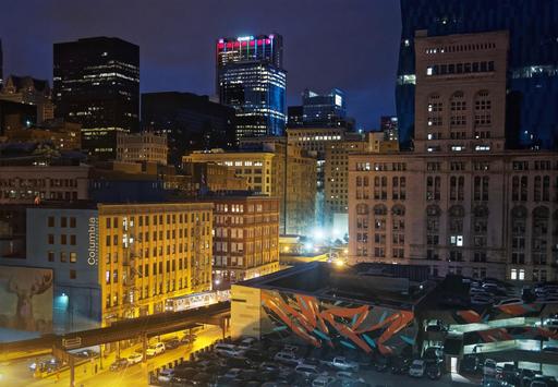 Chicago with Train at Twilight - Olympus PEN-F, Panasonic 40mm f/1.7, ISO 3200. Processed in Photos for macOS and Luminar. Photo by Derrick Story.
But color comes into play here as well. And with a little bit of adjustment on your end, you can take advantage of a complementary color scheme for additional visual appeal.
Complementary colors directly oppose each other in the color spectrum. In our case, we're working with blue and orange. Red and green are also a popular complementary tandem. These colors, when combined in the right proportions, produce white light. They also are attractive to viewers' eyes.
In the case of our twilight cityscape, the blue will come from the sky after the sun has set. We often refer to this time of day as blue hour. The orange is provided by the city lights themselves. Get them in the right combination, and image really glows.
When creating the shot, I typically have to tame the orangish/yellow tones of the city lights. They can overpower the composition. I do this by shooting with the white balance set to Tungsten, then backing off the blueish tones in post. Or I can capture in auto white balance and deal directly with the oranges in the editor.
Choose the method that works best for you. But once you're aware of this compositional element, you can use it to further enhance your cityscapes.
You can share your thoughts at the TDS Facebook page, where I'll post this story for discussion.