I remember hearing in class once, "If you put a sign in a picture, people will read it." Sounds obvious, right? But the point is that they will read it first before exploring other elements in the composition. And you can use this to help tell the story.
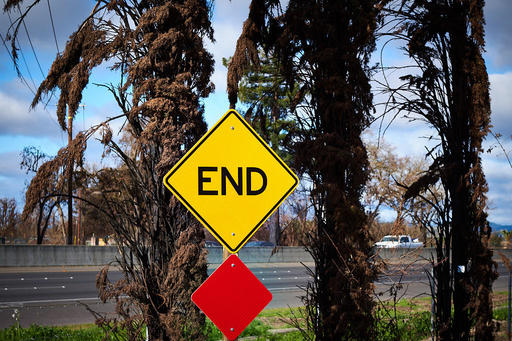
 "End" - Burned cypress trees from the Santa Rosa fires. Photo by Derrick Story.
One of my ongoing photo essays is covering the aftermath of the fires that ravaged Santa Rosa last October. There's a juxtaposition to life here right now. On one hand, the fields are green from the rain, and the skies have returned to their pretty blue. Against that backdrop, there are burned trees, trucks filled with debris, and bare foundations where houses once stood.
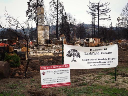
I've noticed how existing signs suddenly take on new meaning (like the End sign above in front of burned cypress trees), or how signs suddenly appear as a result of the event itself, as shown below.
 "Larkfield Estates" - Photo by Derrick Story.
In both cases, I find them compelling elements that add more dimension to the storytelling. Signs are often interesting in themselves, but when combined with an overall composition, they can help make the picture more effective.
You can share your thoughts at the TDS Facebook page, where I'll post this story for discussion.


