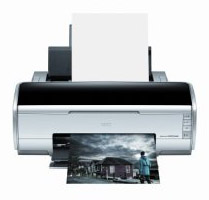
Making a good print is more science than art. The creative process happens before printing -- capturing and editing the image. When it's time to put it on paper, all we want is to take what we see on the monitor and output it. Why is that often so difficult?
It doesn't have to be. Just remember these three steps: calibrate your screen, image edit your photo, and configure your printer.
If you don't have a colorimeter to calibrate your monitor, such as the Pantone Spyder, go to the Displays preference pane, click the Color tab, then click on the Calibrate button. Mac OS X will walk you through a pretty good calibration process. My tips are, use 2.2 for the Gamma setting and D65 for the White Point. Some folks have asked me about the new huey screen calibrator that costs less than $80 and includes nifty software for the Mac. It's fun to use, but I get better results from the Spyder, or even using the Displays preference pane calibrator.
Now that your screen is displaying photos properly, open the image you want to print and make your basic exposure and white balance adjustments. Don't go crazy here, just tweak enough so the image looks natural and balanced.
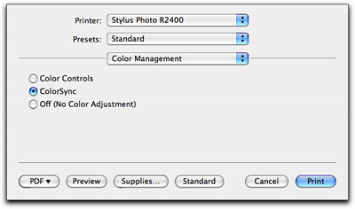
The final tip is to let your Mac control the color management, not the printer. Choose Colorsync in your printer dialog box (from the Color Management dropdown menu) and choose the correct type of paper from the Print Settings dropdown. If you have custom ICC Printer Profiles for your printer, load them and use 'em. This is one of the reasons that I like Epson printers so much. You can download ICC profiles from the Epson site.
Now print. You'll be surprised how much better your output looks by just following these three basic steps. And in case you're curious, my current favorite "serious" printer is the Epson R2400. This is a great fine art unit that produces archival content that lasts for over 100 years. On the simple side of things, I really like the portable Dye Sub units made by Canon. I've been using a CP-300 for some time now for 4"x6" snapshots, and it works great.
Listen to the Podcast
Now that I've piqued your curiosity, it's time to listen to today's audio show titled, "The Perfect Print." You can download the podcast here (26 minutes).
Technorati Tags: digital photography, podcast, technique






A good software complement to this printer is the "Exposure" Photoshop plug-in I just posted a review of on The Digital Story. You can produce very film-like B&W prints with this combo.
Thanks for the Podcast! One little question: Are the monitor profiles called "Colour LCD" with PowerBooks and iBooks something like calibrated profiles? Or, if not, what are they?
Thanks!
Great podcast, perfectly timed with my exploration of this subject! I didn't hear any mention of what color space in which to work. Do you think there is any reason to use the sRGB color space if my camera and printer both can handle the larger Adobe RGB color space?
Thanks!
A couple responses to reader questions here...
First, for Jordan: Adobe RGB color space is preferable when you have complete control over the entire process -- from camera to printer. If you send your images to an online photo lab, then I would use sRGB, because that's the color space they work in.
As for Andreas: There are two basic types of profiles -- those for your monitor and those for your printer. The "Color LCD" is a stock monitor profile. You can create your own by using the Calibrate function in your Displays Preference Pane (if you're using Mac OS X). The printer profiles are a different animal and sometimes come with your printing software. They will show up in Photoshop's print dialog box if you have any loaded.