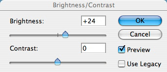
For years, the first thing I told photographers about Photoshop was to avoid the Brightness/Contrast adjustment. Your images would fare much better using Levels or Curves. But Photoshop CS3 has changed that. Brightness/Contrast now behaves like an intelligent tool.
The new version actually compresses highlights and shadows instead of clipping them. This is a tremendous difference that you can test for yourself. If you have the beta version of CS3, open an picture, then go to Image > Adjustments > Brightness/Contrast...
Play around with the sliders and watch what happens to your photo. Now, click the Use Legacy box and make the same adjustments. The resulting image will look much worse than your first effort with the box unchecked - I guarantee it. The Use Legacy box enables the old algorithm that most of us avoided.
You can learn more about this improved tool by reading the latest dekeBytes that walks you through the process of using the new Brightness/Contrast. What will they think of next?
Technorati Tags: digital photography, The Digital Story


I AGREE! This feature was a "photograph taboo" but is now usefull for a change.
at last, nice!