As the author, I'm one of the first people on the planet to get my hands on the just-printed The Digital Photography Companion. This seems like a good opportunity to provide you with insights about the book that you won't find anywhere else.
Before I get to the anecdotes, let's start with the basic specs. The trim size is 5.5" wide by 8.5" tall. It's a nice size that fits in a lot of places. Companion is 228 pages, full color, and printed on 60# coated stock. Personally, I would have preferred a slightly denser 70# stock, and may get my way in future editions (depending on how the first run sells). The good news about the lighter paper stock is that it does keep the thickness of the book to about .5", which makes it easy to stash in the camera bag or jacket pocket. Overall, the book has a very nice look and feel, with good robust binding and clean printing. I'm always nervous about sending the work off the the printer. For the first printing of Companion, they did a great job.
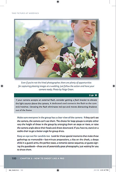
A galley print from page 100 of The Digital Photography Companion. I had some excellent contributors to the book too. This candid was captured by Paige Green.
Who Is This Book For?
Companion is for the average amateur who is passionate about photography and wants to take better pictures. So if you're a seasoned pro, you're not going to get as much from this guide as someone who is more at the enthusiast level. That being said, I've been taking pictures since I was 11 years old, and there's plenty of good stuff in here that I continue to refer to. Companion is also designed to be the official manual for The Digital Story virtual camera club. (The TDS logo and URL is on the back cover.) And we have a dedicated Companion area on the site for us to add more techniques and reader contributions to keep this a living, breathing project.
The Cover
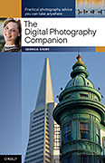
The cover turned out beautifully. The photo reproduction is spot-on, front and back. One interesting tidbit that I want to share has to do with the main cover image. The composition features the Sentinel Building -- now occupied by American Zoetrope. The photo was captured with a Canon G1, a somewhat elderly compact camera. This sets the tone for one of the major themes of the book: You don't have to have "professional" equipment to shoot professional looking images. Learning how to use the tools you have is what's important. When you get your hands on Companion, take a close look at this picture, and see what you think. The cover shot also sets the tone for another theme: get closer. Most shots that you'll see of this tandem (the Sentinel building and the Transamerica Pyramid) will be more loosely composed. I decided to shoot them tight.
Types of Cameras Used for Illustrations and Metadata
Speaking of different types of cameras, one of the new features in Companion is a metadata table in the Appendix (starting on page 196). It lists every shot in the book with its basic information such as camera model, exposure settings, focal length, ISO, location, and photographer. This is to help you understand how each photograph was recorded, and to some degree, drives home the point that camera type doesn't matter nearly as the other variables. A large percentage of images in the book were captured with compacts and entry-level DSLRs. (The best camera is the one you have with you!)
This doesn't mean that we compromised on the images. No way! One mistake that I made in earlier books was that I would use a shot that happened to be a great example of a particular technique, but the photo itself might not have been as appealing as it could have been. For this book, I wanted every shot to be compelling, and be a good example. This was a good call. Companion is my most attractive book to date.
This Book Has an Interface
There's definitely a "look" to many photography software applications these days. The charcoal or neutral gray background that is perfect for picture viewing. When you open up Adobe Bridge or Lightroom, or Apple's Aperture, or even the Events in iPhoto, you see what I mean. I like this look and wanted to bring it to Companion. Not only is it appealing to the eye, it feels in sync with what we're seeing on the computer these days.
As part of this, the tables had to be redesigned to fit in with the rest of the interface. This particular area was actually the brainchild of the book's editor, Colleen Wheeler. After many conversations between the two of us, she decided to bring our ideas to life so we could show the designer exactly what we had in mind. Colleen built samples and templates in Apple's Pages program. We played with the look, and ultimately submitted them to the designer, David Futato.
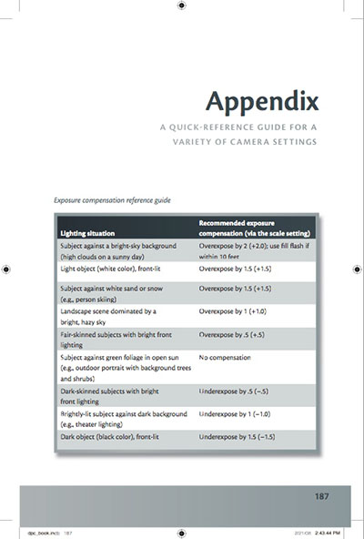
It seemed to resonate with him. David refined the look that Colleen created in Pages, and I think it's quite attractive. Then, by adding lots of photo examples, tons of tables, extensive table of contents and index, plus a full blown Appendix, we have what Colleen calls, "the most reader friendly book I've ever worked on."
What's Different in Companion Compared to Pocket Guide
You may be familiar with Companion's little brother, Digital Photography Pocket Guide, 3rd Ed. I've had owners of the previous book ask me why they should be interested in Companion. There are a number of reasons.
First, Companion is completely up to date. So regardless if we're talking about camera specs or the latest version of Aperture (2.0), Companion is right there on top of it. Next, I have two completely new chapters that aren't in Pocket Guide, "I've Taken Great Pictures, Now What?" and "Printing Made Easy." Both of these chapters are designed to help you once you're uploaded your images to the computer. I think the printing chapter is particularly useful, because I've taken all of the voodoo out of getting great prints. Just follow these steps and your prints will look great.
Also, I've added more tables, better pictures, and put them all in a more attractive design. In a lot of ways, this is the book I wanted to do from the beginning. And thanks to solid Pocket Guide sales in the past, I was able to get the resources that weren't available before.
Final Thoughts
My goal for this project was to create a book that would appeal to the eyes, be informative without attitude, and help empower whoever embraced it to take pictures that were a cut above the general photography aptitude. And, I wanted to make people smile. No so much a ha-ha smile that follows a good anecdote, but more the smile that results from feeling confident. And in the end, you will be the judge as to whether I accomplished that or not.
The Digital Photography Companion is available now on Amazon.com, and for less than $20. The revenue it generates helps support our virtual camera club, The Digital Story, which will always be free and open to any photographer who wants to participate.
Technorati Tags: digital photography, Digital Photography Companion, Technology, The Digital Story





Derrick:
I just pre-ordered your new book in appreciation of the time and energy you devote to teaching us about photography, and to support TDS. I am a passionate amateur in every sense of the word, and your podcasts, very carefully thought out advice, and clear willingness to share set you apart. I may never be a Pro-Photog as a 2nd career, but I will always be interested in the best I can do with the gear I have. Thanks again.
Bob.