There are many reasons to add (or not to add) a watermark to an image. For most photographers, it's not an everyday activity. But there are times when it's useful for protection or promotion.
If you're finishing your photo in Luminar 2018, here's one way to add the watermark. I like this approach because the graphic lives on a separate layer, so you can turn it off, or on, as needed.
In this case, I'm going to add my Nimble Photographer logo to an image. But you can use this technique for "FPO" when working on publication layouts, "Proof Only" for wedding work, and other related activities.
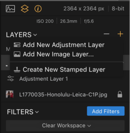
I usually start with a PNG version because it seems to blend better than Jpegs. In Luminar, I go to Layers, click on the + icon, and choose Add New Image Layer from the popup.
When the image comes in, it will be way too big. But that's not a problem. Go to the Tools popup, choose Free Transform, and tame it. Pay close attention to the proportions of the logo and try to maintain them when using Free Transform. Clicking on the Lock icon in the Info Bar may help you with this. (Keep in mind this locks the proportions to the image you're working on, not the original graphic that you brought in. So lock may or may not be useful. But it's good to know that it's there.)
Once you have the logo the size you want, position it, then click Done. If you want to change the position later, use Free Transform to move it. You can return as many times as you want with this tool.
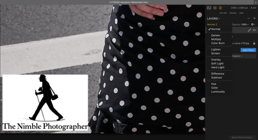
 The image comes in in "Normal" blending mode, showing its white background. But I would prefer a more subtle approach.
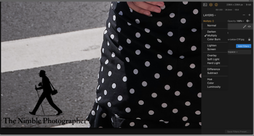
 So I switch to the "Multiply" mode to eliminate the white background.
Make sure that the watermark layer is selected, then go to the blending modes popup and survey your options. For this image, the Multiply option worked great. Play with all of the blending modes and choose the one that works best for your particular shot.
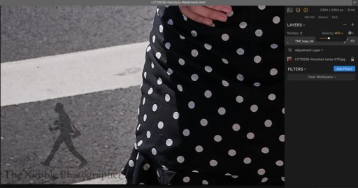
The finishing touch is choosing the right opacity. For a more subtle approach, I pulled opacity down to 40 percent.
 By pulling the opacity down to 40 percent, I can create a more subtle rendering of the watermark.
Be sure to save your work as a Luminar file - File > Save - So you can return to it another time for a different watermark treatment, or none at all. Then make sure your watermark layer is selected, and export the file - File > Export.
 Exported file with watermark included. I used 100 percent opacity for this example so you can better see it. But I could easily go back and change the opacity and export again.
By having complete control over the appearance and application of the watermark, this allows you to create the right look for purpose at hand. Give it a try and see what you think.
Rock Luminar with my new Essential Training
You learn all the ins and outs of Luminar 2018 via my Essential Training on lynda.com and on LinkedIn Learning. It's fun, and I promise, you will learn a lot.


