Recently in DIY

  Page 4 of 4 in DIY  

Zeiss Lens on Olympus E-P1? Oh Yeah!

The Olympus PEN E-P1 is a versatile camera that can accept Leica, Nikon, and Zeiss lenses with the right adapter. I have a small cache of Zeiss prime lenses in the Contax M mount that are part of my Contax RX kit. Since I don't shoot very much film these days, I've been looking for a way to put this wonderful glass to work. I read about the Novoflex Four Thirds adapters, but I could not find the Contax mount anywhere (the Leica version seems more plentiful here in the States).


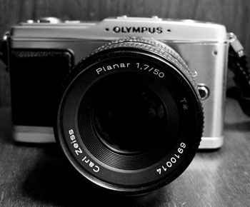
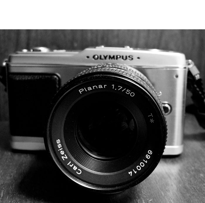
Carl Zeiss 50mm f/1.7 Contax MM mount on an Olympus E-P1 using a Rayqual CY to M 4/3 adapter. Photo by Derrick Story


The Search for a Contax Adapter

After scouring the Web for any adapter that would work, I found a great site called Japan Exposures that had all sorts of photographic exotica, including Rayqual Micro Four Thirds adapters for Contax M and Nikon F mounts. I purchased the Contax mount for 18,700 Yen, and they shipped it to me within a few days. I had a very good customer experience with them.

Mounting the Lens on the E-P1

The Rayqual mount is excellent. There's no wiggle at all. It's finely machined and has a solid feel. The first lens I tested on the E-P1 was the Zeiss 50mm f/1.7 MM. The set up is easy. You mount the adapter on the body, then attach the lens to the adapter. Everything clicks into place. There are no electronic contacts on the adapter, so you work in aperture priority mode. Focus with the lens wide open, then if you need too, stop down to make the exposure. The E-P1 sets the appropriate shutter speed for you. It worked great. If you have lots of light, then you can focus stopped down. Although I must admit, what I wanted to do was shoot wide open most of the time taking advantage of the unique qualities of the Zeiss Planar lens.


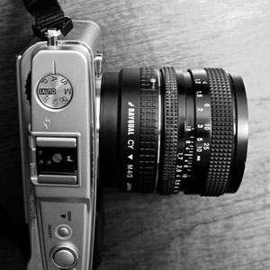
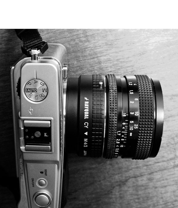
Top view of Carl Zeiss 50mm f/1.7 Contax MM mount on an Olympus E-P1 showing the Rayqual CY to M 4/3 adapter. Photo by Derrick Story


You can configure the E-P1 for manual focus-assist giving you 7X magnification with just a push of the OK button. I love this mode and use it to get the focus just right, then back off to normal view and take the picture. Focusing on the 3" LCD was easier than I expected. Working with the silky smooth focusing ring and the click-stop aperture ring on the Zeiss Planar provided a truly classic photographic experience.

Picture Quality

As far as picture quality, my favorite lens was the Zeiss Distagon 35mm f/2.8. The shots were beautiful at every aperture setting. Next, I also liked the 50mm f/1.7 and the 85mm f/2.8. They were a little softer on the edges than the 35mm, but still quite good. I was disappointed with both the Zeiss 135mm f/2.8 and 200mm f/3.5 telephotos. They weren't as sharp on the E-P1 as they are on the Contax bodies. It seemed to me that the E-P1 performs better with the wider and standard lenses than with the longer focal lengths. I will continue to test and report more on this.


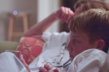
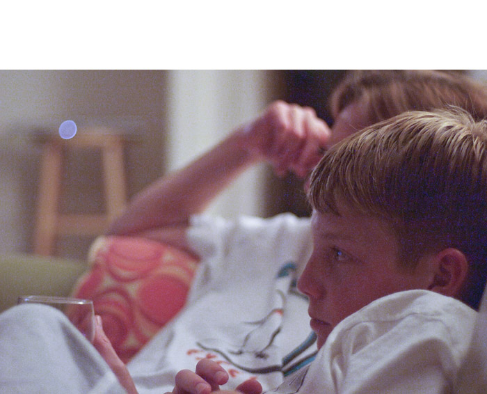
Existing light shot using the Carl Zeiss 50mm f/1.7 Contax MM mount on an Olympus E-P1. The ISO was set to 1600, aperture to f/1.7, and was able to get a shutter speed of 1/30th even in this very, very low light. Photo by Derrick Story


Final Thoughts

Shooting with the Contax lenses on the Olympus E-P1 is a brand new experience. It's so unique, it's almost hard to describe. I'm once again focusing the camera myself, yet I have a big 3" LCD with digital focusing assist to provide a new twist on the process. The camera looks good with any of the Zeiss lenses mounted, and the shooting is outright fun. Most of the camera functions work just fine, including flash, image stabilization, and even movie mode. There are a few gaps in the metadata because the camera can't report aperture or focal length, but you get ISO, white balance, shutter speed, etc. The shots look different than with any other lens/camera combination.

For the time being, I'm going to work with these lenses on the E-P1 and see how it affects my photography. I'm already feeling more creative every time I pick it up. I'll publish a collection on our Flickr site soon.


twitter.jpg Follow me on Twitter

-


You can make photo art notecards that won't be just good; they'll be professional too. And I'll show you how. This workflow uses Aperture software, an Epson printer, and Red River paper. It's fast, efficient, and archival. Once you're set up, you can print just a few cards whenever you need them, or for larger runs, spend a rainy afternoon creating entire sets of cards to sell or give as presents. Of course you can make substitutions to this workflow, but if you have the tools listed here, that's where I'd start.

Equipment

  • Quality ink jet printer. I'm using the Epson R2400 for this project.
  • Red River notecard stock. For glossy surface, use 60lb. Pecos River Gloss (#8451) and for matt surface, I recommend Premium Matte C2S (#1567). Both stocks are 7" x 10" and fold down to a 7" x 5" note card.
  • Photo software. I highly recommend Aperture 2 (or later) for this project. Why? Because I create the notecards using Aperture's book making tool. This allows me to design everything precisely as I like, and then it remembers all my settings so I can revisit the project at any time and print more cards that look *exactly* like the original set.
  • Envelopes. You can use what ever you want here, I found Darice 5" x 7" envelopes at the craft store for about 10 cents each.

Designing Your Card

Since I'm using Aperture, all of my images were already organized. I decided to make a themed set of cards featuring my recent shoot at Bodie State Historical Park in Northern California. I highlighted half a dozen shots for this project, then clicked on File > New from Selection > Book. This is the first step to opening the layout tool. Next, in the following dialog box, choose "Custom" from the "Book Type" popup menu. We won't be using any predesigned templates for this project. Click the New Theme button, give it a name, such as "5 x 7 Notecard," and enter the following information:

Page Size - Width: 7", Height: 10", Margins - Top: 5.5", Bottom: 0.5", Inside: 0.5", Outside: 0.5". Then click OK.


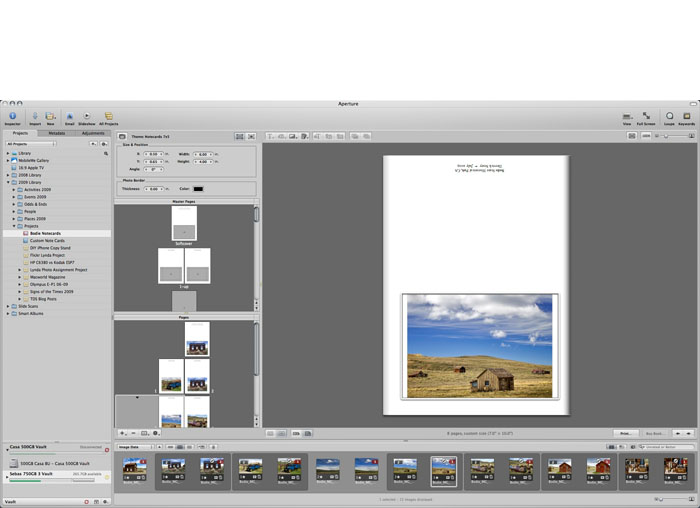
The Aperture layout tool. It was originally designed for books, but it's great for notecards too. Click to enlarge image.


Your selected images will be added to the new project you just created, and you'll be greeted with the layout tool interface. Open up Master Pages (Gear icon > Show Master Pages), and click on the 1-up template. Go back to the Gear icon and choose "Show Layout Options." You'll see new dialog boxes appear above the Master pages that allow you to specify settings.

Go back to the Gear menu, choose Add > Photo Box. A placeholder box will appear on your 1-Up Master page. Click on it to select, then add these numbers to the Size & Position box that's above the Master Pages box:

X: 0.50, Y: 0.65, Width: 6.00", Height 4.00", Angle: 0°. You can adjust these settings later to your particular tastes, but this will get you started. Then right-click on the photo placeholder and choose from the popup menu: Photo Box Alignment > Scale to Fit Centered. You've now set up your template. You can add text by choosing Gear > Add > Text box. Type your text in it, then click on the "T" at the top of the interface to format it. You'll probably have to rotate it 180° if you want it to print correctly on the back of the card.

Now go to the Pages box (below Master Pages) click on the 1-Up thumbnail, and drag a photo from the Filmstrip to the empty placeholder in the big browser window. To make sure your Master Page settings are honored, I recommend going back to the Gear icon and choosing: Reapply Master. You've now designed your first notecard. You can add more notecards by going to the + icon and selecting "Add New Page" from its popup menu. I created eight of these 1-Up pages for my Bodie notecard set.

Get Ready to Print

As with any big printing project, make sure your screen is calibrated and your printer is full of ink and ready to go. I choose the R2400 for this project because it handles card stock easily, plus it seems to like Red River paper. To avoid paper feed problems however, I only load one sheet at a time for notecards.

For notecards using the 60lb. Pecos River Gloss, use the following settings in Aperture.


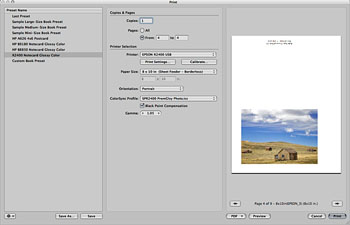
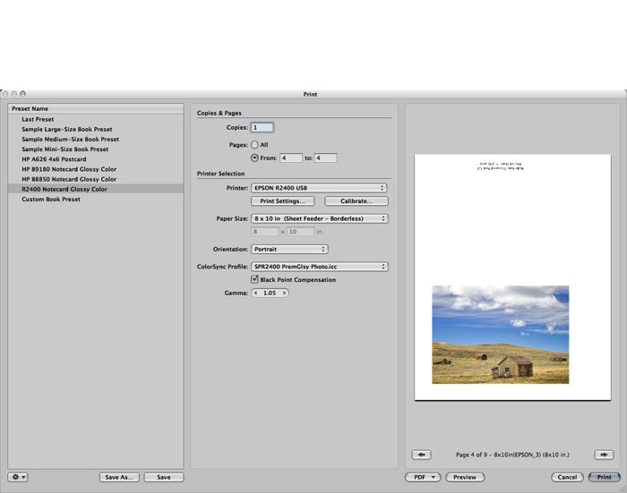
The Aperture Print Dialog. You can save your settings as presets so it's easy to print the job later on. Click to enlarge image.


Select the notecard you want to print, then click the "Print" button in the lower right corner of the Aperture interface. A dialog box will appear with "Custom Book Preset" selected in the left hand column. Make a test printing one card, so I recommend that you use the "From X to X" setting instead of Print All. Next, select your printer from the popup menu. And for paper size, I've had great luck with 8" x 10" sheet fed (even though the paper is really 7" x 10"). I set the ColorSync profile for Epson glossy paper (in this case, SPR2400 PremGlsy Photo.icc), then click the Save As button in the lower left corner to save this preset. Give the preset a descriptive name, such as "R2400 7x10 Notecard Glossy," click OK, then print. Aperture will remember this preset, and you can use over and over again.


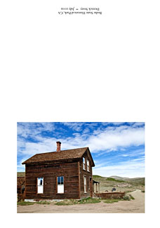
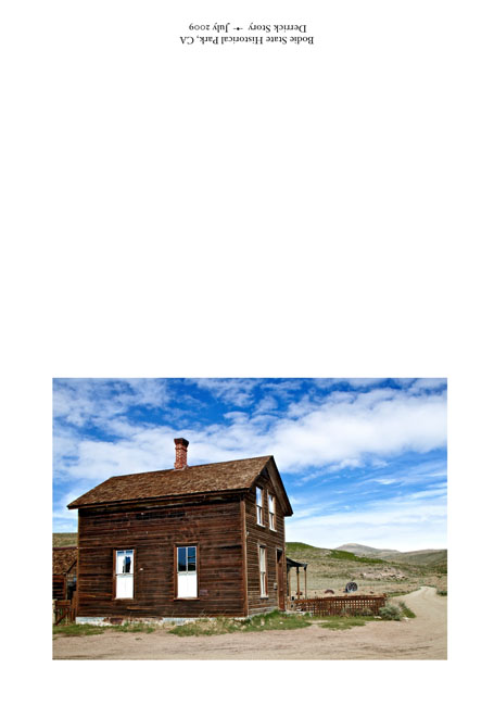
Sample notecard before folding. Red River paper is scored in the middle so it's easy to fold and get a professional looking card. Click to enlarge image.

You have other options in this dialog box too, such as setting Black Point (which opens up the shadow areas) or increasing gamma (which brightens up midtones). The nice thing about these adjustments is that you can tweak your output without having to mess with the picture itself. If I do make print adjustments, I note those settings in the description area of the photo so I can use them again next time.

To print matte surfaced cards, I swap out the black cartridges in the R2400, then create a new preset in the Aperture Print dialog box that uses the Enhanced Matte Paper ICC profile. I then load up a sheet of Premium Matte C2S and make a test print. If I'm not satisfied with the initial output, such as the shadow areas rendering just a little too dark, I make a "New Version from Version" by right-clicking on the image. Now I can adjust the image for the matte surface and try another print.

lynda_aperture.png

Since all of my print settings are saved as presets, and my card layouts are saved as templates, I can come back to this project when ever I want to print additional cards. If you use Aperture's Vault, it will save your settings to a backup drive.

Final Touches

Once all the printing was done, it was fun to spread out the cards and choose my favorites. Some images looked better with the glossy surface while others were really nice on matte. I carefully folded the cards along the score, then bundled each one with its matching envelope. I even found 5" x 7" cardboard boxes at the craft store that I could use for packaging sets of notecards.

Obviously there are variations to just about every step in this process. You can use other photo applications or printers. The tools I chose were the result of testing, with these being the easiest and most efficient.

And I have to say, now that the project is over, making custom notecards from my own pictures is very satisfying.


twitter.jpg Follow me on Twitter

-


Technorati Tags: , , , , , , , , ,

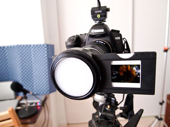
If you have a full frame DSLR, you can easily digitize your favorite 35mm slides at home. I'm using a Canon 5D, Sunpak 444D flash, and a 1980s slide copier. That's all you really need.

Like many long time photographers, I have a collection of 35mm slides. Some of these images are prized shots that I would love to have digitized. I tested a few outside services, but after viewing the results, really wanted to have more control over the process. So in about an hour, I rigged up the home slide digitizer using the following parts.


Photo of Canon 5D 35mm slide digitizer by Derrick Story. See complete set of images on the Digital Story Flickr page.


  • Canon 5D DSLR
  • Sunpak 444D flash in manual mode
  • Vintage 35mm slide copier attachment
  • Tripod
  • Photoflex arm to align the flash
  • Photoflex flash diffuser
  • Cable release

I had a Canon T-ring adapter for the slide copier so it would mount to the 5D. All exposure settings are manual. So I set the ISO to 100 and shutter speed to 1/60th. There's no aperture setting on the slide copier. Instead, you control exposure by how much light you output from the flash. That's why I dug out an old Sunpak 444D flash. It has manual exposure settings (1/16th through full), and I had an extension cord for it too. I set the flash on 1/8 power for dense slides, and 1/16 power for those a bit lighter. I position the flash a few feet from the front of the slide copier and align it so the light evenly illuminates the image.

One of the advantages of this approach is that I can shoot in Raw mode. So once I digitize the image, I can use Aperture, Lightroom, Adobe Camera Raw, or even iPhoto to tweak tone and color. With the 12MP 5D, the file resolution is 3929 x 2619. If I use the 5D Mark II, then I get 5616 x 3343, enough to make a 12" x 19" print at 290 ppi.

I wouldn't recommend this approach if you have hundreds of slides to scan -- an outside service makes more sense in those situations. But when you want to digitize a handful of your favorite images, this method works great. And for Canon shooters who have upgraded from the 5D to the 5D Mark II, you can put your old 5D to work and just leave the rig set up permanently in your studio. In fact, why not tether it to a laptop for a slick digitizing production rig?

I have sample images and lots of shots of the rig itself on the Digital Story Flickr page, including a comparison scan from DigMyPics and this method.

For more interesting home projects, be sure to check out the Photography DIY section on The Digital Story.


twitter.jpg Follow me on Twitter

-


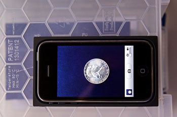
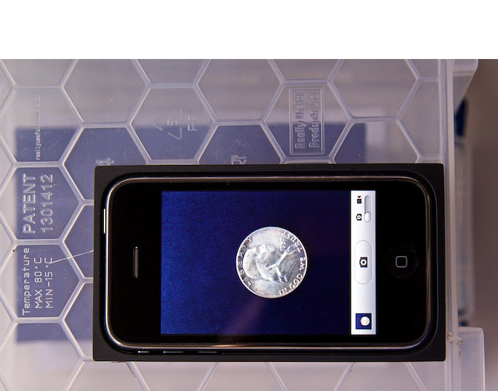
DIY Copy Stand for iPhone 3GS

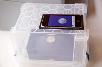
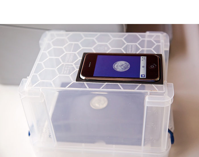
The camera in the iPhone 3GS has improved close-up capabilities, tap focus, and more resolution than previous models. You can use the 3GS to photograph small objects, business cards, even duplicate 4" x 6" prints. With this DIY copy stand that's easy to make, you can produce high quality images with just a couple taps on its screen.

If you've ever tried close-up work with the iPhone, you know you have two challenges. The first is holding the camera steady enough to avoid camera shake. The second is getting the plane of the camera parallel to the plane of the subject to avoid distortion. This little device helps with both, plus diffuses the light for a more flattering rendering.

I have step-by-step photos showing the key elements of this project on The Digital Story Flickr page. In short, it works like this. You remove the tray from the iPhone packaging, drill a hole in it for the lens to see through, cut an opening in the bottom of a translucent box to set the tray in, and you're done. It's really that simple. I recommend that you start with a box that's at least 6" tall. That will give you enough distance to copy 4" x 6" prints. You can use "risers" such a little boxes to photograph smaller items that need more magnification. Here's a short instructional video that provides a nice overview.

Please feel free to add your comments, improvements, or variations on this project. The iPhone 3GS is a handy little camera, and I want to squeeze every ounce of capability out of it.

More on the iPhone 3GS

iPhone 3GS Movie Making Basics - Video for All

"iPhone 3G S from Photographer's POV" - Digital Photography Podcast 180


twitter.jpg Follow me on Twitter

-


This week Stephanie begins by taking you shopping to a bargain store, then heads back to the studio to design a custom notebook that features your photography on the cover. Even though they are easy to assemble (and very affordable), these beautiful notebooks make excellent gifts.

You'll learn, step by step, how to take apart an existing notebook, customize the front and back covers, then reassemble it. The final product becomes an expression of your art.

Other Creative Output Projects with Stephanie

Make a Custom Photo Gift Bag (Video Tutorial)

Buckle-Up Frame Present for Dad on Father's Day

A Time to Remember - Make Your Own Photo Clock

Packing Tape Transparencies

Buckle-Up Frame Present for Dad on Father's Day

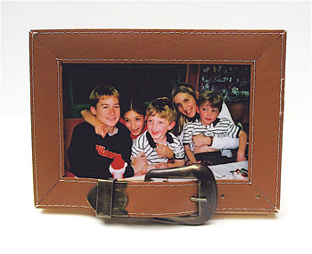
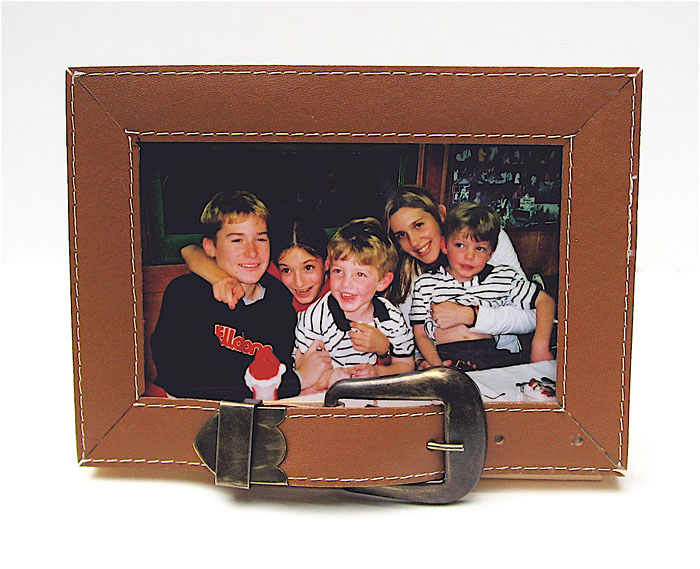
Unfortunately, many people these days have to tighten their belts to make ends meet. It's tough to think about gift giving when so much of your money is put toward paying bills. But that doesn't mean you should forget about good ol' dad on Father's Day (June 21).

Consider making a picture frame that's not only unique looking, but surprisingly inexpensive as well. Pay a visit to your local thrift store and purchase a leather belt and frame. The belt can be any color, however, the width of it should be approximately the same size as the frame's surface.

Measure the sides of your frame, corner to corner. Buckle the belt and cut it into strips that are the same length as the sides of the frame. Position the strips over the frame and miter the corners (45 degree cut) for a clean look. Adhere the pieces of the belt to the surface using a strong adhesive like Beacon's 3-in-1 Advanced Craft Glue.

After the glue dries, it's ready for your photo. Select one that's personal and special to both of you. The frame will look like it was an expensive purchase, and your picture will be a priceless keepsake.

A Time to Remember - Make Your Own Photo Clock

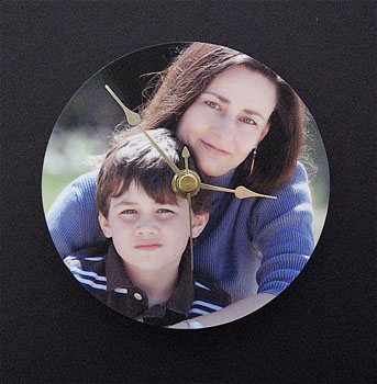
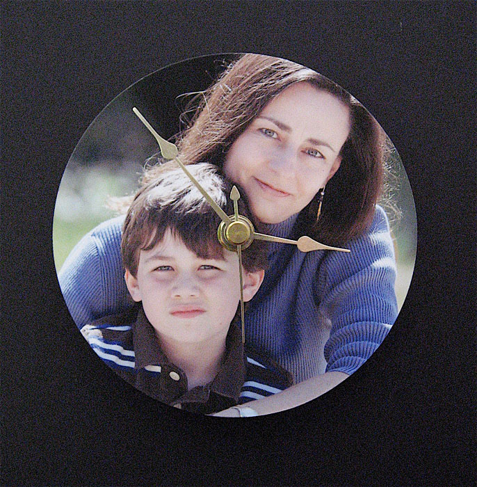
I absolutely love it when I can create something cool out of an object that would normally get thrown away. Case in point... CD discs. These little silver platters offer the perfect surface for creating decorative and meaningful wall clocks. All you need is a CD, a photograph, and a clock mechanism that's available at almost any bargain store.

When you print out your picture make sure it's about the same size as the disc, if not a little larger. Since a CD is about 4.5" in diameter, a 5" x 7" print will usually do the trick. Adhere your image to the CD using a spray adhesive. Trim off the excess paper from the edges and poke a hole in the center.

To turn it into a timepiece, you will need to insert a clock mechanism through the hole and attach it to the back using an industrial strength glue. Carefully remove the clock arms for this phase of the project. You'll reattach them in good time. Clock mechanisms are available at most craft stores, or you can always salvage one from an old wall clock (that isn't as handsome as your work).

Once the mechanism is adhered to the CD, reattach the clock arms and second hand. Mount on the wall, and you have a timepiece that's pretty as a picture. Or to be precise, pretty as one of your pictures.


Event Calendar

Events! See the TDS Event Calendar for photography workshops, speaking engagements, and trade show appearances.

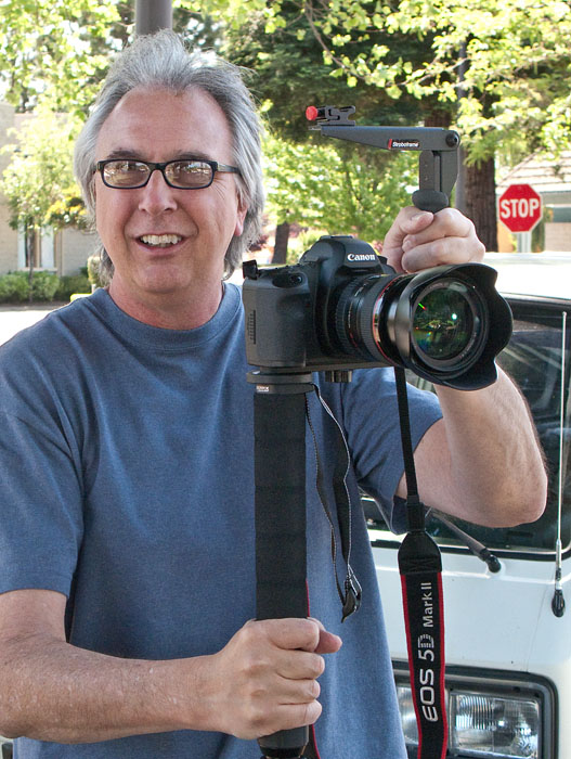
When I started shooting HD video with the Canon 5D Mark II, and now the Canon Digital Rebel T1i, I wanted a rig for recording on the go so I didn't always have to use a tripod. I investigated commercial steadicams, such as the Redrock micro, but spending $1,000 wasn't in my budget. I also looked into "do it yourself" rigs, such as the $14 Video Camera Stabilizer, but I needed something that looked a bit more professional for client shootings. So, I guess I needed a semi-DIY steadicam: one that I could afford, but also had some style.

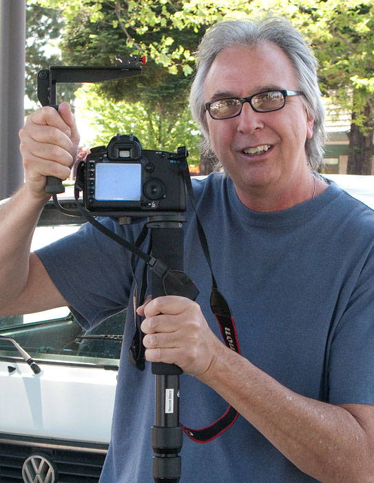
Optical stabilization is very important when you're in video mode. The difference between recording with stabilized lenses and non-stabilized is dramatic. But when you're shooting "walk and talks," optical stabilization isn't enough. So I hacked together a stedicam that uses just two components: 1) Stroboframe Quick Flip 350 Flash Bracket ($48), and (2) a $30 monopod, such as the Velbon RUP-40 4-Section Monopod. Total outlay is less than $80, that is, if you don't already have these components laying around the house right now.

Assembly only takes a minute. Screw the collapsed monopod into the end threaded hole on the flash bracket, attach your 5D Mark II, D90, Rebel 500D, etc., and start recording. I hold the grip of the flash bracket in my left hand and monpod grip in my right. This positioning provides the balance I need to record more evenly, even as I walk. You still need a stabilized lens, but this system works great.

For shots where you don't have to walk, try putting the camera strap around your neck and resting the collapsed monopod on your belt. Hold the steadicam so the neckstrap is taunt. It's amazingly solid.

When you're finished shooting video, disassemble the rig and you have a monopod, flash bracket, and hopefully, some great video footage.


twitter.jpg Follow me on Twitter

-


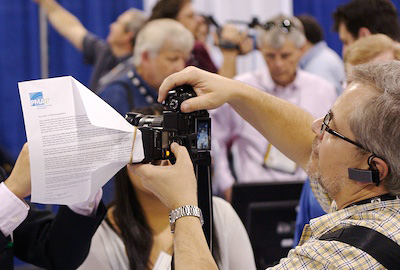
paper_flash_diffuser.jpg

I saw tons of cool equipment at Wednesday's PMA Sneak Peek event, but my favorite was a sheet of letter-size paper folded and attached to a flash with a rubber band to create a very effective diffuser.

I noticed that Steve Makris, a technology writer for the Edmonton Journal, using the device pictured above. I thought is was so simple, yet elegant and quite useful. If you look closely, he's actually using a PMA memo.

And the best thing about it... "I get a fresh one every day," says Steve.

All the more reason to make sure you have a handful of rubber bands in your camera bag.

Technorati Tags: ,

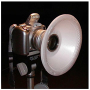
bowl_diffuser.jpg

Virtual camera club member Sarah Kim discovered the CCRRFDv2 by Photophool while browsing flickr. This device helps you evenly illuminate subjects when using macro mode with a Canon S2. The DIY device consists of three plastic foam cereal bowls stapled together with holes cut in the bottom to slip-fit on the lens barrel, and it delivers shadowless lighting in supermacro mode.

Photophool has updated the instructions for building this handy device. You might want to take a look at what's going on here, and think about ways that you could apply the technique to your camera and photography. If you get some cool shots, or discover a clever variation on this theme, be sure to drop me a line.

Sarah has already put her diffuser to work capturing this close-up of her husband's hand while working. Thanks for the tip Sarah!

Photo of the diffuser by Photophool, who has lots of other interesting stuff.

Technorati Tags: ,