Recently in Photos for OS X

  Page 2 of 12 in Photos for OS X  

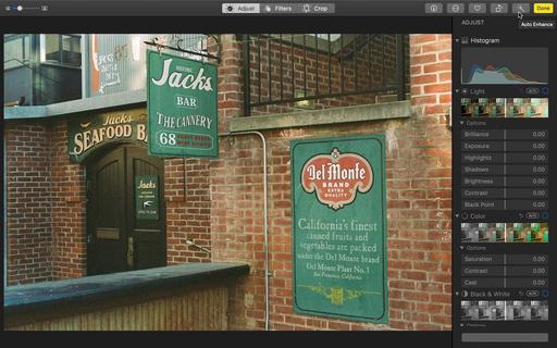
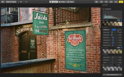
Whether it's a cherished photo from a family album or an artistic image captured on expired film, you can easily breath life into the picture while still retaining the unique qualities of analog photography. And the best part is if you're a Mac user, you already have the app to do so.

Original-Film-Shot-1600.jpg Del Monte Plant No. 1 captured in expired Kodak Gold 200 with a Nikon FM and Nikon Series E 50mm f/1.8 lens. I like the shot, but it was just a bit too off-color for my tastes. Photo by Derrick Story.

Finished-Editing-1600.jpg After just a few clicks in Photos for macOS, I found a sweet spot between the original image and one that I much prefer, but still retaining the original film feel.

Once the image is digitized, here are the 3 steps.

  • Auto Enhance - Photos does a very good job of analyzing film images and applying light-handed corrections to them. I always start with Auto Enhance (what looks like a magic wand), then fine tune from there.
  • White Balance - I prefer using White Balance with the eye dropper to Cast correction. I think WB is better suited to film. I select the Temp/Tint option in the WB popup menu, then click the dropper on a neutral tone area. You can adjust to taste from there.

  • Improve Detail - Definition is great for enhancing midtone contrast and sharpness. If you feel the image needs a bit more, then apply Sharpen as well.

At this point, you should be in great shape for sharing or making a print or two. If you want to keep fiddling, then take a look at the Retouch Brush for any dust spots, Vignette for directing the viewer's eye, and Noise Reduction if you want to tone down the grain a bit.

Your finished product will still have that lovely analog feel to it, but will be fine tuned to your tastes.

Coming Soon! Look for my training on LinkedIn Learning and lynda.com titled, Photos for macOS Catalina and iPadOS that shows you all the amazing things you can do with this new software. Hope to release this title in late November/early December. In the meantime, you can watch Photos for macOS Mojave right now. It will provide you with the info you need for making great slideshows!

You can share your thoughts at the TDS Facebook page, where I'll post this story for discussion.
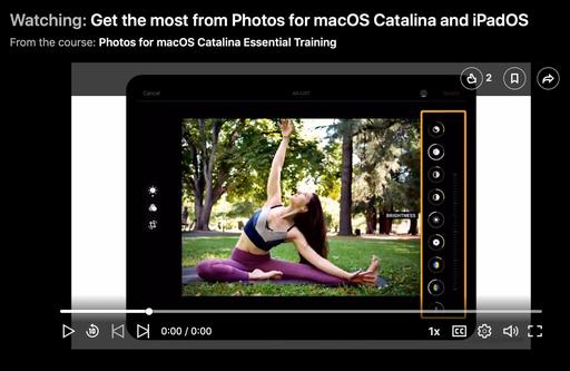
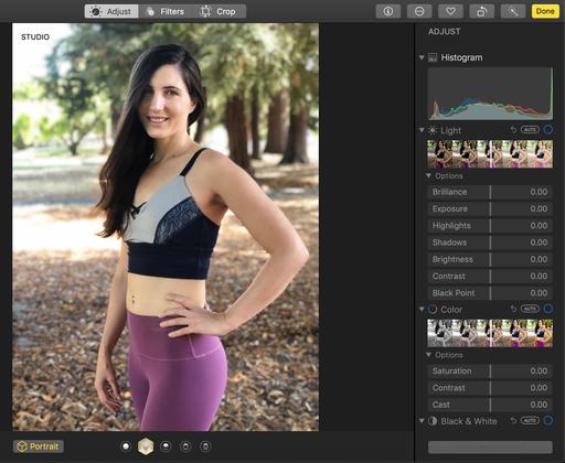
Portrait mode on current iPhones is incredible. Just open the Camera app, slide the options to Portrait, and shoot away. And as impressive as the results initially look, you can make them even better with just a few clicks. Here's how.

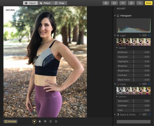
001-Original-Portrait.jpg The original photo is good. But we can make it better.

If you have iCloud enabled (and why wouldn't you?), your picture is automatically saved to Photos on the Mac and your other iOS devices. With just a few clicks in Photos, you can take that good image to then next level.

002-Switch-to-Studio.jpg Choose the right lighting scheme. I captured in Natural, but I think Studio looks better.

Regardless of which lighting scheme you captured in, you have the option of switching in Photos. In this case, I think the Studio lighting scheme is more flattering. (Notice the options displayed at the bottom of the image.)

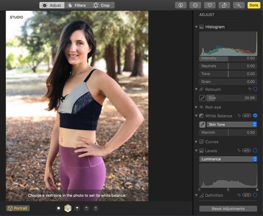
003-Adjust-Skin-WB.jpg Improve skin coloring.

iPhones are generally pretty good with image color. That being said, I've found that there's room for improvement as well. Because we took this portrait in the shade, her coloring was still a bit cool.

I selected White Balance in Photos for macOS, choose Skin Tone from the popup menu, and enabled the eye dropper. I then clicked on her face to adjust the white balance for her particular skin tones in this environment. They looked much better afterward.

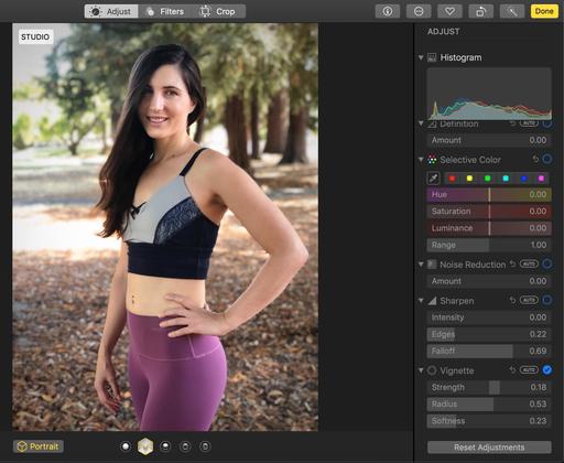
004-Soft-Vignette.jpg Adding a soft vignette puts more emphasis on the subject.

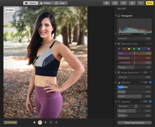
One trick that many portrait photographers use is to add a soft vignette to put more emphasis on the subject. The technique is to start with full Strength, adjust the Radius and Softness, then back off Strength until the vignette isn't detectable to viewer. However, even as a subtle effect, it makes a noticeable improvement in the image. (Here I only needed about 20 percent strength for this portrait.)

005-Sharpening.jpg Finally, just a bit of sharpening to clean things up.

The last step is add a dash of sharpening as well. Move the Intensity slider (don't worry about Edges and Falloff - they are fine where they are) to about 20 percent. You don't want to over-sharpen portraits, just restore crispness to the overall image.

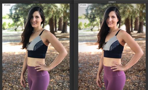
If you're in Photos for macOS, press the M key to see your before and after. Using Photos in iPadOS, while still in editing mode, just tap on the image to see the original version.

side-by-side.jpg Side-by-Side: A good portrait gets even better. Photos by Derrick Story.

Now, thanks to iOS 13 and iPadOS, all of these techniques can be applied on the iPhone and iPad as well, with the exception of White Balance. When in Photos for mobile devices, use the Warmth and Tint adjustments instead.

Portraits captured with iPhones are truly impressive thanks to computational photography. But the artist in you can take them to the next level. Your subjects will thank you.

And stay tuned for my upcoming training on LinkedIn Learning and lynda.com titled, Photos for macOS Catalina and iPadOS that shows you all the amazing things you can do with this new software. Hope to release this title in November. Stay tuned! In the meantime, you can watch Photos for macOS Mojave right now. It will provide you with the info you need for making great slideshows!

You can share your thoughts at the TDS Facebook page, where I'll post this story for discussion.

The iPhone does a great job of recording panoramas. But what do you do with them afterwards? They are hard to share on social because they're quite small when displayed in their entirety. As a result, those tiny details defeat the original purpose of sharing an impressive scene.

Beach-Pano.jpg Maui Beach Pano - There has to be a better way to display this! Photo by Derrick Story.

I have two suggestions for you. The first, for viewing on the iPhone, is to use a dedicated app, such as PanViewer. You can have your image fill the entire screen, then tilt or swipe to enjoy the image details.

But my favorite way is to incorporate the panorama images into a Photos slideshow, then output it as a movie. Here's an example, titled Maui - Morning to Night that incorporates two iPhone panoramas with a few still images.

These movies are easy to create. Start in Photos for macOS. Click on the plus sign that appears when you mouseover My Projects in the Sidebar. Name your presentation. The click on the Add Photos button (+) at the bottom where the thumbnails are displayed. Mix in a few standard images with your panoramas, and arrange them in the order that you want. Finally, apply the Ken Burns theme, and play. You will be delighted with the presentation.

You can export the slideshow as an HD video, then share on Vimeo, YouTube, Facebook, and anywhere else you display your stuff.

You probably have a nice stockpile of panoramas right now. Put them to use! And show them to the world.

And stay tuned for my upcoming training on LinkedIn Learning and lynda.com titled, Photos for macOS Catalina and iPadOS that shows you all the amazing things you can do with this new software. Hope to release this title in November. Stay tuned! In the meantime, you can watch Photos for macOS Mojave right now. It will provide you with the info you need for making great slideshows!

You can share your thoughts at the TDS Facebook page, where I'll post this story for discussion.

I was curious to see if my iPad mini 5 could be useful in Sidecar mode when working with Photos for macOS Catalina. What I was looking for here is an out-of-the-box experience. I didn't want to buy additional software or learn how to become an illustrator. What I did want to see is if this new Catalina feature would be useful in my existing workflow.

The answer is a qualified "yes."

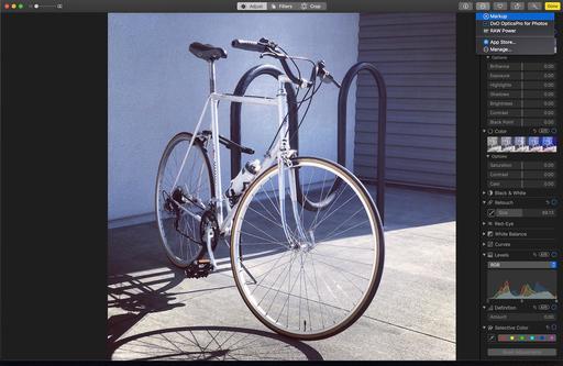
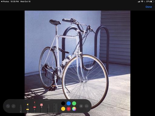
01-ENABLE-MARKUP.jpg Enabling Markup in the editing mode of Photos.

The positive qualification is for those who use Markup in Photos (which I love!). Beyond using the Retouch brush in editing mode, there isn't much to do yet in Photos when using your iPad as a tablet with the Apple Pencil. But if you go to Markup, everything changes for the better.

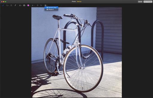
02-Enabling-the-iPad-from-within-Markup.jpg Enabling your Apple Pencil from within Markup.

And the cool thing is, it's super easy to do. First, you have to make sure that your hardware is Sidecar enabled. Basically that means you have an iPad that uses an Apple Pencil. (In my case, that's an iPad mini 5.) And you also need a Mac that's essentially 2016 or later. If you have any questions about compatibility, I recommend this "Sidecar" white paper from Apple for reference. Once you have your gear in order, just follow these steps.

  • Launch Photos for macOS Catalina on your Mac, open a picture and go to Edit mode.
  • Turn on your iPad and have your Apple Pencil ready.
  • On your Mac, in Edit mode, click on the Options button (3 dots in a circle) and choose Markup from the list.
  • In Markup on the Mac, look for the little tablet icon in the toolbar, and click on it. Your iPad should show up in the list.
  • Choose your iPad from the popup, and start using your Apple Pencil on the iPad to illustrate your picture.

It's that easy!

03-Choose-Pen-and-Color.jpg Once your Apple Pencil is enabled in Markup, choose the right tip and color, and start having fun.

If anything goes wrong, just refer to the "Sidecar" instructions to get your tablet up and running.

I've always liked Markup in Photos. It's so powerful and fun. But using it with an Apple Pencil and my iPad takes it to a whole new level. Give it a try.

And stay tuned for my upcoming training on LinkedIn Learning and lynda.com titled, Photos for macOS Catalina and iPadOS that shows you all the amazing things you can do with this new software. Hope to release this title in November. Stay tuned! In the meantime, you can watch Photos for macOS Mojave right now.

You can share your thoughts at the TDS Facebook page, where I'll post this story for discussion.
As soon as I read about the new Photos extension in Pixelmator Pro 1.4, I had to try it for myself. Until this point, most of my finishing work has been accomplished with the Luminar Editing Extension, which I really like. But there are a few gaps in that workflow that I wanted to plug, and Pixelmator is the perfect solution.

Pixelmator-Pro-Extension-1024.jpg

The price is right as well. Since I already own Pixelmator, I could "complete the bundle" in the Mac App Store for only $20. That added Pixelmator Pro to my applications. But even if you buy it as a standalone app, it's still a reasonable $40.

Enabling the Editing Extension

I then enabled the Pixelmator Pro Editing Extension (System Preferences > Extensions > Photos Editing > Pixelmator Pro), and fired up Photos for macOS for a test drive. There are a couple things that I really liked.

Favorite Features

The first is, all of the Pixelmator Pro tools are available in the editing extension, including layers. I now have the convenience of Photos cloud backup and sharing with the power of Pixelmator. An image that I fine tune in Pixelmator is available on my iPhone, iPad, and other Macs just minutes later. This is also a wonderful safety net for your images and work on them.

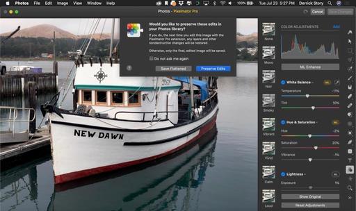
Preserve-Edits.jpg

The second surprise, and this is a great one, is the Preserve Edits feature. When I click Save Changes in the editing extension, I'm given the option to Preserve Edits. This means that I can come back to this image at another time and pick up right where I left off, or change one of my previous adjustments.

I tested this feature, and it works great. This elevates the Photos/Pixelmator Pro workflow above all other extensions that I'm currently using. It's as easy to use as it is powerful. If you don't want to go that route, then you can flatten the image right there on the spot. Even then, you can always return to original if you wish.

One last feature that I want to point out, in the Adjust Colors tab, is ML Enhance. This is a powerful auto adjustment powered by machine learning. And it is good. Click the ML Enhance button, let Pixelmator process the image, then fine tune with the sliders below. Wonderful.

The Bottom Line

Pixelmator Pro 1.4 is a boon to Photos users and any photographer who uses a Mac. It has an abundance of features, integrates seamlessly into the iCloud workflow, and is affordable. I love it.

You can share your thoughts at the TDS Facebook page, where I'll post this story for discussion.
Small Camera, Big Workflow

fujifilm-xf10-front.jpg

The software we have on the backend can help free us from cumbersome equipment at capture. One example is my "weekend kit" that I carry with me when out and about with family and friends.

In one pocket, I have an iPhone X for all the usual reasons. And in the other, I often carry the Fujifilm XF10. Even though it fits in my front jeans pocket, it sports a lovely Fujinon aspherical lens and an APS-C image sensor. Plus it communicates with the iPhone to record location data as I shoot. (I love geotags!)

Most of the grab shots are in Jpeg mode, but if I come across a scene that would benefit from RAW, I can capture a .RAF file with the simple press of a button the the back of the camera. By doing so, I have all of my options available to me later in post production.

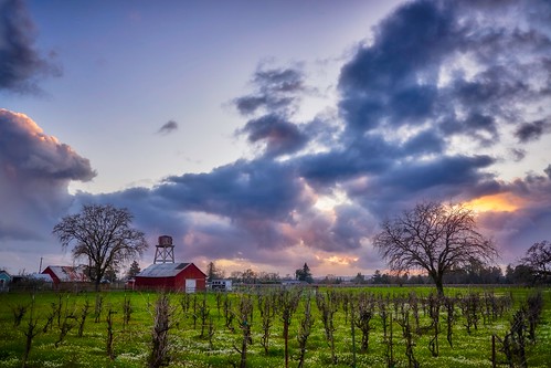
In Between Storms "In Between Storms" - Fujifilm XF10 - Photo by Derrick Story

Once I return home, I have a specific workflow that helps me maximize the content that I've captured in the field. I process the RAW files in Capture One Pro 12. This latest version does a great job with Fujifilm RAW files, pulling out all of the color and detail. Plus, while I'm there, I can fine tune the image a bit with the new Luminosity mask or a graduated screen.

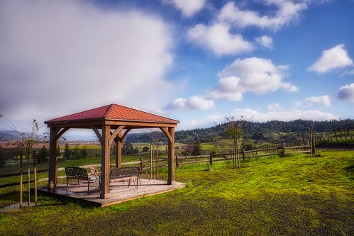
Gazebo on a Rainy Day "Gazebo on a Rainy Day" - Fujifilm XF10 - Photo by Derrick Story

There are lots of things that I could do at this point. And to be honest, this is where most photographers will diverge from my workflow. But I'm going to tell you anyway.

I then export a maximum resolution Tiff file, import it into Photos for macOS Mojave, and use the Luminar 3 Editing Extension to finish the shot.

One of the reasons why I move my best shots to Photos after processing in Capture One Pro 12 is because of iCloud. The image is automatically backed up and propagated to all of my devices. I can use it right away for Flickr, Instagram, Facebook, etc. Plus, I have the good feeling of knowing that my favorite work is archived without any further effort on my behalf.

The other reason is because the Luminar 3 editing extension is just so darn good. The finishing touches I apply with that app really make a difference, and the changes are automatically saved to the images in iCloud.

Side Note: Luminar 3 is on sale for 29 percent off through Feb. 18, 2019. That's only $49 for this impressive app.

I only use this Capture One Pro 12 > Photos > Luminar 3 workflow for my favorite shots. The rest of the images are backed up traditionally via hard drive in Capture One. But those favs... they are culled out and are now in my pocket, and available to share at anytime, anywhere.

Luminar Essential Training

You learn all the ins and outs of Luminar via my Essential Training on lynda.com and on LinkedIn Learning. It's fun, and I promise, you will improve your shots.

Learn Capture One Pro

You can get familiar with this imaging software by checking out Capture One Pro 11 Essential Training on LinkedIn Learning. You can also tune in on lynda.com if you prefer your training there. My updated Capture One Pro 12 Essential Training should be out next month. Stay tuned.

You can share your thoughts at the TDS Facebook page, where I'll post this story for discussion.
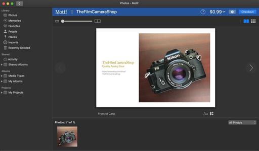
One of the big changes in Photos for macOS Mojave was Apple stepping out of the printing business. You can no longer build greeting cards and calendars directly in the Photos app with Apple design tools. Instead, you can tap 3rd party vendors such as Mimeo or Motif.

motif-in-photos.jpg The Motif interface for card design within the Photos app.

These tools are pretty good. I like the Motif interface in particular. It's clean and flexible, allowing me to customize just about any template to my own tastes.

Once I design the card, ordering it online is a straightforward affair. There is the initial signup process, but once that's accomplished, I can place my order from directly in the Photos app and receive my cards via postal mail a few days later.

For this workflow, most would say that the Apple change wasn't too disruptive. True, you don't get as many or as creative templates to work with via the 3rd party vendors, but other than that, the process isn't that much different.

Unless... you like to print these cards yourself as well using the inkjet printer that's sitting on your desk. After hours of experimenting and researching, I still have not found a way to design a card in Motif or Mimeo, then print a high quality version at home. That function is simply gone.

With the previous Apple tool, I could generate a PDF version of my design, then proof it on my inkjet printer or use is as a title for a slideshow. Having this capability was extremely handy. Outside vendors simply have no interest in providing this for us, because it doesn't generate sales. I get that. But my only proofing option now is to place an order and see what comes back in the mail. That's not really proofing, is it?

I have experimented with other home options, such as designing the card in Pages. But to be honest, it's not nearly as easy or convenient. Plus the pervious Photos method stored the designed card in my Projects area so I could go back to it at any time.

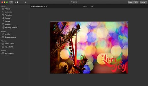
There is one faint silver lining to all of this for home printers. Apple does allow previous card projects to be exported as PDF documents. So you can still print at home the stuff that you created in the past.

export-to-pdf.jpg You can still output to PDF your previous card projects created in earlier versions of Photos.

The bottom line is this: If you like designing cards in Photos and don't mind ordering them from a vendor, I would take a look at Motif. It's quite nice. But if you're a home printer, and want a convenient way to create these yourself, I still haven't found the perfect solution.

But I promise... I'll keep looking.

Learn Photos for macOS Mojave Inside Out

Photos for macOS Mojave Essential Training is available on lynda.com and it's also ready to view for LinkedIn Learning subscribers. See for yourself how the Mojave/Photos workflow is both powerful and fun to use.

You can share your thoughts at the TDS Facebook page, where I'll post this story for discussion.
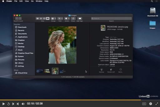
The big story, as I see it, with Photos for macOS Mojave, is Mojave itself. It's a very photographer-friendly operating system. And in my latest lynda title, Photos for macOS Mojave Essential Training, I show you how the Photos app and the OS work together to make your iPhone-mirrorless-DSLR experience efficient and enjoyable. Here's a "What's New" movie from the title that will get your feet wet.

The cool thing is, this software is already on your Mac. All you have to do is learn how to use it. And what better way to do that than with me showing you my favorite tips and tricks.

Here's an overview of the course: "With the Photos app for macOS Mojave, you can manage, enhance, and share photos in a variety of ways. In this course, photographer and educator Derrick Story takes you on a detailed exploration of this Apple photo management application. To start things off, Derrick discusses what's new in Photos for macOS Mojave. Next, he goes over ways to add photos to your library, and then sort, organize, and delete those images. Later, he walks through how to use the application's basic editing tools, as well as how to leverage third-party editing extensions while editing in Photos. Plus, learn how to work with video and Live Photos, share and export your work, and more."

Topics Include:

  • What Photos on the Mac can do that an iPhone can't
  • Importing images from your hard drive or camera
  • Sorting, organizing, and deleting photos
  • Creating Smart Albums
  • Using face recognition and the People album
  • Capturing and cropping screenshots
  • Recording videos with your Mac
  • Enhancing and adjusting photos
  • Working with live photos and videos
  • Working with metadata and location information
  • Sharing and exporting photos

Mojave-Whats-New.jpg

Photos for macOS Mojave Essential Training is available on lynda.com and it's also ready to view for LinkedIn Learning subscribers. See for yourself how the Mojave/Photos workflow is both powerful and fun to use.

You can share your thoughts at the TDS Facebook page, where I'll post this story for discussion.
Former Aperture users... don't delete the app quite yet. I have a helpful, practical purpose for keeping it on your hard drive: to add IPTC metadata (semi-automatically) to your pictures.

I'm using the Automator/Aperture tandem to include my copyright and author info with images that may fall outside my normal workflow, and don't have camera functions to include them. I've been adding data to iPhone images and those from the Fujifilm XF10. Here's how it works.

step-1-quick-action.jpg Start with an Automator Quick Action.

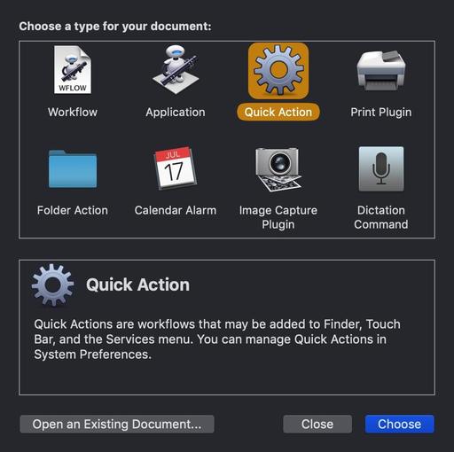
First you have to create an Automator Quick Action. I outlined the steps on how to do this in the article, Create Your Own Quick Action Shortcuts for Photo Tasks. This time, however, you're going to build a Quick Action using a series of short AppleScripts written for Aperture. Here's the recipe.

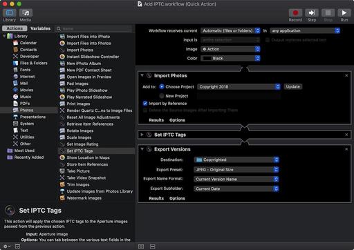
add-iptc-workflow-web.jpg

The actions are in this order: Import Photos, Set IPTC Tags, Export Versions. When I add the actual fields to the Automator Action, I keep it simple. Study the screenshots carefully to customize your own workflow. Here are the actual IPTC tags that I include.

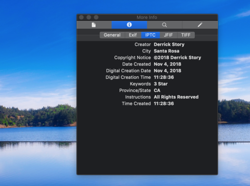
set-iptc-tags-web.jpg

Once you have everything completed, Save the Quick Action. Automator will place it in the proper Services folder so it's available when working at the Finder level in macOS Mojave. Now it's time to play.

Make sure Aperture is open and running in the background. I would also create a new folder on your Desktop to receive the copyrighted images.

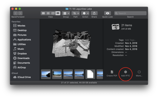
Copy a small batch of images to a folder on your Desktop. Open them in Mojave's Finder using Gallery View. You can peruse the current EXIF data for the shots. Now let's add the IPTC info. Select them all (CMD-A), then choose your new Quick Action from the gear menu. Automator will go to work.

add-info.png

In the background, Automator will run all the pictures through Aperture, add the data you want, then place them in the folder you selected on the Desktop. It will take a few seconds per image to process. One it's finished, all of your copyrighted images should be in their new folder. You can check one by opening it in Preview and reading the Info panel.

info-panel.png

I imported these IPTC pictures into Photos for macOS Mojave, worked with them, then exported them out of the app. All of my metadata stuck with the pictures.

There are lots of individual uses for this workflow. It just depends on the data you add to the Automator Action. Give it a try and see what you come up with.

The Apple Photos Book for Photographers, 2nd Edition

Updated for macOS High Sierra, the The Apple Photos Book for Photographers, 2nd Ed. provides you with the latest tips, techniques, and workflows for Apple's photo management and editing application. Get your copy today!

You can share your thoughts at the TDS Facebook page, where I'll post this story for discussion.
Many excellent headline features for photographers appeared in macOS Mojave, but a small one that's truly helpful is the debut of filenames with our thumbnails. They're helpful in many ways, including knowing which camera the image was captured with when shooting RAW.

display-filenames.jpg Both original filenames and edited titles are displayed here in Photos. Read on to learn how to control this.

Alternatively, you can have a title appear with your thumbnail instead of a filename. (This used to be your only choice.) Either approach is controlled by the "Add a Title" field in the Info box (Window > Info). Just make sure that you have titles turned on so that either of these bits of information shows up (View > Metadata > Titles).

If the Add a Title field is left blank, then Photos will display the filename when viewing thumbnails. On the other hand, if you do add a title, then that is displayed instead. You can see examples of both in the illustration above.

And for those situations where I want the filename to appear, but I do want some additional information in the metadata, I enter that in the Add a Description field, which has no effect on the metadata displayed with the thumbnail.

Like I said, this isn't a headline feature. But for those of us who use Photos regularly, we really appreciate (finally) having filenames appear with our images.

The Apple Photos Book for Photographers, 2nd Edition

Updated for macOS High Sierra, the The Apple Photos Book for Photographers, 2nd Ed. provides you with the latest tips, techniques, and workflows for Apple's photo management and editing application. Get your copy today!

You can share your thoughts at the TDS Facebook page, where I'll post this story for discussion.