Recently in Mobile

  Page 15 of 15 in Mobile  

The easiest way to move a picture that you've just edited in your Aperture library to your iOS device is to drag and drop. That's right. It's that simple. And it works for iPhoto too.

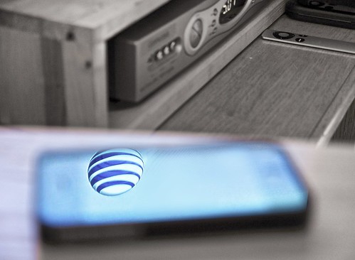
AT&T Reflected in iPhone
Edited in Aperture, but want to use on my iPad. No problem! And it literally takes seconds to move.

Here's how to do it:

  • Purchase PhotoSync ($1.99) in the iTunes App Store and load on all of your iOS devices.
    • Download the free Mac version of PhotoSync from the Mac App Store and put it on your Dock.
    • Launch PhotoSync on your iOS device.
    • On your Mac, drag the thumbnail of the image you want to transfer (in either iPhoto or Aperture) on to the PhotoSync icon in the Dock.
    • Within seconds, the image will appear on your Camera Roll on your iPad or iPhone.

    Setting the Size for the File That's Transferred

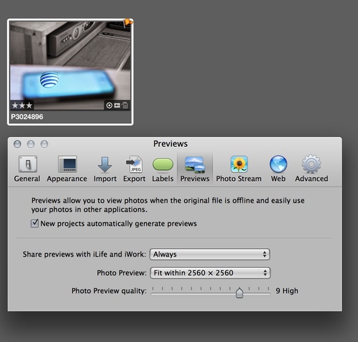
    In Aperture, the Preview size of the file is what is moved from your Mac to iOS device. You can control that size by, in Aperture, going to Preferences > Previews, and setting the parameters you want. Here's what I use.

    aperture_preview_setting.jpg The size of your Preview in Aperture is the size of the file that's transferred.

    Once you have the image, or images on your iOS device, you can easily show them off, post to Instagram, or even add to your Flickr account. Actually, I prefer uploading to Flickr from my iPhone than on my computer. It's more fun, and I have all of those filters to play with.

    Aperture Tips and Techniques

    To learn more about Aperture, check out my Aperture 3.3 Essential Training (2012) on lynda.com. Also, take a look at our Aperture 3 Learning Center. Tons of free content about how to get the most out of Aperture.


    iPad for Digital Photographers

    This is the kind of stuff I write about in iPad for Digital Photographers-- now available at a special pre-order price of $13.70.


    Comments Are Off!

    Due to a wave of recent spam attacks, I've had to turn off the comments feature on The Digital Story. You can, however, add your thoughts at the TDS Facebook page, where I'll post these stories for discussion.

    Rode iXY Mic for iPhone

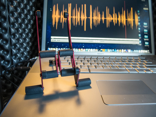
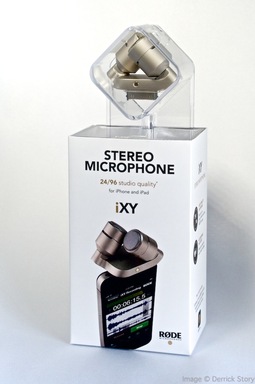
    You can record serious audio with your iPhone. With the new Rode iXY Stereo Recording Microphone for iPhone/iPad ($199) combined with the Rode Rec app in iTunes ($5.99), you can create audio for movie voiceovers, interviews, ambient environment, and more.

    Basic Features for the Mic

    The basic features for the mic include:

    • 30-pin Dock Connector - for iPhone 4/4S, iPad 1st/2nd/3rd gen
    • Two 1/2" cardioid condenser capsules
    • Onboard A/D conversion
    • Up to 24-bit/96kHz recording
    • Works with paid ($5.99) or free Rode app
    • Adjustable input levels
    • Foam windshield for outdoor recording and to control "pops" indoors
    • Reinforced protective zippered case

    Sample Recording

    Here's a sample recording with the RØDE iXY mounted to my iPhone 4S. The recording was captured with me holding the iPhone in my living room. I did not use the included windshield or a pop-screen on the mic. The file is unedited, but compressed to MP3.

    You can also download the audio test here (42 seconds).

    RØDE Rec App

    The $5.99 RØDE Rec app for the iPhone (there is a free version too) is a complete recording, editing, and sharing studio for your iOS device. Highlights include:
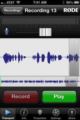
    Rode Rec app

    • High resolution 16-bit, 48kHz stereo/mono recording (up to 24-bit/96kHz when paired with the RØDE iXY microphone)
    • EQ and dynamics: Compression, high/low-pass filter, and frequency cut/boost
    • Live input monitoring
    • Preset recording profiles for a range of common situations (lecture, concert, interview and more)
    • Complete control of the iXY microphone, including high pass filter and LED behavior
    • Real-time waveform and one-touch markers
    • Landscape mode provides greater visibility when editing
    • Non linear cut/copy/paste/crop
    • Output in multiple formats including WAV, AIFF, AAC, Apple Lossless, FLAC and more

    Software and Hardware Working Together

    RØDE has put together a powerful tandem of hardware and software. In my sample recording with an iPhone 4S, I chose my living room at home and recorded without the foam windshield that comes with the mic.

    I could monitor my input with headphones while I spoke. I used the "Hiss Reducer" preset that's located in the Input menu for the app. Once I finish a capture, it's added to the Recordings menu where all of my "raw" files are listed. I say it that way, because I'm capturing at 44100 Hz (can go to up to 24-bit/96k Hz) and in mono (stereo is available too). But when I share the file, I have the option of sending it out as an AIFF, WAVE, CAF, AAC, Apple Lossless, FLAC, or Ogg Vorbis. The master audio remains in my Recordings menu until I remove it.
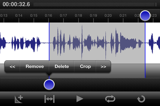
    Editing in the Rode Rec app Editing in the RØDE Rec app.

    I can edit what I've recorded on the iPhone or iPad before I share it. This is a terrific timesaver when working on the go. Rotate the phone sideways to reveal the editor. Tap and drag downward to select an area. Tap on the blue dot to reveal the contextual menu with options for your selection. It's easy and works great.

    Bottom Line

    The RØDE iXY Stereo Recording Microphone for iPhone/iPad is a quality stereo microphone that converts your iPhone into a high resolution audio recorder. As nice as the mic itself is, what pulls this package together is the RØDE Rec app that maximizes the hardware's capabilities.

    For best results, I recommend using the included foam windshield and mounting your iPhone on stand. The first version of the iXY Mic is available with a 30-pin Dock Connector. But it appears that Rode is working on a Lightning connector version too.

    I give the RØDE iXY Stereo Mic a very high Nimbleosity rating. It allows me to use my iPhone for recording on the go instead of having to carry a separate device. I'm sure you'll hear a podcast recorded with it before long.


    The Digital Story on Facebook -- discussion, outstanding images from the TDS community, and inside information. Join our celebration of great photography!
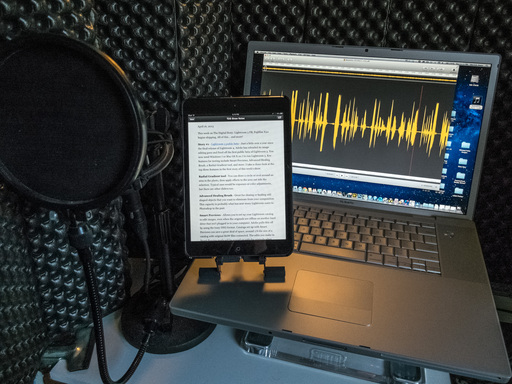

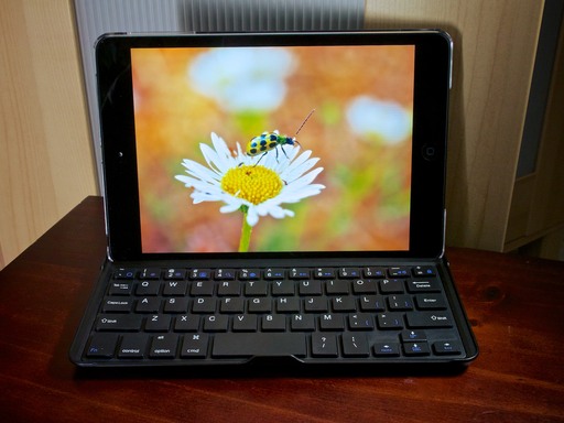
    One of the regular deals making the rounds via Groupon and other discount sites is the Vibe Aluminum Bluetooth Keyboard Case and Stand for the iPad mini. I decided to risk $22 to try it for my mini, and I'm pleasantly surprised by its performance.

    Vibe Bluetooth Keyboard

    The Vibe has a rechargeable battery that powers its built-in Bluetooth transmitter. When I first received the keyboard, I charged the battery using the power cord that came in the box. I then paired the keyboard with my mini.

    Typing is a little cramped, as you would expect for a small keyboard, but after a few minutes, I was doing just fine. The aluminum keyboard has a metal protrusion near the spacebar that serves as a latch if you use it as a cover for the iPad. The protrusion does interfere a bit with using the spacebar. I'm working around it now, but it did bother me in the beginning. I learned that if I use my left thumb for the spacebar, I rarely have a problem,

    I really like the blue function keys that control screen brightness, volume, search, home screen, and more. I find them easier to use than tapping on the glass when the iPad is positioned upward in the slot on the keyboard that serves as its stand.

    Because they communicate via Bluetooth, however, you don't have to use the Vibe as a stand. I sometimes use my leather case as a stand with the keyboard positioned in front of it. I find that more comfortable.

    You can use this device as a cover too. It locks into place over the iPad's screen. I don't use it that way because I don't want the keys in contact with the glass. So I continue to use my soft case for the iPad and just carry the keyboard separately. And because it's so thin and light, finding room for the keyboard in my shoulder bag hasn't been a problem.

    Overall, I've been quite happy with the Vibe as both a part-time stand and keyboard for the iPad mini. It works as advertised, seems to have quality construction, and looks good too.

    If you run across a Vibe online at a good price, you'll probably enjoy using it.


    The Digital Story on Facebook -- discussion, outstanding images from the TDS community, and inside information. Join our celebration of great photography!


    Flickr 2 Updated

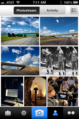
    The folks at Flickr are not resting on their recent laurels. They've released Flickr 2.1 for iOS, and it includes a handful of terrific new features, including:

    • Faster uploading
    • Easily save photos from your Photostream to your camera roll
    • Automatically saves your original, pre-filter photos to your camera roll
    • Quickly tag your contacts in photo comments and description by simply typing @screename
    • Get notified when your contacts mention you
    • Higher resolution photo display in lightbox view
    • Take photos in a snap using your iPhone's volume up button

    In my testing, images do process faster during uploading. And I love the fact that I can save shots from my Photo Stream to my Camera Roll, especially since I have more than 1,100 images posted on Flickr. I'm also happy to see the Volume Up "+" button making its way back as a shutter button in our photo apps.

    If you haven't tried the new Flickr for iOS app, I highly recommend it. You can download it in the iTunes App Store.


    twitter.jpg Follow me on Twitter


    Wood Camera for iPhone

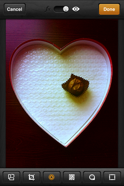
    Chocolate Heart

    If you're in the mood for a new photo app to play with on your iPhone, you may want to take a look at Wood Camera - Vintage Photo Editor. Currently on sale in the iTunes App Store for 99 cents, Wood Camera provides an array of imaging tools to capture, edit, and share your pictures.

    The app features 32 lenses, which you'll recognize as filters similar to those found on Instagram and Flickr. You can capture with a filter turned on, or apply the effects afterward while editing. A nice touch is the ability to control the intensity of the lens via a slider. There are lots of other tools too, such as brightness, contrast, sharpen, saturation, hue, cropping, frames, and effects. Plenty here to keep you busy while waiting in line for coffee at Starbucks.

    Once you have the image to your liking, you can save to your Camera Roll or post online to Instagram, Facebook, Flickr, and Twitter. I had good luck posting to Instagram, but wasn't as successful sharing to Facebook and Flickr. Maybe the network gods were against me at the moment.

    The quality of the output from Wood Camera seems somewhere in between Instagram and Flickr. OK on the iPhone, but not as good as Flickr when examined on a computer screen.

    All in all, though, Wood Camera is a blast to play with and a great deal at 99 cents. You might want to see what you can create with it.


    Join me on my Instagram site as I explore the world of mobile photography.

    You can create attractive portfolio pages and share them wirelessly with others around you -- all served securely from your digital camera. Sounds crazy, right? It isn't.

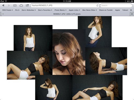
    Renee Light Table Portfolio page served from an Olympus OM-D to an iPad mini using the Toshiba FlashAir memory card.

    In short, what I do is create the portfolio pages using Light Table in Aperture 3.4, then write those files to a Toshiba FlashAir Wireless SD Card($55). After that, all I have to do is insert the card into my Olympus OM-D and turn on the camera.

    If I want to display this portfolio page on my iPad, or someone else's iPad, I have them log on to my FlashAir card and it will serve the page wirelessly to their device. If they want a copy of it, they can save the page to their Camera Roll.

    This is all made possible by the FlashAir card's ability to create its own secure web server. I talk about how this works on this week's podcast, Ingenious Toshiba FlashAir. Not only can this wireless-capable SD card share images from your camera to computers and mobile devices, it can actually serve web pages, PDFs, and other content.

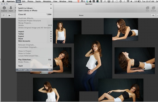
    I created the portfolio page in Aperture 3.4 using the Light Table tool. Once the page was designed, I saved the Light Table as a PDF, then converted it to a JPEG to reduce file size.

    Print Light Table I created the Light Table in Aperture 3.4, then saved it as a PDF using the Print command.

    Once I have the JPEG version of the portfolio page, I copy it to the FlashAir SD card via drag and drop on my Mac. I then eject the card from the computer, insert it into my OM-D, and turn on the camera.

    As soon as the camera is powered up, it turns on the web server in the Toshiba FlashAir card. Now, all I have to do is open Settings on the iPad, choose the FlashAir WiFi Network, and direct my web browser to http://flashair/

    I can share pictures on the camera, plus any additional files that I've added to the card. It's secured by WPA2 Personal security. So only those I give a password to can access the content on the FlashAir card.

    It's the perfect combination of geeky technical plus design using the elegant Light Table tool in Aperture. And best of all... it' easy!

    Aperture Tips and Techniques

    To learn more about Aperture, including how to build Light Tables, check out my Aperture 3.3 Essential Training (2012) on lynda.com. Also, take a look at our Aperture 3 Learning Center. Tons of free content about how to get the most out of Aperture.

    instagram_ipad.jpg

    Viewing the Instagram app on an iPad has been annoying at best. The notion of browsing photos in the iPhone-sized interface felt like a waste of real estate.

    Now a better experience is available for iPad photographers. They can point their web browsers to instagram.com, then log in with their credentials. After doing so, their Instagram photo feed now makes better use of the iPad's larger screen. I tested the site on both my iPad mini and the full size iPad Retina display. What an improvement.

    In addition to viewing the picture feed, you can comment and like the images too. If you want to view your profile, tap on your name in the upper right corner. Unfortunately, you can't add pictures via the web interface -- you still need the app for that. But it's certainly more fun looking at photography using the site.

    I added an "Instagram Web" button to my iPad Home Screen by tapping the Share button in Safari and choosing "Add to Home Screen."


    Join me on my Instagram site as I explore the world of mobile photography.

    Want to capture the moment with a friend or your sweetie? Lauch Pocketbooth on your iPad or iPhone and snap an old time photostrip that you can post, email, print, of have delivered.

    pocketbooth_ipad.png

    This 99 cent app is like having you own portable photo booth with you everywhere you go. Enjoying a great night out? Launch Pocketbooth and record the moment. You can use a number of effects including B&W, 1975, Antique, Color, and Sepia. Plus there are 9 more that you can purchase in-app.

    You can use the front camera if you're taking the portraits yourself, or the back-facing camera if someone else is operating the photo booth. Other options include number of photos in the strip and border style.

    Once you've captured the series, ala flashing light warning from the traditional photo booths, you can post the series on Facebook, Twitter, share via email, save to your camera roll, send to an AirPrint printer, or order a traditional photo output to be mailed to you. Current special price is $1.99 per strip.

    Might be fun if you go out for Valentine's Day...


    twitter.jpg Follow me on Twitter


    The Brydge Polycarbonate Keyboard is currently on holiday special for $130. That's $80 less than the anodized aluminum version that looks a lot like the keyboard for a MacBook Pro. I decided to save the money and go with the polycarbonate. And after hours of use, I don't think I'm any less happy with this model, than I would have been with the more expensive aluminum.

    Brydge Keyboard for iPad An iPad 3 with the Brydge polycarbonate keyboard. Photo by Derrick Story.

    First and foremost, the Brydge is an adjustable viewing stand for the iPad. This is accomplished using a pair of finely-crafted hinges made from anodized aluminum. They have just the right amount of resistance, allowing you to rotate the iPad nearly 180 degrees.

    For the first time, I consistently get a great viewing angle for browsing, watching video, and viewing photos. You could position this combo vertically, but it feels a lot like doing a laptop thing... which looks a bit weird. When used as designed, horizontally, I think the Brydge is a great iPad stand.

    The Brydge features a full Bluetooth keyboard that includes a row of iPad-specific function keys. You can use these keys to return home, adjust brightness, change volume, control playback, and more. The key action is good, but not as firm as a quality laptop. No big surprise there. The Bluetooth connectivity works well, and you can conserve battery power by disabling it via a switch on the right side. When the Bluetooth is on, the keyboard adds some helpful controls to the iPad.

    The only weird thing is that my brain goes into laptop mode and wants to use the nonexistent trackpad. Of course there isn't one. But there are plenty of function keys to augment operation.

    By the way, I highly recommend having a stylus to go with the Brydge. For me, it was a natural complement to the keyboard.

    And finally, the Brydge is an iPad cover. Its rubber pads on the inside handrest keep the screen a safe distance from the keys. You don't have to worry about scratching the iPad. It definitely adds thickness to the entire package, however, taking up more space than my 15" MacBook Pro Retina Display when closed. The polycarbonate Brydge plus iPad 3 weighs about 2.4 pounds. Keep in mind, though, that it does have to weigh enough to steady an upright iPad.

    Two of the Brydge models include Bluetooth speakers built in to the keyboard. Personally, I don't think they sound as good as the iPad speaker. They're optional for the aluminum model, and I would save the money and go without them. The speakers come standard with the polycarbonate Brydge. So mine has them regardless.

    Final Thoughts.

    In short, I like the Brydge. My favorite way to use it is as a multi-angle stand. The aluminum hinges are solid and securely hold the iPad in place. It's not bad as a keyboard, either. Typing is a little cramped, and it will take you a few minutes to get your touch-typing mojo flowing. I do like having the keyboard for email and notes, however.

    As a cover, it is thick. But if you keep the Smart cover with you, you have the option to use the Brydge when you need it, and travel light with just the Smart cover when you don't. When I'm photo editing, for example, I prefer to hold the iPad unencumbered in my hands. It's easy enough to remove the Brydge for these situations.

    If you're an iPad road warrior, you might want to consider this accessory. I think it extends the capability of my iPad 3. And it's downright fantastic for watching movies.


    twitter.jpg Follow me on Twitter


    5 Personal Myths About the iPad mini

    the_daily_on_mini.png

    I've had the iPad mini since day 1 of its release. And how I'm using it is much different than I would have anticipated. Here are 5 personal iPad mini myths that have been debunked over time.


    I loved reading The Daily on the iPad mini, and I'm going to dearly miss that publication.


    Myth 1 - I'll use the camera more: I thought because the iPad mini was smaller that I would be more prone to using its built-in camera. Nope. I still reach for my iPhone 4S for mobile photography. I can send the image to the iPad in a matter of seconds using PhotoSync. The iPhone is a better image capture device. The iPad is a superior viewing device.

    Myth 2 - I won't use it as a mobile portfolio because it doesn't have a Retina display: Wrong again. Even though I much prefer the Retina display on my iPad 3, my photos still look terrific on the mini. I use it all the time as a mobile portfolio. And it's much lighter to carry around and hand to a client.

    Myth 3 - I'll use the mini for image editing just like I do my iPad 3: Wrongo in the Congo. I'm much more comfortable using Snapseed, iPhoto for iOS, and Photogene on the full size iPad. I will use the mini in a pinch. But I much prefer the iPad 3 for image editing. In an odd sort of way, the iPad 3 had become more of a computer to me since having the mini.

    Myth 4 - I'll still use the iPad 3 for periodical and magazine reading: Sorry, but that hasn't panned out at all. I love reading the San Francisco Chronicle, USA Today and other periodicals on the mini. And I'm really going to miss The Daily (shown above), which I have been a subscriber to since its launch. The mini is far more comfortable to hold for reading than a full-sized iPad. And as a result, I'm reading more than ever on an iPad. I would go so far as to predict that the mini is really going to help us make the transition to digital periodicals.

    Myth 5 - The mini will never become my favorite iPad: Hmmm, the jury is still out on this one. No way I would ever want to give up the beautiful iPad 3. But around the house, 3 times out of 4, I'm picking up the mini. And that surprises me the most.


    twitter.jpg Follow me on Twitter