Recently in Mobile

  Page 2 of 15 in Mobile  

Apple ProRAW - The Best of Both Worlds

IMG_6918.jpeg

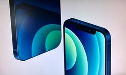
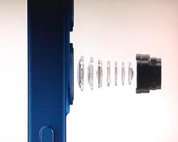
As interested as I am in iPhone 12, ProRAW is what really caught my eye during the last Apple Event. There's a key phrase in Apple's description that I think sums it up well:

"ProRAW gives you all the standard RAW information, along with the Apple image pipeline data. So you can get a head start on editing, with noise reduction and multiframe exposure adjustments already in place -- and have more time to tweak color and white balance."

"Get a head start on editing" is really the beauty of this for mobile photographers. Many of us shoot with both an interchangeable lens cameras and an iPhone. But the workflows are much different.

For my Olympus PEN-F for example, I shoot in RAW+Jpeg, use the Jpegs when I nail it, and go to the RAWs if the photo needs a bit more work. On my phone, I rarely shoot in RAW because I have to use a different camera app and the workflow isn't as smooth. Plus, editing RAW files on the phone isn't that fun.

IMG_6896.jpeg

With Apple ProRAW, I don't have to start from scratch with my mobile RAW files. I can enjoy the magic of computational photography, then tweak the results to my personal tastes without compromising the file. This is something that I would love to see expand beyond iPhone photography.

The catch is, you'll need a new iPhone to use it. I won't be able to tap ProRAW from my perfectly capable iPhone X (a device that I'm quite fond of). If I were to upgrade, being the photographer that I am, I would certainly opt for the iPhone 12 Pro Max with the 65mm telephoto and the Sensor-shift OIS for the 26mm camera. That bad boy will cost $1,399 with 512GB of memory. Whoa. I truly am buying a camera system, aren't I?

IMG_6901.jpeg

We're not exactly sure when ProRAW will be released. We do know that it won't be on the iPhone 12 as shipped. So there will be some waiting time. That's not really a huge problem since there are plenty of other features to explore and learn in the meantime.

So I think I'm going to wait and see how things shake out. I'm not shooting as much right now anyway because of the pandemic. I'm totally in love with my Fujifilm X100V when I do get out. And as I said earlier, I'm still quite enamored with my iPhone X.

But I am very enthusiastic about Apple ProRAW. And I know there will be a day when it will be my go-to format for mobile photography.

When I talk about camera manufacturers paying attention to what's happening in the smartphone space, this is the kind of stuff I'm referring to. Imagine having ProRAW on your favorite digital camera? That would be sweet. Stay tuned.

How to Watch Photos for macOS Catalina and iPadOS

Learn everything you need to know about Photos for the Mac and iPad by checking out my latest course on LinkedIn Learning and on lynda.com. This course is perfect for Mac and iPad based photographers who shoot with iPhone, Mirrorless, and DSLR cameras. It covers both photography and movies. And if I say so myself, it's a lot of fun.

You can share your thoughts at the TDS Facebook page, where I'll post this story for discussion.

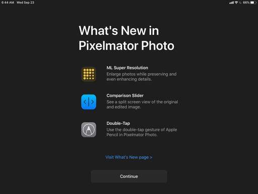
The most tantalizing feature in the new Pixelmator Photo 1.4 is ML Super Resolution, which uses machine learning to enlarge images with just one tap. The feature was designed for Apple's new powerful iPad Air, but I decided to test it on my iPad mini 5 to see if this was a viable tool for me as well. I'm happy to report that it is.

Pixelmator-Photo-ML.jpeg

If you're not familiar with Pixelmator Photo, you should check out my review from October 2019 titled, Pixelmator Photo - Incredible iPadOS App. This year's update includes double-tap gesture support with Apple Pencil, a comparison slider, and ML Super Resolution.

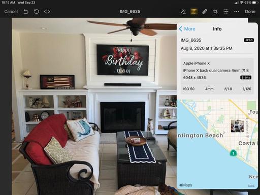
I opened an iPhone X Jpeg in Pixelmator Photo and checked its resolution, which was 4032 x 3024 pixels. I then enabled ML Super Resolution and checked again. Now the info box read 6048 x 4536 pixels.

IMG_0163.jpeg

I think the best way to appreciate the sample-up difference is in terms of print size. The original iPhone picture could be printed at 13"x10" at 300 dpi. The sampled-up version could be printed at 20"x15" at 300 dpi. That's a big difference. What it means for me is that I can now make a legit 13"x19" print from an iPhone picture... from my iPad mini.

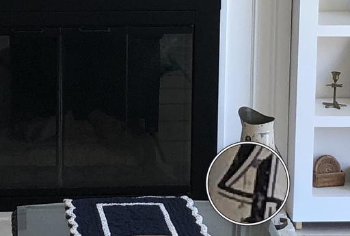
I magnified both versions of the shot and didn't discern any loss of detail or smearing. In fact, the Pixelmator image looked better, even after sampling up.

original.jpg Original iPhone Photo (above)

pixelmator.jpg Sampled Up Pixelmator Version (above)

All of this is terrific news for iPad photographers. Yes, you can sample up images on your computer. That's not the point. What's interesting here is that you can sit back with an iPad in hand and do serious image editing, and enjoy it more while doing so, and practically anywhere that you want.

IMG_0159.jpeg

Oh, and just one more thing: Pixelmator Photo is available now for $7.99.

You can share your thoughts at the TDS Facebook page, where I'll post this story for discussion.

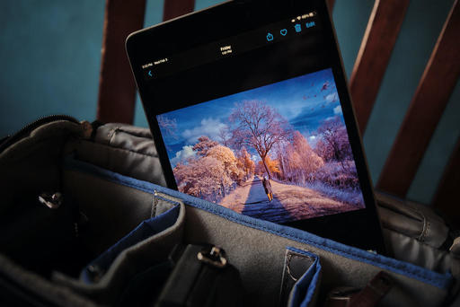
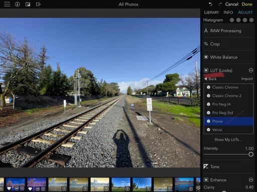
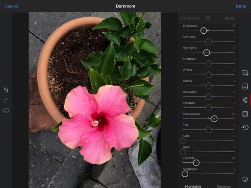
Even though Photos for iOS is my home base for managing and editing images on the iPad, I've been using Darkroom to augment it for additional image editing tools.

IMG_0150.jpeg The Adjustments panel in Darkroom.

Darkroom works well as both a standalone app, or as a plugin for Photos. It's equally adept at editing RAWs as it is Jpegs. My normal workflow is to open the image in Photos, and if I need to do something beyond its tools, I tap the "3 dots" in the upper right corner and access Darkroom. Any work that I do there is fed back to my Photos library.

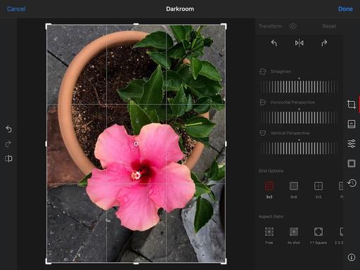
Aside from its excellent set of tone and color tools, Darkroom also features lots of extras, such as an extensive Filters library, outstanding cropping tool with perspective controls, and even a framing workshop where you can add borders to your images.

IMG_0153.jpeg The Cropping tool in Darkroom.

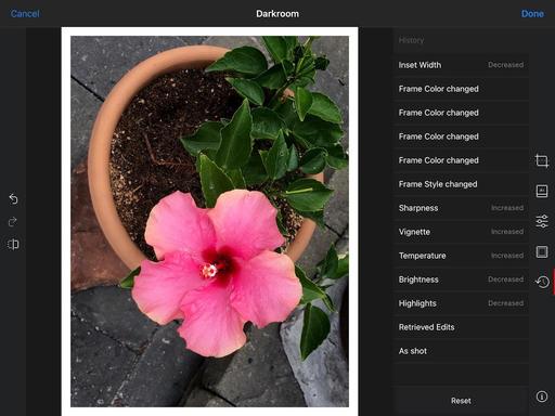
The app also encourages you to take more risks with your image editing because it supports a robust History interface that displays all of the adjustments you've made, and allows you to go back in time to any spot in the process. If you don't like the direction you're going, just return to the edit before it all went wrong.

IMG_0152.jpeg The History interface in Darkroom.

You can use the app for free, which has lots of power, or you can upgrade to Darkroom+ that gives you a ton more including Curves, Selective Color, Video Editing, Watermarking, Premium Filters, and on and on. The additional tools are available via subscription ($19.99 a year) or for one total price of $49.99.

If you enjoy image editing on the iPad, Darkroom can certainly enhance that experience. The free version is wildly powerful, and if you get hooked, Darkroom+ is a comprehensive package.

You can share your thoughts at the TDS Facebook page, where I'll post this story for discussion.

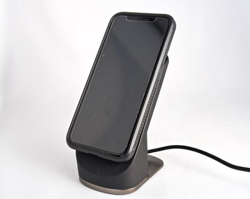
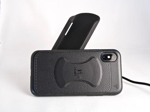
I wanted a place to dock my iPhone X while working in my home office. It's all part of my changing work life where I'm setting up new areas to get things done. I decided to try the PITAKA Wireless Charging Stand Dock because of its versatility. And after a few weeks of use, I feel like I made a good decision.

P4181227.jpg

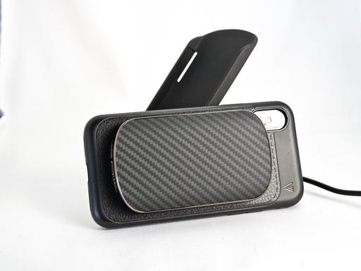
The stand itself is actually a holder for the wireless charger. It's a clever design where the charger slips into the stand, then via a magnetic strip that you attach to your case, the phone snaps in place. The clever part is, that you can take the charger with you when away from home and need some extra juice on the road.

P4181232.jpg Wireless charger removed from the stand, yet still attached to the phone.

You can use your existing case, as I did, using the adhesive magnetic strip that's included in the kit. Pitaka includes templates for current smartphones so you can place it in exactly the right spot. It's slim, good looking, and hasn't changed the comfort of my current case, nor has it impeded the use of other wireless chargers.

P4181231.jpg Included magnetic strip to attach your phone to the charger.

When it comes to actually charging my phone, it takes about as long as my Samsung wireless pad, which is longer than plugging the phone directly into the wall. But it hasn't been a problem, because I just click my iPhone on to the stand when I sit at the computer, and click it off when I leave. Over the course of the day, my iPhone X has remained nicely juiced up.

You can also buy custom cases from Pitka that have the magnetic strip embedded in them. They look quite nice, and the reviews have been solid. So if you're in the mood for a new case, they might be worth a look.

But the setup included in the box will get you started as is. I like having the stand to make it easier to check the phone when I'm working at the computer. Having the removable charging unit is a nice touch for those days in the future when I can travel again. And overall, the design is quite good.

It's easy to recommend the PITAKA Wireless Charging Stand Dock for $79. Who knows, someday I may even buy one of their cases as well.

There are product links in this article that contain affiliate tags. In some cases, depending on the product, The Digital Story may receive compensation if you purchase a product via one of those links. There is no additional cost to you.

You can share your thoughts at the TDS Facebook page, where I'll post this story for discussion.

Each camera manufacturer has their particular WiFi app, and some definitely work better than others. But if you really want tap the potential of camera to mobile communication, I would take a look at Cascable 4 as well.
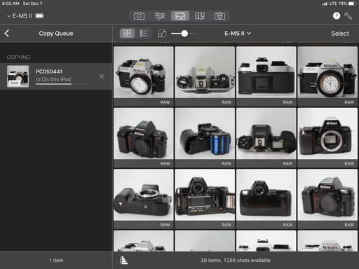
copy-to-ipad.jpg Copying images from an Olympus EM-5 Mark II to an iPad mini using Cascable 4.

With Cascable 4, I can use one app with many different cameras to transfer Jpegs and RAW files, use remote release, remote live view, remote settings adjustment, and more. Currently, it supports 181 cameras including models from Canon, Fujifilm, Nikon, Olympus, Panasonic, and Sony. I use it for my PEN-F, OM-D EM-5 Mark II, and EM-1 Mark II.
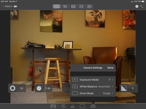
pen-f-live-view.jpg Live View photography with the Olympus PEN-F. I can adjust camera settings and choose focusing areas via my iPad mini.

I use Cascable 4 with both the iPhone X and the iPad mini5, but prefer it on the iPad where I can go right into image editing and sharing via the other tools I have on the tablet. Plus, having the bigger screen is more fun to work with.

Performance depends on the camera and its wireless capabilities. For example, with the Olympus PEN-F, RAW files transfer quickly and Live View is snappy. But with older cameras, such as the Nikon D610 with the WU-1b WiFi adapter, RAW files are out of the question because of the dodgy transfer speed.

This does bring up an interesting option, however. The only thing as bad as the WU-1 WiFi adapter is the Nikon WMU app that limits file download size to 1618 x 1080. That's barely good enough for Instagram. Cascable can improve that.
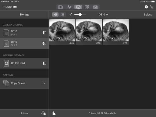
nikon-D610.jpg Using the second card slot on a Nikon D610 for lower resolution Jpegs that can be transferred wirelessly.

Since the app can read both card slots on many cameras that have them, you could designate Card Slot 2 for Jpegs only, shoot RAW+Jpeg (with RAWs going to Slot 1), then have Cascable read Card Slot 2 for the Jpegs. If I shoot Small/Basic on the Nikon for the Jpegs, then Cascable can actually transfer those (it can't handle the RAWs; the pipe just isn't big enough from the WU-1.) That gives me a much bigger file to work with: 3008 x 2008.

The process is still slow, and I'd be better off just taking the card out of the camera and using Apple's SD card reader. But if you need to go wireless, at least there's an option.

The Bottom Line

Cascable 4 is like having a Swiss Army Knife for wireless communication between camera and mobile device. It has a bounty of tools, great interface, and works with many cameras.
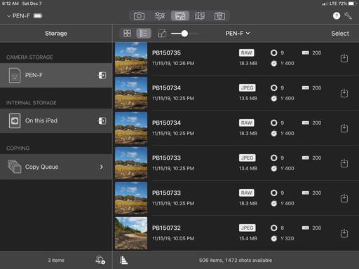
detailed-view.jpg Detail view of images on an Olympus PEN-F.

It's not perfect, of course. Even though it's compatible with many FujiFilm cameras, it doesn't connect with my XF-10, a camera that I love to walk around with. It can't talk to my Pentax KP either. So I can use for my Olympus and Nikon bodies, but not the others. You'll definitely want to check the compatibility list before purchasing. It also gets a little over zealous with the disconnect notices, forcing me to turn them off in Settings.

And even though the basic version is free for the downloading, which I highly recommend, if you want to unlock all of the features with the Pro bundle, it will cost you $29. That's a bit higher than we're used to paying for a mobile app.

That being said, I paid it. And I have no regrets doing so. There are so many cool features that at first go unnoticed, such as automated recipes, neutral density calculator, sharp stars calculator, and geotagging, that it becomes a trusty companion when integrating your camera and mobile device on the road. And compared to the alternatives supplied by the manufacturers, Cascable 4 is a breath of fresh air.

You can share your thoughts at the TDS Facebook page, where I'll post this story for discussion.

I've never been one of those grumpy guys who mumbled, "Cameras don't take pictures, people do." In part, because I like new photography gear and enjoy using it. Image making is both man and machine.

But that doesn't mean that I need to pack all of my stuff every time I travel, especially if I'm not on assignment. This week in Maui is a perfect example of how rewarding life as a nimble photographer can be.

Sea Turtle on Maui Sea turtle rising for a breath of air. Olympus TG-4 compact camera in UW mode. Photo by Derrick Story.

I almost bought the Olympus TG-6 for this trip. It's a great camera, but I have the TG-4 that's still performing well. So well, in fact, that I couldn't justify spending the $449 for the latest model. So I didn't. And so far, I have not regretted that move once. (Or should I say: non-move.) The TG-4 is performing wonderfully both topside and while snorkeling.

Butterfly Fish on Maui Olympus TG-4 while snorkeling is wonderful at capturing the sights beneath the surface. Photo by Derrick Story

As an aside, if you spend any time on adventures at all and want to be able to take pictures regardless of the conditions, the Olympus Tough ($449) is an amazing camera. I highly recommend it.

Lapping Waves at Sunset Waves rolling on shore at twilight. Olympus TG-4. Photo by Derrick Story.

Another essential item on the island has been my Apple Watch Series 2. Again, not the newest kid on the block by any measure. I must admit that the Apple Watch Series 5 is impressive. But the Series 2 is what's on my wrist right now.

There are a few things about the Apple Watch that I really like on these trips. Since I'm swimming a lot, I can leave the hotel with the watch only and leave my iPhone X back in the room. (I do carry the iPhone when I'm not in the water.) It's wonderful having the watch log my exercise, tell time, and play music through my AirPods (which I stash in a waterproof pouch while swimming). It basically keeps me on track when I'm out and about.

egret-maui.jpg Ergret on Maui. Olympus TG-4. Photo by Derrick Story.

My goal here isn't to sound off like a tightwad. But I think the pace of change with our technology has slowed enough to where we can still use gear that's a few years old, and with excellent results.

The TG-4 does capture in RAW and my photo processing software is better than ever (Photos for iPadOS, Luminar 3, Photos for macOS). Having solid post production applications allow me to get more out of my images. I use Luminar 3 as an editing extension for Photos for macOS when I'm on vacation. They're a wonderful tandem.

So yes, software has been one of the keys to all of this. The other of course, is being a good photographer at capture. By giving the hardware every opportunity to be successful when I'm taking the picture, I set up a good opportunity to finish off the image with the modern software that's available. The upshot is that I'm able to walk around with just a TG-4 and an Apple Watch for the better part of the day.

I'm having a a great time traveling as light as possible. Life as a Nimble Photographer has its rewards, for sure. And I'm still coming home with many, many wonderful images.

There are product links in this article that contain affiliate tags. In some cases, depending on the product, The Digital Story may receive compensation if you purchase a product via one of those links. There is no additional cost to you.

You can share your thoughts at the TDS Facebook page, where I'll post this story for discussion.

Texas Hold'em Is Back, and for Free

We can't edit pictures all the time. For those moments when you just want to lean back and enjoy your iPad, you can now fire up the classic Apple game, Hold'em - and you can do so for free.

texas-holdem.jpg

This was my favorite game back in the iPod days. Even on that tiny screen, it was fun as I pitted my poker skills against a cast of characters determined to bankrupt me. But then, it went away. Now, after an 8-year absence, it's back. It's part of Apple's celebrating 10 years of the App Store.

Part of the clever design is based on the orientation of your iPad or iPhone. Hold it horizontally, and you have an overview of the table. Turn it vertically, and you get a close-up of the player that you're dealing with at the moment. Nice.

You can download Hold'em for free. It might take a few minutes, however, because it's about 1.5 GBs in size. Those colorful characters and settings do require their megabytes.

As far as the play itself goes: Just as fun as I remember, and even more beautiful... especially on my iPad mini 5. Get yours today.

You can share your thoughts at the TDS Facebook page, where I'll post this story for discussion.

Finally! Dark Mode for Instagram

Bright is nice, but dark is better if you're a photographer. And now, Instagram will render in dark mode if you've enabled it on your iOS device.

dark-mode.jpg

You can toggle between dark and light on Instagram via your system setting in iOS 13. So you might want to add the Dark Mode shortcut to your Control Center. That way you can easily switch between the two.

To set this up, go to Settings > Control Center > Customize Controls and tap on the green + next to Dark Mode. That will move it to the active panel.

Now, all you have to do is swipe downward from the upper right corner of your screen to bring up Control Center, then tap on the Dark Mode icon.

If you like Instagram, you're probably really going to like it in Dark Mode. Set it up, and see what you think.

You can share your thoughts at the TDS Facebook page, where I'll post this story for discussion.

iPad photographers are enjoying the best days ever. First, the release of iPadOS with improved Photos and file management. Now, the bar has been raised again with Pixelmator Photo 1.1.

editing-mode.jpg Editing interface for Pixelmator Photo.

My recommendation is that you skip the trip to Starbucks this morning and spend your $4.99 on this app. It's full featured, powerful, fast, and it integrates seamlessly with Photos for iPadOS and iCloud Drive. Honestly, the workflow couldn't be easier.

Show Photos vs Show Files

If you're already using Photos for iPadOS, the Show Photos view is a natural way to begin. You control the view by tapping the "Show Files / Show Photos" link at the top of the interface.

photos-library-view.jpg Show Photos view that lets you access your entire Photos library.

Pick an image, work on it with Pixelmator's excellent tools, then click the Done button. Pixelmator will ask you if it can modify the image in your Photos library. Give it permission, and it's updated. The edits are fully non-destructable, so you can return to the original at any time.

After a number of tests, this system worked very well. The image showed up as advertised in Photos, and if I wanted, I could continue working on it there using its adjustments such as Brilliance and Definition. A long-press on the picture would show me the original - how it looked before both the Pixelmator and Photos edits. Very nice.

icloud-drive-view.jpg Accessing iCloud Drive in Show Files mode.

In Show Files mode, I can open any compatible image from my iCloud Drive, stored on the iPad itself (outside of the Photos library), or in Dropbox. This is more like the traditional: open a file > work on it > save it > and go back to browsing mode workflow. It's easy and straight forward.

Export Options

Regardless of where the image came from, you can export it using a variety of options. Just tap on the 3 dots (...) in the upper right corner of Pixelmator and choose Export from the popup menu.

export-mode.jpg Exporting options in Pixelmator.

Lots of great options here. It feels like a real export dialog. I know that sounds funny, but I'm not used to these sort of things on my iPad mini. And I'm loving it.

I decided to open an image from my iCloud Drive, edit it in Pixelmator, then export it to Photos. Worked great. Lots of options here. Have fun.

Batch Processing

This is an unexpected and welcomed perk. Batch processing is one of those things that we think we need a computer for, instead of being able to depend solely on a tablet. For many jobs, that's no longer the case.

batch-processing.jpg Some of the Batch Processing presets.

Get started by tapping on Select on browsing mode. Choose the pictures that you want to batch process, then tap on Batch. You have a number of presets to choose from including machine learning enhance, cropping, visual presets, rotating, straightening, and file format. The presets with three dots (...) allow you to customize them. Once the batch has been run, you can save the images or share them with all of the usual options.

Image Editing

The first thing that I liked about the image editing tools was that I could use my Apple Pencil for everything. Not only is this fun and precise, it feels much more professional than using the Healing Tool with my finger.

more-editing-tools.jpg Just a few of the editing tools in Pixelmator.

There are editing tools for just about everything you would want, including adjustments for tone, color, sharpening, vignette, healing, cropping, and machine learning auto correct. There are also a bounty of presets divided into categories such as Black & White, Cinematic, Classic Films, Modern Films, Landscape, Vintage, Urban, Night, and all the presets from Pixelmator Pro. And you can create custom presets as well.

The workflow is non-destructive. And if you start by working on an image from your Photos library, you can seamlessly bounce back and forth between the two environments, taking advantage of the best tools from each app. It really couldn't be easier.

The Bottom Line

If you're running iPadOS and love photography, run don't walk to the App Store and buy Pixelmator Photos for $4.99 before they come to their senses and charge what this app is really worth, which is at least double the asking price. Highly recommended.

You can share your thoughts at the TDS Facebook page, where I'll post this story for discussion.

First Look at Editing Photos in iPadOS

One of the reasons that I upgraded from the iPad mini 2 to the 2019 version was to be ready for iPadOS and the redesigned Photos app. And after my preliminary testing, I can tell you that I'm not disappointed.

IMG_0033.jpg Highlights adjustment in iPadOS

There's a lot to unpack in iPadOS, and even the Photos app is worth a few articles itself. But I thought that I should start with the new editing tools, since that's what many of us have been waiting for.

New Adjustment Sliders

The interface is redesigned. It's clean and easy to navigate. When you enter Edit mode, you have adjustment categories on the left side: Adjustments, Filters, and Cropping. When you click on a category, the tools appear on the right side. Click on Adjustments, for example, the the following tools are available:

  • Auto
  • Exposure
  • Brilliance
  • Highlights
  • Shadows
  • Contrast
  • Brightness
  • Black Point
  • Saturation
  • Vibrance
  • Warmth
  • Tint
  • Sharpness
  • Definition
  • Noise Reduction
  • Vignette

Next to each tool, there's an adjustable scale that allows you to apply the effect in the desired amount. With Auto, you can move the scale up and down to fine tune the appearance of the image. So it's no more "all or nothing" for Auto.

Having the additional adjustments are welcomed. I can perform many of the basic edits that I need in the Photos app, which wasn't the case before. And the quality of the adjustments are quite good.

A Few Missing Pieces

There are still a few missing pieces, however. I would love a Retouch brush for simple spot removal. I'm happy to have Vignette, but I wish I could control its shape as well as the amount applied. At the moment, it's just amount. And Apple has abandoned the B&W tools. I loved those.

There is some compensation for taking away the B&W panel by making the Filters amount adjustable. So I'm no longer stuck with just Mono, for example, I can apply the filter at different percentages. But it's still not the same as the excellent B&W panel that we once had. Gone are Intensity, Neutrals, Tone, and Grain. Maybe they will come back some day.

Beefed Up Cropping Tool

IMG_0034.jpg The Crop tool in iPadOS Photos.

The Crop tool now supports vertical and horizontal transform tools. We have flip and rotate. And the Auto correct is now an option and isn't automatically applied.

Filters Are Now Adjustable

Apple didn't add any additional filters. But as I mentioned earlier, all of the existing ones are now adjustable from 0 percent to 100 percent. This definitely makes them more useful.

Edits Saved to iCloud

Once I tapped the Done button in Photos, my edited image was uploaded to iCloud and shared across my devices, including the Mac that is running Mojave. On the iPhone running iOS 13.1, I could see the individual edits in the Photos app. On the Mac, the picture had been enhanced, but no sliders we modified. I'm guessing that that will change with Catalina.

Bottom Line

The new Photos app on iPadOS is a substantial improvement over its predecessor. I really like it now. And I hope Apple continues with its evolution.

I will cover more aspects of Photos and iPadOS in upcoming articles.

You can share your thoughts at the TDS Facebook page, where I'll post this story for discussion.