Recently in Photography

  Page 339 of 385 in Photography  

PPhoto_50_14_dg.jpg

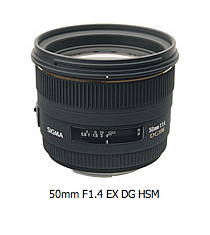
One of my biggest complaints about the Canon lens arsenal are their 50mm options. There is the sharp, but grindy 50mm f-1.8. This is the lens I use, but not the one I want. Canon's 50mm f-1.4 is only slightly better design wise, but soft at the edges when wide open. And the 50mm f-1.2 is huge and way to expensive for my budget. Therefore, I've begrudgingly stuck with the high-value but low sex appeal 50mm f-1.8 for all these years.

But Sigma may be coming to my rescue. They just announced their 50mm F1.4 EX DG HSM, and boy does it look sweet. It will be available in Sigma, Canon, Nikon, Pentax, and Sony mounts. Their specs are exactly what I'm looking for:

  • Standard lens with large maximum aperture of F1.4.
  • It creates sharp images with high contrast and ensures superior peripheral brightness.
  • Incorporates molded glass aspherical lens, perfectly correcting coma aberration and creating superior image quality.
  • Super multi-layer lens coating reduces flare and ghosting.
  • Hyper Sonic Motor (HSM) ensuring silent, high-speed AF with manual focus override.

Sigma had not announced price and availability yet. Oh please make it soon and affordable. I'll follow up as soon as I get my hands on one.

Technorati Tags: , , , ,

dpc_in_pocket.jpg

"The new trim size [of The Digital Photography Companion] will make it more appealing for bookstore shelving, but we wanted to make sure it stayed portable too," wrote Colleen Wheeler in her post, It's Still a Pocket Guide at Heart. (The Companion is someone you want with you, not home on the shelf when you need to figure out your exposure compensation setting.) So we went with a 5 1/2 by 8 1/2" size that will fit nicely in camera bags. Oh, and it still fits in some (larger) pockets. (Author carrying case not included.)

Photo by Colleen Wheeler (editor of Companion). Pocket by Derrick Story.

Event Calendar

Events! See the TDS Event Calendar for photography workshops, speaking engagements, and trade show appearances.


Technorati Tags: , , ,

spyder3.jpg

The good news about an updated monitor calibrator, such as the Spyder3Elite by ColorVision, is that it reminds us that we have to calibrate in the first place.

By way of anecdote, I'm setting up a just-arrived MacBook Pro 17", and wanted to make a quick print yesterday. After making sure I had the right drivers for Leopard, I then noticed that the image looked a little different on the screen than what came out of the printer. Oh rats! Calibration.

The Spyder3 has been on my radar, and fortunately, PhotographyBLOG has just reviewed the Spyder3Elite. Here's their introduction to the product:

"The Spyder3Elite is the top-of-the-range product in Datacolor's new line-up of display calibration devices. You need to calibrate your monitor to ensure that the colours you see on your screen are the colours seen on someone else's screen, or on the paper when you print. The Spyder3Elite uses a 7 colour detector engine and a larger light aperture to improve performance and colour accuracy over both the previous Spyder2 and competing brands. It also features an Ambient Light Control which will automatically measure the light in a room at regular intervals. Jon Canfield recalibrates his entire studio to find out if the Spyder3Elite delivers on its promises..."

The Spyder3Elite is available on Amazon for $236.

Now I've got to get back to my MacBook Pro and get that monitor looking right...

Technorati Tags: , , ,

marty_german_hidi_cr.jpg

"I read about the lunar eclipse just a few hours before it was to start, in an urgent email from a friend," said Marty German. "I had just enough time to Google the local start times for each of the main phases."

How Marty Took the Shots

"I setup my 1980s Leitz Tiltal tripod and mounted my Nikon D200 camera with its 1980's Nikon 80-200 f/2.8 ED AF lens manually focused to infinity, and set it to its maximum 200mm zoom. It was the longest lens that I own. I shot everything in raw so that I could 'tweak it' later. As it turned out, this made all of the difference! To minimize vibrations I used the self timer to trigger the actual shots."

"Because my first shot was of the full moon at 'first contact', it was basically a 'full sunlit' object. So the same exposure to photograph someone on the beach in full sun, is perfect for shooting the full moon."

"I guessed my starting exposure using the f:16 rule. This rule says to use f:16 at the shutter speed nearest to your ISO setting. In this case this was 1/500th of a second (because I was shooting at ISO 500) but after bracketing a few shots, f:11 turned out to be the best exposure. I think this was because the eclipse had already begun."

"As quickly as possible, I made a dozen shots before retreating into my warm house. It was 22 degrees here in CT. This is good for a 'dry' clear sky but challenging for the photographer to endure! When the wind blew, my tears froze to my eye lashes making it difficult to compose the moon in the viewfinder."

"An hour later, I went back outside and repeated the same basic procedures, but this time the luminance of the mostly eclipsed moon had decreased. The best test exposure histogram changed to f:9 at 1/500th of a second with everything else remaining the same."

"After another dozen 'duplicate' CYA shots, I went back in to thaw out, again. Unfortunately, gloves don't work the controls of a DSLR very well so I didn't have any on. Did I say it was really cold out?"

"Another hour later and the moon was dark except for the 'earth shine' created by our atmosphere catching and bending our star's light and acting as a giant filter!"

"The rust color is created by the dust particles and gases in our atmosphere. From the look of the moon, our atmosphere was pretty dirty that night! The same as it looks through the smoke of a campfire at night. Because our atmosphere is so thin, only a small ring of sunlight around the rim of the earth gets bent enough by the atmosphere to illuminate our moon when it is in this totality of our eclipse. For this final shot of the rusty moon, I opened up the lens to it's maximum f:2.8 aperture and the exposure was all the way down to 1/10th of a second."

"All night, I'd been watching high cirrus clouds moving in and in this final shot they softened the moon noticeably. The secret to getting a shot through 'steady' air is to make lots of repeat shots and hope you get a clear one. Patience and persistence is required! That's why I made a dozen duplicate exposures of the first two phases. But for this third shot, with the clouds getting heavier and the exposure much longer, I made two dozen exposures for this last shot of the moon."

"As it turned out, only one out of all of these final shots was good enough to use! This kind of photography often comes down to luck no matter how good your gear and preparedness is."

How Marty Processed the Images

"I used my Aperture 2 trial software to 'process' the three shots. Thanks to Derrick's, "Aperture 2: New Features" tutorial on lynda.com, it took only a couple of minutes for me to adjust each shot, fine tuning exposures, boosting contrast and reducing color noise. Now I have to come up with the money to buy Aperture, and it's all your fault, Derrick ;-) (BTW Great tutorial! Thanks again.)

"Normally I'd have used Capture NX to process my Nikon raw shots, but I found that the new Aperture interface was faster and easier to use, and IMHO, the raw converter in Aperture 2 is as good as NX's and both NX and Aperture produce noticeably better Nikon raw conversions than ACR does."

"Because my longest lens is only a 200 mm lens, the moon shots required a lot of cropping and the final moon image of each ended up being only 500 pixels square. This was also simple to set precisely so that they were all exactly the same size in Aperture 2."

"I took these three images and combined them in Photoshop CS3 to make up the final montage, and then up-sampled the final image to 300 dpi and 4" x 6" which is 1800 pixels by 1200 pixels."

"I made this montage for my 9 year old nephew, Clay. I hope you enjoy my pictures as much as I've enjoyed looking at all of your best shots on the Digital Story Public Pool on Flickr."

Photo of the Lunar Eclipse Phases by Marty German.


More Tips from The Digital Photography Companion

"How I Did It" is a new feature of The Digital Story featured on The Digital Photography Companion mini site. These are techniques from virtual camera club members who have built upon information in The Digital Photography Companion, or have come up with new tips altogether.

We're building a living library of knowledge for everyone to use (and contribute to). If you have a "How I Did It" tip to share, just send it to me with the sample photo, and put "How I Did It" in the email subject.

Technorati Tags: , , , , ,

As the author, I'm one of the first people on the planet to get my hands on the just-printed The Digital Photography Companion. This seems like a good opportunity to provide you with insights about the book that you won't find anywhere else.

Before I get to the anecdotes, let's start with the basic specs. The trim size is 5.5" wide by 8.5" tall. It's a nice size that fits in a lot of places. Companion is 228 pages, full color, and printed on 60# coated stock. Personally, I would have preferred a slightly denser 70# stock, and may get my way in future editions (depending on how the first run sells). The good news about the lighter paper stock is that it does keep the thickness of the book to about .5", which makes it easy to stash in the camera bag or jacket pocket. Overall, the book has a very nice look and feel, with good robust binding and clean printing. I'm always nervous about sending the work off the the printer. For the first printing of Companion, they did a great job.

dpc_pge100.jpg
A galley print from page 100 of The Digital Photography Companion. I had some excellent contributors to the book too. This candid was captured by Paige Green.

Who Is This Book For?

Companion is for the average amateur who is passionate about photography and wants to take better pictures. So if you're a seasoned pro, you're not going to get as much from this guide as someone who is more at the enthusiast level. That being said, I've been taking pictures since I was 11 years old, and there's plenty of good stuff in here that I continue to refer to. Companion is also designed to be the official manual for The Digital Story virtual camera club. (The TDS logo and URL is on the back cover.) And we have a dedicated Companion area on the site for us to add more techniques and reader contributions to keep this a living, breathing project.

The Cover

dpc_cover_sm.jpg

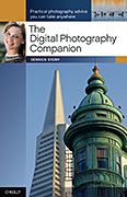
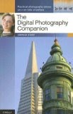
The cover turned out beautifully. The photo reproduction is spot-on, front and back. One interesting tidbit that I want to share has to do with the main cover image. The composition features the Sentinel Building -- now occupied by American Zoetrope. The photo was captured with a Canon G1, a somewhat elderly compact camera. This sets the tone for one of the major themes of the book: You don't have to have "professional" equipment to shoot professional looking images. Learning how to use the tools you have is what's important. When you get your hands on Companion, take a close look at this picture, and see what you think. The cover shot also sets the tone for another theme: get closer. Most shots that you'll see of this tandem (the Sentinel building and the Transamerica Pyramid) will be more loosely composed. I decided to shoot them tight.

Types of Cameras Used for Illustrations and Metadata

Speaking of different types of cameras, one of the new features in Companion is a metadata table in the Appendix (starting on page 196). It lists every shot in the book with its basic information such as camera model, exposure settings, focal length, ISO, location, and photographer. This is to help you understand how each photograph was recorded, and to some degree, drives home the point that camera type doesn't matter nearly as the other variables. A large percentage of images in the book were captured with compacts and entry-level DSLRs. (The best camera is the one you have with you!)

This doesn't mean that we compromised on the images. No way! One mistake that I made in earlier books was that I would use a shot that happened to be a great example of a particular technique, but the photo itself might not have been as appealing as it could have been. For this book, I wanted every shot to be compelling, and be a good example. This was a good call. Companion is my most attractive book to date.

This Book Has an Interface

There's definitely a "look" to many photography software applications these days. The charcoal or neutral gray background that is perfect for picture viewing. When you open up Adobe Bridge or Lightroom, or Apple's Aperture, or even the Events in iPhoto, you see what I mean. I like this look and wanted to bring it to Companion. Not only is it appealing to the eye, it feels in sync with what we're seeing on the computer these days.

As part of this, the tables had to be redesigned to fit in with the rest of the interface. This particular area was actually the brainchild of the book's editor, Colleen Wheeler. After many conversations between the two of us, she decided to bring our ideas to life so we could show the designer exactly what we had in mind. Colleen built samples and templates in Apple's Pages program. We played with the look, and ultimately submitted them to the designer, David Futato.

dpc_p187.jpg

It seemed to resonate with him. David refined the look that Colleen created in Pages, and I think it's quite attractive. Then, by adding lots of photo examples, tons of tables, extensive table of contents and index, plus a full blown Appendix, we have what Colleen calls, "the most reader friendly book I've ever worked on."

What's Different in Companion Compared to Pocket Guide

You may be familiar with Companion's little brother, Digital Photography Pocket Guide, 3rd Ed. I've had owners of the previous book ask me why they should be interested in Companion. There are a number of reasons.

First, Companion is completely up to date. So regardless if we're talking about camera specs or the latest version of Aperture (2.0), Companion is right there on top of it. Next, I have two completely new chapters that aren't in Pocket Guide, "I've Taken Great Pictures, Now What?" and "Printing Made Easy." Both of these chapters are designed to help you once you're uploaded your images to the computer. I think the printing chapter is particularly useful, because I've taken all of the voodoo out of getting great prints. Just follow these steps and your prints will look great.

Also, I've added more tables, better pictures, and put them all in a more attractive design. In a lot of ways, this is the book I wanted to do from the beginning. And thanks to solid Pocket Guide sales in the past, I was able to get the resources that weren't available before.

Final Thoughts

My goal for this project was to create a book that would appeal to the eyes, be informative without attitude, and help empower whoever embraced it to take pictures that were a cut above the general photography aptitude. And, I wanted to make people smile. No so much a ha-ha smile that follows a good anecdote, but more the smile that results from feeling confident. And in the end, you will be the judge as to whether I accomplished that or not.

The Digital Photography Companion is available now on Amazon.com, and for less than $20. The revenue it generates helps support our virtual camera club, The Digital Story, which will always be free and open to any photographer who wants to participate.

Technorati Tags: , , ,

applescript_banner.jpg

Have you seen this? Sal Sogholan just published an amazing Aperture-InDesign Integration Demo on Apple.com that enables you to use Aperture as the database for an InDesign-based publishing system, complete with maintaining direct links to the related master images in the Aperture library. "Placed previews can be updated as needed and even replaced with high-resolution exports in preparation for offset or direct-to-plate printing."

And the best part is, you can try it for yourself by downloading the Aperture-InDesign demo installer. Sal had warned me that there were some powerful scripting hooks baked into the latest version of Aperture. This manifestation is one of the first of many cool automation tools to pop out of that oven. Take a look for yourself.

Technorati Tags: , , , , ,

flickr_edit.jpg

In this week's podcast on mobile photography, I talk about how easy it is to upload your photos directly from the mobile device to an online service such as Flickr. I often post mine using the email application on the iPhone. (And remember, we have a Digital Story Public Group on Flickr.)

The problem is, the iPhone doesn't have an image editing application. So what do you do if you want to make a few adjustments to your picture after it's posted online? A while back, Flickr struck up a deal with Picnik to enable roundtrip image editing from your Flickr library. You have all the common tools available, and when you're done, Picnik updates your Flickr library with the adjusted photo. It couldn't be easier.

picnik_edit.jpg

I do this post editing with a computer when I have the opportunity later (either on a laptop or in an Internet cafe). Why not use the iPhone for online editing too? Well, not until they are Flash-enabled. Picnik needs Flash for online editing. Sigh, maybe someday...

Technorati Tags: , , , ,

canon_iris_mode_dial.jpg

According to a recent story in Photography Bay, Canon has applied for a patent to use Iris watermarking to help photographers protect their images. In short, you have the camera read your iris, then it embeds your unique biological data into every shot. You can have additional metadata added if you wish. (Notice the callout 106d that indicates Registration mode.)

This is really interesting stuff. If you want to read more about how Canon envisions this, take a look at the Photography Bay article. It may be available on your next camera...

Technorati Tags: , , , ,

mike_doel_hidi.jpg

"I had been trying to consider how to tackle the theme of "Empty" for a recent TDS photo assignment, when a significant snowstorm provided the inspiration," said Mike Doel. "In addition to knowing that the golf course would be empty, I figured that it would also be a good example of one of the tips I've learned from The Digital Story - try to find photos that catch views that are unique or unexpected."

How Mike Did It

"When I arrived at the course, the first thing I did was to get permission to take photos. Having received that (as well as a "you've got to be nuts" look) from the staff member in the pro shop - surprisingly still open for business - I headed out with my Canon 5D, my Canon EF 24-105 f/4.0 L IS USM lens, and my tripod. The first tee box was cluttered with fallen branches and other debris, so I hiked down the ninth fairway to get a better shot."

"The shot was composed with five main elements - the red sign that tells the viewer we're at a golf course, the "empty" bench which reinforces the theme of the assignment, the two trees on either side, and the background with the lake and foot bridge. The shot is perhaps a bit too symmetrical (it would have been better if I gotten the bench a bit more to the side), but I was having a tough time doing that without obscuring the bridge. I especially liked how the red of the sign stood out against the white background, and it was the sign that I focused on."

"From another one of Derrick's tips, I knew that snowy scenes like this can fool your camera's light meter, which expects to find scenes with lots of midtones. Since snow is white and not 18% gray, I knew I had to over-expose the image to get the right color. I figured about 1 and 1/3 stops of over-exposure would do the trick, but I ended up using Aperture's exposure slider to actually boost it a bit more in post-production. The shot was taken in manual exposure mode at an aperture of f/16, shutter speed of 1/60th of a second, and an ISO of 100. The 1/60th of a second shutter speed is just long enough to provide a bit of motion to the falling snow."

"When shooting in really cold temperatures like this, you have to be careful about bringing your camera back into warmer temperatures - especially if it's into a room with any significant humidity in the air. The water in the air could condense onto your cold camera equipment (similar to what happens when people with eyeglasses come inside from the cold) and cause all kinds of havoc. A good tip is to put your camera into a gallon ziplock bag before coming inside. Once the camera has warmed up to room temperature, it is safe to take it out of the bag."

Photo of 9th Tee by Mike Doel.


More Tips from The Digital Photography Companion

"How I Did It" is a new feature of The Digital Story featured on The Digital Photography Companion mini site. These are techniques from virtual camera club members who have built upon information in The Digital Photography Companion, or have come up with new tips altogether.

We're building a living library of knowledge for everyone to use (and contribute to). If you have a "How I Did It" tip to share, just send it to me with the sample photo, and put "How I Did It" in the email subject.

Technorati Tags: , , , , ,

tethering_web.jpg

Tethering a camera to your computer allows you to capture images directly into it. This is particularly handy for product shots and in-studio portraits when you want to see a full resolution version of the photo right away. With a tethered camera, you click the shutter and the image appears on your monitor. Just like that.

Many DSLRs will have tethering software bundled in their kit. Both Canon and Nikon provide this feature on most of their advanced cameras. Check their software disks for more information.

Aperture 2 also provides tethered shooting. You can refer to this chart to see if your Canon or Nikon camera is supported. In general, tethered Nikon DSLRs work with both Tiger and Leopard, and Canon shooters must be running the Leopard for this feature.

If you have a camera and software that supports this technique, I suggest you give it a try. It's a great feeling to click the shutter, and then see the image appear instantly on your computer monitor.

Technorati Tags: , , , , , ,