Recently in Photography

  Page 369 of 385 in Photography  

Canon SD 700 IS

I'm researching an article on image stabilizers for compact cameras. I'm going to start out by testing the Canon PowerShot SD700 IS, which I should have in my hands within a week or so. But I would like to test other image stabilizer compacts too, and am interested in your comments about them.

If you have experience with any current image stabilizer compacts, or have one you recommend that I test, please post a comment. Also, I'm fascinated by the technology behind these cameras. So if you have any inside info on image stabilization, point me in the right direction.

I'll be sure to report back on what I find...

Tips for Great Group Shots

Group Shot

The two key components to great group shots are composition and lighting. Start with lighting. You could position everyone in the bright sun, snap a frame or two, and move on. But I doubt that your subjects will be thrilled with the results. Harsh direct illumination creates unflattering shadows and high contrast.

Diffused, even illumination will help everyone in the shot look their best. I often schedule group shots for early or late in the day to take best advantage of sweet light. Slightly overcast days are a blessing because nature creates a giant softbox in the sky for you. If conditions are less than ideal, use open shade from a tree or patio, then turn on your flash letting it serve as a fill light. Keep in mind, however, that you have to stay within the range of your flash, which is usually about 8 feet.

When composing the shot, position your subjects as close together as possible. People tend to stand too far apart, and this space between them is accentuated by the camera. I'll often position some of the subjects at a 45 degree angle to the camera. This creates variety in the composition and enables them to stand closer to others in the group. Before you snap the shutter, check everyone's hair and clothing to make sure nothing is out of place, then ask, "Can you see the camera? If you can't see the camera, it can't see you." Reposition as necessary.

Once you have a group shot you like, ask folks if they have a few more minutes for something fun. You can let them strike poses, lean against one another, try interesting angles such as you shooting up at them, or anything else that comes to mind. Often this will be the shot that they like the best, and it ends the session on an upbeat note.

Canon PowerShot SD630

The Canon PowerShot SD630 has all the bells and whistles that you'd expect from a quality 6-megapixel compact, and more... more ISO speed. Most compacts have a hard time controlling image noise above ISO 200. This is one of the compelling reasons to use a DSLR -- you can shoot at ISO 800 and 1600 and get quality images.

I just read a very good review on Imaging Resource that waxes positively about the SD630's image quality at high ISOs. Here's what Stephanie Boozer and Dan Havlik had to say:

"To me, digital noise has always resembled that obnoxious snowy fuzz you get on your TV when it's stuck between channels. The triumph of Canon's recent digital SLRs is that they've been able to shoot at high ISOs with low incidence of noise. With these new ELPHs it appears Canon has been able to bring its low-noise/high ISO expertise to a non-professional audience which is very good news for consumers. Most people have gotten so used to shooting with a flash in low light that they're amazed when they see the results without one. Instead of blown-out faces and blacked out backgrounds you have nice natural skin tones and detail of the room behind your subject. While there's still a greater chance of blur when you shoot without a flash -- even at the SD630's speedy ISO 800 setting -- if your subject's relatively still, results with the Canon SD630 look sharp."

There's lots of other good info in their review, and I think it's worth a read if you're shopping for a quality compact in the $300 range that can shoot in existing light with good results. You can also check out Canon's product page.

Technorati Tags: , ,

Use iPhoto 6 to Create Custom Postcards

custom_postcard

With iPhoto 6 and a compact photo printer, you can create stunning postcards right at your desk. In previous posts, I've talked about using the greeting card function in iPhoto to create title graphics for slideshows, and then how to animate them. Now you have another use -- print your own postcards.

I use a older Canon CP-330 compact printer, but any of the models will work for this project including the new SELPHY CP720. These are affordable little units that output 4"x6" dye sub prints with UV coating that last for 100 years. Each print is made of durable card stock with postcard markings on the back. I would guess that similar printers are made by other companies too, such as Epson and HP.

To make you custom postcard, just follow these instructions, except when it's time to print, choose the "from 1 to 1" option in the print dialog box and output to your compact printer. Make sure you have the card stock oriented the right way so you're not printing upside down on the card stock. The postcards look simply amazing, better than what's on the rack at the local souvenir shop. And they don't cost more either. Each card you output sets you back about 28 cents. Give it a try!

My postcard illustrated here will be used to promote The Digital Story site. You can create cards to promote your online galleries and send them to interested parties. Something to consider...

See It in Person

If you're in Northern California on the weekend of October 7, stop by the Macintosh Computer Expo and sit in on my iPhoto 6 Tips and Tricks session. It's free, and I'll show you this tip plus lots of other cool iPhoto goodies. For those who really want to dig into some shooting techniques, stick around another day and sign up for my Digital Photography Made Amazing half day workshop on Oct. 8. But sign up early because seating is limited.

Technorati Tags: , , ,

iLifeZone

Ben Long has just published not one, but two books on Aperture. And does he know this application. We invited Ben to join us on the latest iLifeZone to talk about Aperture with Scott Bourne -- both pros and cons. It's a great conversation with a terrific guy. You might want to check it out.

I also chime in with some solid iPhoto tips. And Chris Breen poses the question: "What's the best way to convert color digital images to black and white?" We try to answer his query.

You can subscribe to the iLifeZone via iTunes Music Store.

Technorati Tags:

MacBook Pro 17

Over the last couple months, I've talked to quite a few photographers who are running Aperture on the new Intel-based MacBook Pros. This includes me. (Yes, I talk to myself too.) I use Aperture on a 17" MacBook Pro and have been satisfied with its performance.

But at times I would hear comments from some of the others that Aperture wasn't running well on their Intel-based laptops, and that they were seeing the spinning beach ball more often than they cared to. Finally, I sat down with one of these fellow shooters, and we both opened our laptops and launched Aperture. Sure enough, mine performed better -- not only on launch, but during sorting and editing too. My friend was using a similarly configured 15" MBP, and I the 17".

I then began to retrace my earlier conversations. Sure enough, those who were not as happy with Aperture performance on MBP were using the 15" models, and those happier had 17" laptops.

When I ran System Profiler on the test laptops, the specs were very similar, including RAM (2 GBs). One difference on my 17" is the 7200 RPM hard drive compared to the 5400 RPM drive in the 15". But the 17" still performed well when I accessed libraries on external 5400 RPM drives.

This is purely anecdotal, but it seems to me that if you're going to run Aperture on a laptop, give a good look at the 17" model. You may be a bit happier with the performance. We'll see if the next rev of MBPs closes this alleged gap any. My guess is that we'll see upgraded machines by the end of the year.

Technorati Tags: ,

Red Photo Assignment

If you haven't submitted your photo assignment for August yet, today is the deadline. The theme for this month is "red."

Our monthly Photo Assignment on The Digital Story is designed to make us all working photographers. It helps us apply the techniques we learn and produce a body of work to show to the public. We have a great line up in the works for the August gallery. I'll showcase the entries on Monday, Sept. 4. For more information about how to submit your photo assignment, go to the Submissions page and follow the instructions for Photo Assignment.

Featured photo: This "red" entry is from Jennifer Tofani. "I was bleary eyed with bloodshot eyes," she said about her return trip home. "As I leaned on the window watchng the sky go by, I saw red! Although the red was but a dot on the tip of a wing, it really stood out against the pale blue sky and white clouds."

Technorati Tags: , ,

How to Animate Your iPhoto Titles

Motion Title

You can put your great looking slideshow titles in motion without ever leaving iPhoto. In a previous post, I explained how to use the Greeting Card function in iPhoto 6 to generate compelling title slides. You can take these images to the next level by animating them.

Start by making a copy of your title slide and placing the two identical images side by side at the beginning of your iPhoto slideshow. Then apply the Ken Burns effect to the first slide. For the "Start" point, zoom in a little (using the Zoom slider setting located at the lower right of the frame). The set the "End" point of the effect to show the slide at 100 percent (no magnification).

Open the "Adjust" panel and set the slide appearance length to 6 seconds or so with no transition. Now go to the second slide and set its length to 2 seconds with a Dissolve transition. You won't use the Ken Burns effect for this image. Now click once on your first slide and hit the Preview button to see the effect.

I've posted an example so you can see the effect in action. You can play with the settings to create exactly the look you want. It's a professional way to start your slideshow that's so easy to create in iPhoto.

See It in Person

If you're in Northern California on the weekend of October 7, stop by the Macintosh Computer Expo and sit in on my iPhoto 6 Tips and Tricks session. It's free, and I'll show you this tip plus lots of other cool iPhoto goodies. For those who really want to dig into some shooting techniques, stick around another day and sign up for my Digital Photography Made Amazing half day workshop on Oct. 8. But sign up early because seating is limited.

Technorati Tags: , , ,

iPhoto Ppostcard

Here's a great graphics trick that many people don't know. You can easily build fantastic slideshow titles right within iPhoto 6. Start by clicking once on an image in your iPhoto library that would be a good opening title. Now click on the "Create a new card" icon at the bottom of the iPhoto window. (It's the greeting card picture with a plus sign.) iPhoto will open a new window and ask you to choose a theme.

Go to the popup menu in the upper left corner of the dialog box and select "Postcard." Then browse the different themes until you find one you like. Select it by clicking on it once, then click on the Choose Theme button. This prompts iPhoto to open a new window with the preliminary design of your card.

To add text to the front of your postcard, which will soon become your opening title, click on the Design icon to reveal a popup menu, and select option #2. You can add type to your card by clicking on "Insert Title" and typing.

You have lots of design control. You can change backgrounds by clicking on the Background button, switch themes by clicking on the Themes button, and even change fonts and size by clicking on the Settings button. Once you have the postcard designed to your liking, go to the File menu and choose Print. iPhoto will assemble your card for you then present you with another dialog box.

If you're greeted with the standard view of the dialog box (that doesn't give you any options), click on the Advanced button. Now set up "From 1 to 1" for your Pages selection. You don't need the back of the postcard for this assignment. Go to the PDF dropdown menu and select "Save PDF to iPhoto."

Your Mac will run a little workflow that soon asks you which iPhoto Library to save the image in. Select your slideshow album from the "Choose Album" popup menu and hit "Continue." iPhoto will place a 1200 x 800 Jpeg of your postcard in your album. Rename the image "Opening Title" and drag it to the first position in the album. You can create as many of these graphics as you need throughout the show. You now have a stupendous opening graphic for your slideshow.

See It in Person

If you're in Northern California on the weekend of October 7, stop by the Macintosh Computer Expo and sit in on my iPhoto 6 Tips and Tricks session. It's free, and I'll show you this tip plus lots of other cool iPhoto goodies. For those who really want to dig into some shooting techniques, stick around another day and sign up for my Digital Photography Made Amazing half day workshop on Oct. 8. But sign up early because seating is limited.

Technorati Tags: , ,

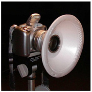
ExpoDisc

Capturing accurate color under different types of lighting isn't always easy. Fortunately, most of the time the auto white balance setting does a good job. And if you shoot Raw, you always have the option to fiddle with your white balance settings in post production.

But imagine setting all of those concerns aside and just get the color right when you take the picture. I've been using the ExpoDisc recently, and my colors have never looked better.

The ExpoDisc works hand in hand with your Custom White Balance setting. By following just a a few easy steps, you essentially create a new white balance preset tailored specifically for the light source that's illuminating your subject. I can set up a custom white balance setting in less than a minute on my Canon DSLRs.

In my next podcast I cover the custom white balance setting and explain how to use it with a variety of accessories including a sheet of white paper, a coffee filter, and the ExpoDisc. You can find my podcasts on iTunes Music Store. The custom white balance episode will be available this coming Tuesday.

The ExpoDisc is available for $80 - $115 depending on what diameter you buy.

Technorati Tags: , ,