Recently in Photography

  Page 78 of 385 in Photography  

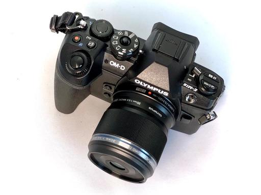
Over the past month I've been testing the Olympus Digital ED 17mm f/1.2 PRO, Digital ED 25mm f/1.2 PRO, and the Digital ED 45mm f/1.2 PRO lenses. Knowing that ultimately I could only afford one, I had to decide which of the trio I was going to invest in.

P1052727.jpg The Trio of Olympus PRO Lenses. Photos by Derrick Story.

The final decision did not come down to performance or quality. All three optics delivered beautiful images. And when I zoomed-in on the RAW files in Capture One Pro, I could not believe how well they held together. Truly impressive.

What it came down to was this: Which optic was more practical for my photography? And after a month of very enjoyable work, the clear winner for me was the Olympus Digital ED 45mm f/1.2 PRO lens.

Leah with 45mm f/1.2 PRO Leah in the Studio - Olympus 45mm at f/1.2, E-M1 Mark II, ISO 200, processing in Capture One Pro 11. Photo by Derrick Story.

In the end, the 45mm f/1.2 is the pro portrait lens that I've always wanted for my micro four thirds system. It's the right focal length, it doesn't take up too much room in the camera bag, and the images are absolutely beautiful.

Yes, I would love to keep all three optics in the PRO line up. But right now, I can only afford one, and that one will the 45.

You can share your thoughts at the TDS Facebook page, where I'll post this story for discussion.
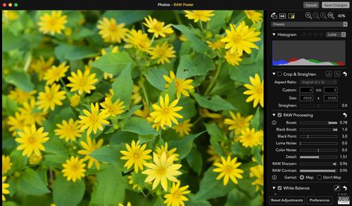
Photolemur 2.2 Spectre is a next-generation picture enhancement application for both Mac and Windows. It uses image recognition technology that understands different components of a photo, then applies up to 12 different algorithms in an attempt to improve it. And in many instances, it does this quite well. Photolemur is available as a standalone app, as a plugin for Lightroom, and my favorite method, as an editing extension for Photos for macOS.

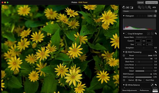
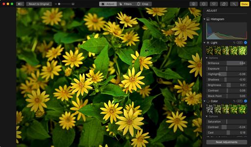
before-and-after.jpg Photolemur editing extension running with Photos for macOS High Sierra.

Regardless of how your access the software, it couldn't be easier to use. Simply open a RAW file or Jpeg in Photolemur, then let it work its magic. After 15 seconds or so, you're presented with an edited image. During that time, the software analyzed your shot and applied some or all of the following corrections.

  • Color recovery - Automatically restores the natural beauty of the blues, yellows, and reds.
  • Sky enhancement - Recognizes clouds of all kinds - cirrus, cumulus, stratus and nimbus - and makes them look as lifelike as possible.
  • Exposure compensation - Senses the inaccurate exposure settings and enhances them by lightening or darkening.
  • Natural light correction - Knows what time of the day is and how to adjust the tones, exposure, and contrast of mornings, evenings, dusk, and dawn.
  • Foliage enhancement - Neutralizes the lost of colors of nature shots emphasizing the trees, leaves, plants and makes them as true-life beautiful as possible.
  • Noise reduction - Identifies and reduces digital noise.
  • Smart dehaze - Detects and fixes distracting elements such as haze, fog, mist, dust, and smog.
  • Tint perfection - Finds a pleasing balance between colors depending on image itself and its composition.
  • Raw processing.
  • JPG fix - Detects imperfections in JPEG files and brings them back to a clear, clean, and crisp state.

original-landscape.jpg Original, unedited landscape in Photos for macOS.

===============================

finished-landscape.jpg Finished version after Photolemur processing and a few small tweaks in Photos for macOS. Notice the improvement in the sky and how the building and foliage have been brightened. Photos by Derrick Story.

The only user-controlled adjustment in Photolemur is the Boost slider. This is available after the image has been processed, and it allows you to fade the effect if you wish. The Boost slider is helpful, but I really like using Photolemur as a plugin for Lightroom or as an editing extension for Photos because I can make my own final adjustments once the image has been AI enhanced.

This is the best of both worlds. Photolemur serves as a foundation auto-enhance tool that I can then customize to my own tastes.

using-boost.jpg The Boost slider allows you to back-off the enhancement to a percentage that looks right to you.

As you would expect, the technology works better with some shots than others. I was particularly impressed with how Photolemur reads a sky and improves it automatically. It's also quite good with foliage. It can handle multiple images at once, so you can run a batch of vacation shots through Photolemur and turn them around quickly.

Photolemur does an admirable job with portraits as well, although sometimes your subjects might not want to be as sharp and crisp as the application might render. Here's where the Boost slider is very important.

Overall, I'm impressed with the results of this app. In my workflow, it can serve as a first-step edit in Photos, allowing me to fine-tune the image after the initial pass. That being said, I would trust the standalone version to a quick-process batch of vacation photos to prep them for a on-the-fly slideshow.

I tested the downloadable version of Photolemur that's offering a family license and bonuses for $45 (limited time, Mac or Windows version). A single license version is also available in the Mac App Store for $14.99, which seems like a great price for this software.

New Photos for macOS High Sierra Training!

Is it time for you to learn the ins and outs of the latest version of Photos? Take a look at Photos for macOS High Sierra Essential Training on LinkedIn Learning, or on lynda.com. Maximize your iPhone photography and complement the work you do with your mirrorless cameras as well. You'll love your cameras even more...

You can share your thoughts at the TDS Facebook page, where I'll post this story for discussion.
This is The Digital Story Podcast #616, Jan. 2, 2018. Today's theme is "Pick One from Each." I'm Derrick Story.

Opening Monologue

We spend a lot of time discussing the art and science of photography. As we should. This is our chosen craft. But to be a truly effective artist, we need to address issues beyond aperture settings and sensor size. I've identified 5 key areas that can help us become more efficient and effective in 2018. And as a result, better content creators as well.

Pick One from Each

rainbow-1024.jpg

These five key areas are definitely slanted toward photographers. But with a few tweaks, could be applied to any creative endeavor. Each needs to be accomplished before the end of 2018. Let's take a look at them.

Create a New Revenue Stream - Yeah, I know, you already have a full time job or are retired. Great. If we've learned nothing else from 2017 is that these situations can turn on a dime. It take but only a minute to lose a revenue stream, but usually weeks, months, or even years to create a new. Start one now. Here are some ideas.

Experiences Over Things - I'll discuss new gear in a moment. But this is more about focus. Using resources to facilitate experiences instead of just accumulating possessions creates an energy that fuels us in nearly every area of our life. I'm suggesting workshops, social groups (in person), personal projects, a camera buddy, and day trips.

Fix or Improve One Valuable Relationship - Unfortunately, the people in our lives often become collateral damage when bad things happen to us. Many of these relationships can be repaired or improved. Pick one, and take steps to make it better. You will feel lighter.

Decide What Equipment You Need to Move Forward - Don't wait until you're tempted by the latest new thing. Take a look at your craft and identify the soft spots. Then plan for and purchase the gear that will help you strengthen those areas.

Improve Your Physical Well Being - Fatigue makes cowards of us all. Whereever you are with your physical well being right now, you can improve it. Look at diet, exercise, and daily habits in general. I recommend physical activity first thing in the morning, then one other time over the course of the day. Each session can only be 15-20 minutes. You will be delighted with the results.

Update Your Camera Metadata

Take a minute tonight to update the copyright imprint on each of your cameras to 2018, double check the timestamp, and create new 2018 metadata templates for Lightroom and Capture One Pro.

The 2018 Nimble Classroom Series

The 2018 Nimble Classroom Series begins in February. Here are the first three sessions:

  • Layers in Capture One Pro 11 - Feb. 10
  • BUILD YOUR DIGITAL DARKROOM WITH PHOTOS - MARCH 10
  • Digital Asset Mgmt with Luminar - April 21

You can sign up right now for each of these and reserve your spot. Only 6 participants per class.

Updates and Such

Three new training videos are now posted for our Patreon Inner Circle Members:

  • Tips for Importing Images into Photos for macOS
  • Using Gradient Masks in Luminar
  • Working with Light Adjustments in Capture One Pro

You can become a member of our Inner Circle by clicking on this link or by clicking on the Patreon tile that's on every page of The Digital Story.

B&H and Amazon tiles on www.thedigitalstory. If you click on them first, you're helping to support this podcast. And speaking of supporting this show, and big thanks to our Patreon Inner Circle members:

And finally, be sure to visit our friends at Red River Paper for all of your inkjet supply needs.

See you next week!

More Ways to Participate

Want to share photos and talk with other members in our virtual camera club? Check out our Flickr Public Group. And from those images, I choose the TDS Member Photo of the Day.

Podcast Sponsors

Videoblocks - Go to videoblocks.com/digitalstory to get all the stock video, audio, and images that you can imagine for just $149. Save on millions of studio-quality clips, tracks, and graphics.

Red River Paper - Keep up with the world of inkjet printing, and win free paper, by liking Red River Paper on Facebook.

The Nimbleosity Report

Do you want to keep up with the best content from The Digital Story and The Nimble Photographer? Sign up for The Nimbleosity Report, and receive highlights twice-a-month in a single page newsletter. Be a part of our community!

Want to Comment on this Post?

You can share your thoughts at the TDS Facebook page, where I'll post this story for discussion.
Wireless charging is one of those technologies that I found myself asking, "OK, how hard is it really to plug a Lightning cable into my iPhone." The answer is, it's not that hard. By the same token, it's also not as convenient or fun as using the $25 Samsung Wireless Charging Pad.

samsung-charger-iphone-1024.jpg iPhone X with case charging on the Samsung Wireless Charging Pad. Photo by Derrick Story.

That's right, you can use the Samsung charger because it's a Qi-enabled device - the same technology that Apple is using for the iPhone 8, 8 Plus, and X. Standards are beautiful things. Up the road, Apple will have its own Qi charger. But until they do, iOS users can tap anything that adheres to the Qi specs.

Out of the box, the charging pad is about as easy as it gets. Plug it into an outlet and place the phone backside down on the surface. I left the phone's protective case on, and it didn't interfere with the refueling process. A blue light emits from the charger while it's active. When you lift the phone off the charging pad, the light goes off.

The charging rate seems reasonable, but I wouldn't call it blazing. I know it says "fast charging" on the box. But that's only for select Samsung devices. And even then, the speed is only 1.4X over normal charging. So if you're after truly fast charging, you should choose alternate approaches. But if you want convenience at an affordable price, this isn't a bad way to go.

samsung-box-1024.jpg

In my first test, I started at 35 percent full, put the iPhone X on the device for 90 minutes, and the phone's readout was 83 percent after an hour and a half. I checked it again at the 2-hour mark, and it was at 95 percent. Essentially, I was ready to roll after a couple hours on the charging pad.

During this process, I could pick it up, check messages, then set it back on the charger and let it continue refueling. I like this aspect a lot because it feels very natural. There are no cords to fool with. I'm just picking it up and setting it down.

I also tried a "top off" when I was in-between appointments. The iPhone was at 73 percent when I placed it on the charging pad and left it there for 30 minutes. When I picked it up, the capacity had increased to 85 percent. Again, not blazing, but reasonable and easy.

The charging pad is about the size of a drink coaster, but sits a little higher. The kit comes with the pad, a 3' cord, and a two-pronged wall socket adapter. It's handsomely designed and looks good on the table when not in use. And since it uses Qi technology, you can use the charging pad with a variety of devices, including the new AirPods wireless case when Apple releases it.

iPhone users do give up some speed in return for convenience. The Samsung charging pad takes longer than a high quality Lightning cable plugged into a wall charger. But in everyday use, it didn't seem like an issue.

The Samsung Wireless Charging Pad is an affordable entry into wireless charging for those with new iPhones who want to take advantage of this feature. Plus, it looks good sitting on the table. Just don't let anyone set their drink on it.

You can share your thoughts at the TDS Facebook page, where I'll post this story for discussion.

A Visit to the New Apple Park

Now that the Apple Park Visitor Center is open to the public, I thought I'd take a look at this new state of the art facility in Cupertino, California.

Apple Park Visitor Center The Apple Park Visitor Center. Photos by Derrick Story

The new facility is only about a 5-minute drive from the existing Apple campus. One of the advantages of Apple Park over the old campus is that there's full-fledged visitor center that's open to the public. It includes an augmented reality tour of the entire area, comprehensive product showcase, cafe/coffee shop, and rooftop dining area with a view of the spaceship-like main building.

Apple Park Visitor Center The augmented reality tour of the campus. Lots of Apple staff on hand, easily spotted by their red shirts.

I recommend starting with the campus tour. After a short wait in line, you're handed an iPad and walked over to a giant model of the campus. The model is monotone gray with no detail. But when you point the iPad to any area, a real life image appears on the screen. This is the new age of architecture modeling. It's fun and impressive.

Apple Park Visitor Center Point the iPad to any area of the model, and the campus comes to life on the screen.

In some instances, you can pinch upward on a building to lift its roof and peek inside. There are plenty of goodies and a few Easter eggs as well. Apple staff are on hand to share campus facts and assist with the tour. For example, What are the 3 ways that you can get inside Apple Park (beyond the Visitor Center)? 1) Become an employee, 2) Have an employee escort you in as a registered visitor, and 3) as a contractor working on a job for Apple.

PC282628.jpg The product room features tons of Apple gear, old and new.

Next stop is the giant product room that features both current and past Apple gear. You can browse iPhones back a few generations, look at computers, headphones, iPads, and more. There are also Apple branded goodies such as T-shirts, hats, and postcards. It's a great place to hang out and explore consumer technology.

By this point you may be ready for a refreshment. The Cafe provides a variety of drinks and snacks that you order via a wandering staff member, much like an Apple Store. I asked for an Americano coffee drink. She entered my request, offered my paying options (I used Apple Pay with my watch), then a few minutes later, my name was called and I retrieved my drink.

Apple Park Visitor Center The Cafe offers a variety of refreshments.

Last stop is the rooftop area that features tables to enjoy your refreshments augmented by a real view of Apple Park. The area is covered, so it's quite comfortable just to hang out, converse with your friends, and admire the view.

Apple Park Visitor Center A rooftop view of Apple Park.

The Apple Park Visitor Center is a satisfying stop for those who enjoy Apple technology. As you would expect, friendly staff are on hand in every area to answer questions and help enhance your experience. There's lots to look at, the facility is impressive, and you'll learn plenty as well. And you can't beat the price... even parking is free.

You can share your thoughts at the TDS Facebook page, where I'll post this story for discussion.

You can ask Alexa to play your favorite podcasts, but unless you've done a little groundwork, she won't know what to do. So, here's one way to enjoy The Digital Story on your home assistant.

Stitcher.jpg

  • I recommend using the Stitcher podcast player. Go to the iOS or GooglePlay app store, search for Stitcher, download it, and set it up. Once you've established your account, you can search for The Digital Story. Add that podcast to your Favorites Playlist in Stitcher.
  • Next, you'll need to add a new Skill for your Echo. Go to your Amazon Alexa app on your smartphone, tap on the menu icon in the upper left corner, and choose: "Skills."
  • A Skills homepage will appear. In the search box, type Stitcher. When it appears, tap Enable Skill.
  • You'll need to connect the Stitcher Skill to your Stitcher account that you've previously set up. You can do that by tapping on Settings in the Skill, then connecting the account. Once you've done that, you can command, "Alexa, ask Stitcher to play The Digital Story."

You can use this same system to play your other podcasts on the Echo. Just make sure they are added to your Favorites in the Stitcher app, then the Echo Skill should be able to find them.

You can share your thoughts at the TDS Facebook page, where I'll post this story for discussion.
This is The Digital Story Podcast #615, Dec. 26, 2017. Today's theme is "You Are the Keeper of Memories." I'm Derrick Story.

Opening Monologue

My father loved family history and spent countless hours researching every branch of our family tree. Now that he's moved on, I'm the family historian. Chances are, that's a role that you have for your clan, whether you realize it or not. And that's the focus of this week's TDS photography podcast.

You Are the Keeper of Memories

My sister-in-law arrived at our Christmas Eve gathering with a slide project under one arm, and a carrousel of family pictures under the other.

family-slideshow.jpg

About half way through the evening, everyone gathered around the dining room table to watch their family history projected on glossy white closet door. Many of the images were amazing.

I watched the siblings react to images of them as children. I marveled at pictures of their mom when she was a young woman, raising a family of four on her own. I saw beautiful classic cars, outdated furnishing, and plenty of vintage clothing.

Most of these images were captured on 35mm slide film by a talented grandmother who has long since passed away. But thanks to her, an entire family was able to journey back in time and see glimpses of the world that shaped their lives.

Even though cameras have changed, the value of the images they record remain as important as ever. And chances are good that you're the one who will provide the family history for your children, their offspring, and the generations that follow. So here are a few tips to ensure the story lives on.

  • Capture people, places, and things. The portraits are vital, but so are the homes and the cars that are part of our current lives.
  • Record a few shots with your phone as well as your camera. The location data that the phone captures will apply to every shot with a nearby timestamp. And that can prove very important up the road.
  • It's essential that you shoot a group shot at family gatherings. They are the most important images.
  • Share images immediately after the event. Even though you may be the primary keeper of the family history, diversifying this content helps ensure its survival.
  • Organize your work so it makes sense to others. Use albums with logical names, take advantage of face detection, and add as much descriptive text as you have time for.

And if you have access to family history now, consider sharing it at the next gathering. I promise you that it will be worth the effort.

3 Libraries, 1 Low Price

So I've been talking about all of the royalty free content I can download via my videoblocks account. They help expand your horizons by constantly introducing you to new items in their library. This week, however, I want to talk about the special offer for TDS Listeners: 3 Libraries, 1 Low Price - $149 for the entire year provides you with unlimited access to 615,000+ Videos, Audio Tracks, and Images.

San Francisco Street Photography Workshop

On April 26 through 28, we will be gathering in San Francisco for one of our most popular workshops. You can reserve your place now by visiting our Workshops page.

Updates and Such

Big thanks to all of our Patreon members!

B&H and Amazon tiles on www.thedigitalstory. If you click on them first, you're helping to support this podcast. And speaking of supporting this show, and big thanks to our Patreon Inner Circle members.

And finally, be sure to visit our friends at Red River Paper for all of your inkjet supply needs.

See you next week!

More Ways to Participate

Want to share photos and talk with other members in our virtual camera club? Check out our Flickr Public Group. And from those images, I choose the TDS Member Photo of the Day.

Podcast Sponsors

Videoblocks - Go to videoblocks.com/digitalstory to get all the stock video, audio, and images that you can imagine for just $149. Save on millions of studio-quality clips, tracks, and graphics.

Red River Paper - Keep up with the world of inkjet printing, and win free paper, by liking Red River Paper on Facebook.

The Nimbleosity Report

Do you want to keep up with the best content from The Digital Story and The Nimble Photographer? Sign up for The Nimbleosity Report, and receive highlights twice-a-month in a single page newsletter. Be a part of our community!

Want to Comment on this Post?

You can share your thoughts at the TDS Facebook page, where I'll post this story for discussion.
One of the things that I love about Photos is that it automatically backs up my content to iCloud and makes those images available to all of my devices. But when you have big shoots, such as a travel adventure, you probably don't want every outtake using up space in your online storage. That's when a secondary, sorting library is very handy.

photos-refined-library.jpg I captured hundreds of images on my trip to South Carolina. But I'm only using cloud storage for my selects. Here's how.

The way Photos works is that only your System Library is connected to the cloud. But you can create as many standalone libraries as you want, and switch among them. So, if you create a standalone library to sort your big shoots, then only move your selects to the System Library, you have the best of both worlds. First, here's how to create a standalone library.

Create additional Photos libraries from Photos for macOS High Sierra Essential Training by Derrick Story

One you have your standalone "sorting library," upload the entire shoot. You can mark your selects using the heart icon (favorite), or you can use the star-rating system that I describe in my Photos for macOS High Sierra Essential Training on LinkedIn Learning, or on lynda.com.

Once you have your selects, export them as Unmodified Originals (File > Export > Export Unmodified Original), switch to your System Library, then import those selects. You still have all of the outtakes in the standalone library that you'll want to keep and backup. But your working library is far more refined and efficient.

I've been using this system for my personal work since the introduction of Photos for macOS High Sierra that included the new filtering function. It's really easy. All of my essential images are archived and shared across devices. Those outtakes live on my backup drives. It's a nice workflow.

New Photos for macOS High Sierra Training!

Is it time for you to learn the ins and outs of the latest version of Photos? Take a look at Photos for macOS High Sierra Essential Training on LinkedIn Learning, or on lynda.com. Maximize your iPhone photography and complement the work you do with your mirrorless cameras as well. You'll love your cameras even more...

You can share your thoughts at the TDS Facebook page, where I'll post this story for discussion.
Not only have I been working with a new Olympus E-M1 Mark II and a trio of PRO prime lenses, I've also been introduced to a new backpack to house them in: the The Wandrd 21-Liter PRVKE Photography Backpack. I wasn't familiar with Wandrd products before, so it's been fun to learn about their carrying solution.

wandrd-front-2.jpg Front view of the backpack. You can see the side access reflected in the mirror, and the water bottle pocket on the foreground side. Notice the weather-resistant zipper for the large front pocket. And of course, there's the rolltop style that stays compact or expands as needed.

In many ways, the Wandrd PRVKE looks and feels like an adventure bag. It has an excellent harness system that's very comfortable. The bag is designed with durable, water resistant Tarpaulin and Ballistic 1680 D Nylon with robust zippers. And the rolltop opening allows you to add an extra 5 liters of storage if you need it.

wandrd-back.jpg The harness system is well-designed and quite comfortable.

But I've also been impressed with what a good travel bag it is. The Wandrd PRVKE has a slim profile that slides easily under the seat in front of you on the plane, multiple access points for camera gear and laptop, and pockets in all the right places. The top handle is large enough to serve as a trolly sleve on your roller suitcase as well.

wandrd-inside.jpg The removable camera cube plus an additional storage pocket for accessories.

Inside, there's a removable camera cube that's large enough to hold a mirrorless or DSLR kit. You can access the gear inside the camera cube by opening up the back of the bag, or through a side pocket, which is more convenient when you're in the field shooting. I found it easier to load the bag through the back, and use it through the side and top access.

Then there are the nice touches: Fleece-lined cell phone pocket, secure passport pocket, lens cap holder, expandable water bottle/tripod pocket, large outside front pocket that I use for my jacket, dedicated rain cover storage, and separate storage for both laptop and tablet computers. This is a very well thought out backpack.

Now that I'm back in the city, the Wandrd PRVKE seems at home here as well. I can carry my everyday gear, grab the top handles, and go. It feels comfortable over one shoulder too.

There's a larger version, the 31 liter, but I like the 21 liter. It's big enough for what I need to transport without being bulky. I recommend the Photography Bundle that includes the backpack, rainfly, accessory straps, camera cube, and waist band. That kit costs $264.

After a few weeks of use, I have to admit that I'm hooked on this backpack. I'm already planning on using it for my next trip in January. Looks like we're going to be spending the Winter together.

You can share your thoughts at the TDS Facebook page, where I'll post this story for discussion.
Iceland-2006.jpg

In August 2006 I was in Iceland with a dozen comrades testing a beta version of Adobe's latest photo application: Lightroom. The days were 23 hours long, and we would shoot well into "the night." Then we'd gather in our makeshift lab to learn how to process and post the images using this new software.

Even though Apple had released Aperture a few months earlier, many predicted that Adobe's product would eventually be the most popular. And they were right. Lightroom has had a beautiful run since that summer in Iceland.

Now, just over a decade later, Adobe announces that it has released the final standalone version of Lightroom.

DP Review reports: Adobe has released the final standalone Lightroom, version 6.14, adding some bug fixes and camera and lens compatibility, but otherwise using the opportunity to encourage users to jump on the subscription bandwagon.

lightroom6_1.jpg

To their credit, Adobe isn't hiding this fact. They announced that this final update was coming all the way back in October, and today's update announcement notes state the facts plainly:

Lightroom 6.14 is the last perpetual, standalone version of Lightroom.

While you may continue to purchase and use Lightroom 6 with a perpetual license, Adobe will no longer provide updates to the software. Consider upgrading to the Creative Cloud Photography plan to get the latest updates in Lightroom Classic CC and the all-new Lightroom CC, and ensure that the software works with raw files from the newest cameras.

As of today, Lightroom 6 becomes an 'unsupported product.'

Everything changes, and especially our software. The next step for Adobe customers is renting. I'm not saying that this is good or bad. But it is the end of an era - and one worth noting.

You can share your thoughts at the TDS Facebook page, where I'll post this story for discussion.