Recently in Photography

  Page 87 of 385 in Photography  

Photos for macOS version 3 will ship with High Sierra. As part of the public beta, we're getting a chance to look at this app and some of its new features. One that I think a lot of photographers will be interested in is Curves.

after-curves-2.jpg Image after applying Curves in Photos 3. Image by Derrick Story.

As it stands now, this implementation of Curves is on the basic side in terms of features (no presets, etc.), but effective. We have highlights, midpoint, and shadows droppers. We can target specific tones and add them to the adjustment curve. And we can work in individual channels, or all channels rolled up in RGB view.

before-curves.jpg Before the Curves adjustment in Photos 3

There are also the normal controls that you would expect such as Auto Curves, reset adjustment, and the ability to turn it on and off without affecting the other sliders.

processed-image.jpg Final image output from Photos 3. Picture by Derrick Story.

Sometimes it's handy to target a specific tone and make an adjustment. In Photos 3, we'll be able to do just that with Curves.

Book, Videos, or Live Classroom: Photos for macOS

I'll be covering Curves and all the new Photos features in my upcoming Nimble Classroom on Photos for macOS, October 7. Interact with me and others from the comfort of your home.

You might also be interested in exploring the world of modern photography with my The Apple Photos Book for Photographers that features insightful text and beautiful illustrations.

And if you'd like to cozy up to a video at the same time, watch my latest lynda title, Photos for macOS Essential Training

You can share your thoughts at the TDS Facebook page, where I'll post this story for discussion.

Beware of Flare

It wasn't that long ago that a lens hood was mandatory gear. Hoods serve the dual purpose of helping to protect the front element from accidental bumps, plus assist in blocking stray light falling directly on the glass.

beware-of-flare.jpg

But no practical person rigs up a lens hood for his iPhone. And it's rare that I even see them on mirrorless cameras as well.

But not using a hood doesn't mean that flare won't compromise your image when shooting toward the sun. The biggest downfall is contrast degradation. If you do a "before and after" test with your hand shielding the lens, you'll see what a difference it makes eliminating stray light.

So, by way of reminder, I say this: first, be aware of situations where flare might occur, then, take steps to prevent it. Most commonly, I will cup my hand and use it as a temporary lens hood. I'll move it around until I find the position where the stray light is blocked, but my hand isn't part of the picture.

If it's convenient for your camera, a lens hood still makes sense. It doesn't always eliminate flare by itself, but it definitely makes it easier to control. Plus, you can cup your hand on the outside of the hood, then use them both together.

Regardless of the method that you use, beware of flare, and don't let it compromise your shots.

There are certain tools, that once you learn them, you wonder how you ever lived without them. For me, the Gradient Mask in Capture One Pro is a perfect example.

fix-a-sky.jpg

I particularly like the gradient mask for adjusting the sky in landscape shots. Not only does it make it easy to tweak color, saturation, and tone, I can go back with the brush tool and tailor the mask exactly as I wish. Keep in mind this is my everyday photo management software that can handle this. (Sweet!) Here's a short video that shows how it works.

Open one of your favorite landscapes in Capture One, then follow along with the video. After just a few minutes, you too will be smitten with the Gradient Mask tool.

Master Capture One Pro

Start with Capture One Pro 10 Essential Training that will quickly get you up to speed with this pro level imaging application.

Then drill down into mastering the editing tools with Capture One Pro 10: Retouching and get supremely organized with Advanced Capture One Pro: Catalog Management.

Personalized Instruction Too!

If you want to have your questions incorporated into the curriculum, plus have live Q&A interactions, then take a look at my Nimble Classroom Series. I have personalized online sessions scheduled for Capture One Pro, Photos for macOS, and Luminar. Sign up today!

You can share your thoughts at the TDS Facebook page, where I'll post this story for discussion.

This is The Digital Story Podcast #593, July 18, 2017. Today's theme is "Just One Print." I'm Derrick Story.

Opening Monologue

Sometimes we make things too big. And as such, we shy away from them. I was actually thinking about this as it relates to making prints from our digital images. The idea of printing and all that goes with it seems like so much work. But what if you said to yourself, "I'm going to make just one print." That doesn't seem so bad, does it? We explore this approach on today's TDS Podcast.

Just One Print

print-1024.jpg Work in Progress - A 13" x 19" print with an ImageFramer matte on my worktable getting ready to be framed.

You probably didn't know that for a while, I smoked cigarettes. I was in a rock n roll band called Section 8. I was in my 20s, and it was the golden era of small night clubs in Southern California. After our sound check, but before the gig actually started, we had a lot of time on our hands. And that's when I learned to smoke.

As you may have guessed, after a while the charm wore off. And when it was time to quit cigarettes, I found that was much more difficult than starting. Fortunately, my paths crossed with someone who could help me. He was teach smoking cessation for the Public Health Dept.

One of the things that he used to say, is that when the urge would strike, just say that I'm not going to do anything for the moment. Not forever, or even tomorrow, Just right now. And soon the urge would pass.

I learned that this technique worked in the opposite direction as well. If I was facing a big task, I would say to myself, "I'm just going to do one thing right now." Then later on, I would do another. And I some point I would have completed the whole thing.

I bring this up, because I think people feel that printing their images is a big task. Not only the actual output, but the matting and framing and all of that. But what if you decided to make just one print? That's it. Just a print, then a matte, then a frame. How would you feel about printing after that?

Making Your Your Own Mattes with ImageFramer

So after I made my one print, I decided to make a matte for it. I had a particular color scheme in mind, so I opened ImageFramer and started playing. Once I created the design I wanted, I substituted the picture with a a blank white Jpeg. Why? Because my intention was to print out this design on Red River Paper, cut it, then use it as a matte. And it looks terrific!

ImageFramer on Facebook

For more tips like these, and lots more, visit ImageFramer on Facebook. And give your images the ImageFramer look they deserve.

We want everyone to enjoy the benefits of the new ImageFramer. ImageFramer 4.0 is a free upgrade for ImageFramer 3 customers. Note that it requires macOS 10.11 (El Capitan) or later. TDS listeners can receive a 20 percent discount by visiting: our ImageFramer landing page.

Vanagon Update

Here's the latest on the VW Vanagon...

New Subjects Added to The Nimble Classroom

I've trying to figure out a way to bring more personalized training to photographer without them having to travel. It's one thing to get on a plane to photograph wine country or the French Quarter, but not quite as alluring to sit in a classroom for two days.

As a result, I've designed a new approach called, The Nimble Classroom. And now there are four courses for the Summer Session of The Nimble Classroom.

  • August 19, Catalog Management, Capture One Pro
  • September 9, Expert Editing, Capture One Pro
  • September 23, Luminar Pro Techniques
  • October 7, Photos 3 for macOS

You can learn more about them and sign up for your favorites by visiting The Nimble Classroom online.

Updates and Such

Big thanks to all of our Patreon members!

B&H and Amazon tiles on www.thedigitalstory. If you click on them first, you're helping to support this podcast. And speaking of supporting this show, and big thanks to our Patreon Inner Circle members.

And finally, be sure to visit our friends at Red River Paper for all of your inkjet supply needs.

Texas-based Red River Paper recently announced a new fine art paper, Palo Duro Etching. The new paper is a 100 percent cotton rag paper and is free of optical brightener additives. The paper is designed to offer warm white tones, deep blacks and a subtle texture to accurately recreate traditional darkroom fine art prints.

See you next week!

More Ways to Participate

Want to share photos and talk with other members in our virtual camera club? Check out our Flickr Public Group. And from those images, I choose the TDS Member Photo of the Day.

Podcast Sponsors

ImageFramer 4 - ImageFramer is used by artists, professional and amateur photographers, scrapbookers, framers, and people who simply want their family photos to look better.

Red River Paper - Keep up with the world of inkjet printing, and win free paper, by liking Red River Paper on Facebook.

The Nimbleosity Report

Do you want to keep up with the best content from The Digital Story and The Nimble Photographer? Sign up for The Nimbleosity Report, and receive highlights twice-a-month in a single page newsletter. Be a part of our community!

Want to Comment on this Post?

You can share your thoughts at the TDS Facebook page, where I'll post this story for discussion.
Capture-One-Square.jpg

Want the benefits of personalized training without having to travel? The new Nimble Classroom Series offers just that.

Participation is limited to six, questions can be submitted before each session with the answers incorporated into the curriculum, and live Q&A segments allow us to address queries that arise during the live instruction.

You can attend class via your computer, tablet, or smartphone. Each session is recorded, so you can review the content as many times as you wish in the future. Each participant receives a video as part of their tuition.

Luminar-Class.png

Plus, the Nimble Classes are affordable. Five hour sessions only cost $99 (Luminar & Photos) or $129 (Capture One Pro). Combine the low tuitions with the fact that there are no airfares, hotels, rental cars, or restaurants to contend with, and the result is high value live instruction. You work with Derrick Story as if he were sitting right across from you.

Signups have already begun for the first set of Nimble Classes:

photos-3-logo.jpg

  • August 19, Catalog Management, Capture One Pro
  • September 9, Expert Editing, Capture One Pro
  • September 23, Luminar Pro Techniques
  • October 7, Photos 3 for macOS

Reserve your spot today and learn photography software from a pro photographer who uses these tools in his daily work. It's fun, affordable, and most importantly, it will help you improve your images.

If you have questions about the Nimble Classroom Series, contact me via the Nimble Contact Form.

I hope to see you in class!

My original goal was to use the Olympus PEN-F for street photography and travel. I packed it neatly in my Think Tank Retrospective 7 for the SF Street Photography Workshop last April. Now, three months later, it's still in my bag.

Olympus-PEN-F.jpg

The mistake that I made was thinking that the PEN-F was a niche camera, something that one uses for certain situations such as exploring urban environments. But the truth is, at least for me, that it's the camera that I want to have with me all the time. So, what happened?

  • 20 MP Sensor - I didn't think that bump from 16MP (my E-M5 Mark II) to 20MP would be that big of a deal. But, turns out that it is. I'm loving that extra resolution.
  • Amazing Design and Quality - I've never owned a Leica, but I have some idea now why photographers love that level of quality. Every physical detail on this camera is exquisite. I use a BolinUS Handmade Leather Half Case and a leather wrist strap. This combination is absolutely irresistible.
  • The Creative Front Dial - The dial on the front is genius. I have my B&W setting (Mono 2), film color, and Art Filter all pre-programmed. All I have to do is set the front dial to the effect I want, shoot RAW+Jpeg, and enjoy pure creativity.
  • Fully Articulated 3" LCD - I like the PEN-F's implementation of the swing out LCD better than with my E-M5 Mark II because it doesn't interfere with any ports. I can shoot using so many interesting angles with this viewfinder. And being able to close it up so only its textured back is exposed, saves me the trouble of having to purchase and mess with an LCD screen protector.
  • It Fits Everywhere - For everyday use, I keep the Olympus 14-42mm EZ zoom with the Auto Opening Lens Cap for a camera that fits anywhere, and is ready to shoot instantly.

I tried to make the PEN-F a niche camera, but it refuses to be typecast. I'm resigned to the fact that it is indeed my favorite Micro Four Thirds camera... ever.

The Olympus PEN-F is currently available at B&H Photo for $1,099 with free shipping and no tax.

You can share your thoughts at the TDS Facebook page, where I'll post this story for discussion.

There are many reasons why I carry the DxO ONE camera. It's super compact, works with my iPhone and Apple Watch, has an amazing editing extension for Photos for macOS, and provides tons of control and flexibility.

4th-july-plaza.jpg "4th of July Concert in the Square, Healdsburg, CA" - Captured with the DxO ONE by Derrick Story.

But at the end of the day, what really keeps me reaching for the camera is its outstanding image quality. It does capture in RAW, but most of the shots that I publish with it are Jpegs that have automatically been added to my Photos for macOS library, then fine tuned with the DxO Optics Pro for the DxO ONE editing extension.

For this outing on the 4th of July, I didn't want to carry a camera bag, but I wanted a bit more visual horsepower than just the iPhone. This is when the DxO ONE really shines. It fits in my pocket allowing me to travel light, but it provides amazing image capability when I want it.

I know that compact camera popularity has declined during the rise of smartphones. But the DxO ONE is different. It works with the iPhone and gives you the pixel grabbing power of a 1" sensor, but without the bulk. It's a beautiful combination.

If you want more than your iPhone, but don't want to carry a dedicated camera, reach for the DxO ONE. After all this time, it continues to amaze me.

Photos for macOS as Your Digital Darkroom

You can learn more about using DxO Optics Pro as an editing extension in my lynda.com training, Photos for macOS: Advanced Editing Extensions.

And if you'd prefer to cozy up with a book, check out The Apple Photos Book for Photographers that features chapters on basic editing, advanced post processing, and editing extensions.

You can share your thoughts at the TDS Facebook page, where I'll post this story for discussion.

This is The Digital Story Podcast #592, July 11, 2017. Today's theme is "DJI Spark - The Nimble Drone." I'm Derrick Story.

Opening Monologue

Quite frankly, drones were just too cumbersome to mess with. Since aerial photography was not essential to my business, I decided to bide my time until the right quadcopter was developed. Fortunately, I didn't have to wait too long. In June 2017, DJI released the Spark. It is truly the Nimble Photographer drone, and the top story for today's show.

DJI Spark - The Nimble Drone

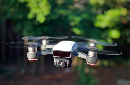
dji-spark-1024.jpg

One of the things I really like about the Spark is that I can carry it with me all the time in my Think Tank Retrospective 7 shoulder bag. It fits nicely in the front pocket, and it's like carrying a second camera. Except this camera can fly.

I don't lug around extra batteries or a controller. I'm sticking with the basic $499 kit. I have an extra set of props and the charging cable. That's it.

All of my testing has been using the iPhone or iPad mini as the controller. My preference is the iPad because of its additional screen real estate, plus my phone is free for other tasks during flights. The DJI GO 4 app is quite good.

So really, the only think I've added to my everyday kit is the svelt quadcopter itself. But the payoff is tremendous. Here are five reasons why I recommend the Spark for Nimble Photography.

  • Built Like a Rock, but Much Lighter - You don't need to baby this device. It is solid. I carry it in a soft case in the front pocket of my Retrospective 7, and forget about it. When it's time to fly, the Spark is ready.
  • Amazing Technology - Incredible use of GPS satellites, infrared detection, WiFi connectivity, still photography, video recording, and aerodynamics. When combined with a state of the art smartphone, it's mind blowing what you have in the palm of your hand for $500.
  • Excellent for Still Photography - The 12 MP camera is quite good. Jpegs only. But on the fly you have options for single shot, burst mode, auto exposure bracketing, timed shot, shallow focus, and panorama photography. You can use full auto, or switch to manual exposure mode as needed. You can change both the ISO setting and white balance. All of this from your smartphone.
  • Intelligent Flight Modes - For HD video recording, you can take advantage of settings such as Active Track and Tripod mode. For Active Track, you ID a subject, and the Spark follows it while recording. For Tripod mode, it becomes super steady and moves slowly allowing for the sexy screen saver videos that we see on Apple TV.
  • Learn a New Skill - Just like I had to learn all about audio to become a photographer podcaster, I'm learning about aeronautics to become and aerial photographer. And it's fun. I'm using an app called Kittyhawk to review flight conditions such as wind and airspace clearance, I'm aware of obstructions and airport, and I'm learning how to take pictures from a completely new perspective.

I did register with the FAA because I may use some of my imagery commercially. Even though the Spark is super nimble, it's a serious aircraft. And I respect both its capabilities, and the responsibilities that come with its use.

Capture One Classroom

I've been trying to figure out a way to bring more personalized training to photographers without them having to travel. It's one thing to get on a plane to photograph wine country or the French Quarter, but not quite as alluring to travel far to sit in a classroom for two days.

As a result, I've designed a new approach called, The Nimble Classroom. And the first course series offered as part of this program will be for Capture One Pro. Here are the highlights.

Capture One Classroom - Session 1 - Catalog Management
Saturday, August 19, 8am PDT/11am EDT

Designing your Capture One Pro catalog to meet your needs as a photographer is an important first step toward creating a digital asset manager that is easy to use, effective, and enjoyable.

In this class, Derrick Story shows you best practices for creating a top notch catalog environment. Participants may submit their unique questions before class, allowing Derrick to incorporate that content into his teaching. And there will be live Q&A sessions throughout the course.

Class participation is limited to 6. The course may be viewed on a computer, tablet, or smartphone. Details will be sent to you prior to class.

Tuition for the one-day session is $129. No plane fares, hotel rooms, or rental cars. You can reserve your spot by visiting The Nimble Classroom on theNimblePhotographer.com

Framing Tip of the Month

One thing your professional framer will tell you is that some pieces of art «need» help. If a picture is a non-standard size, either too large or too long, or the focal point of the picture is very close to the lower edge of the image, then the mat can be "pulled down".

This means that the lower edge of the mat is wider compared to the upper and side edges, creating a feeling of proportionality. This same technique can be applied in cases where two pictures of different sizes are shown together. If the inner edges of both mats are made slightly narrower, the two pictures will look more balanced.

ImageFramer on Facebook

For more tips like these, and lots more, visit ImageFramer on Facebook. And give your images the ImageFramer look they deserve.

We want everyone to enjoy the benefits of the new ImageFramer. ImageFramer 4.0 is a free upgrade for ImageFramer 3 customers. Note that it requires macOS 10.11 (El Capitan) or later. TDS listeners can receive a 20 percent discount by visiting: our ImageFramer landing page.

Updates and Such

Big thanks to all of our Patreon members!

B&H and Amazon tiles on www.thedigitalstory. If you click on them first, you're helping to support this podcast. And speaking of supporting this show, and big thanks to our Patreon Inner Circle members.

And finally, be sure to visit our friends at Red River Paper for all of your inkjet supply needs.

Texas-based Red River Paper recently announced a new fine art paper, Palo Duro Etching. The new paper is a 100 percent cotton rag paper and is free of optical brightener additives. The paper is designed to offer warm white tones, deep blacks and a subtle texture to accurately recreate traditional darkroom fine art prints.

See you next week!

More Ways to Participate

Want to share photos and talk with other members in our virtual camera club? Check out our Flickr Public Group. And from those images, I choose the TDS Member Photo of the Day.

Podcast Sponsors

ImageFramer 4 - ImageFramer is used by artists, professional and amateur photographers, scrapbookers, framers, and people who simply want their family photos to look better.

Red River Paper - Keep up with the world of inkjet printing, and win free paper, by liking Red River Paper on Facebook.

The Nimbleosity Report

Do you want to keep up with the best content from The Digital Story and The Nimble Photographer? Sign up for The Nimbleosity Report, and receive highlights twice-a-month in a single page newsletter. Be a part of our community!

Want to Comment on this Post?

You can share your thoughts at the TDS Facebook page, where I'll post this story for discussion.
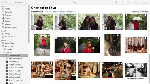
Back in mid-June, Instagram introduced a new archiving feature that allows users to move images off their profile page into a separate area that only they can see.

IMG_4181.jpg

If you haven't looked at it yet, it's worth knowing. It allows photographers to clean up their profile page, while still keeping those "slice of life" images that are meaningful to us personally, but not so intriguing to others.

The feature is easy to use. Just tap on the 3 dot menu, then tap on Archive that appears at the top of the popup menu. The image is moved into a separate area that is accessible via the top menu bar.

You can move pictures back to your profile page via a similar process, this time choosing Show on Profile that appears in the popup menu.

What a great way to do a little Instagram housekeeping!

You can share your thoughts at the TDS Facebook page, where I'll post this story for discussion.
Symmetry in Street Photography

There are so many different things to look for when exploring urban areas. Of course, we're always hoping for a decisive moment. But there are satisfying shots even in the quiet moments.

apartments-new-orleans.jpg "For Rent" - Olympus PEN-F with 14-42mm EZ zoom. Photo by Derrick Story.

One of the things that I look for is symmetry. Whether it's the pattern of two iron emergency staircases on the outside of a brick building, or a set of steps leading up to a duplex apartment, these images can add texture to your presentation. And if you can subtly disrupt the balance with a closed curtain or For Rent sign, all the better.

You can call it your quiet moment photography.

You can share your thoughts at the TDS Facebook page, where I'll post this story for discussion.