Recently in Show Notes

  Page 96 of 97 in Show Notes  

Aperture

No question RAW photography provides shooters with more quality options than standard JPEG formats. But until 2006, the workflow for managing RAW files was clunky at best.

The problem was that we really didn't have a pro-level integrated environment for organizing, editing, and outputting RAW files. The general workflow was to open here, store there, edit with this, then, create a new file that had to be managed too. Software companies such as Adobe, Apple, and Light Crafts realized that there had to be a better way, and then did something about it.

As a result of their efforts (and others too), we are now entering the New Age of RAW Photography. Integrated environments with smooth workflows enable photographers to focus more on taking their shots and less on managing them. Applications such as Apple Aperture, Adobe Lightroom, and Light Crafts Lightzone are leading the way.

Another factor is that our input devices, also known as digital cameras, are much improved. We no longer have inferior images as the starting point for the photographic process. Having quality data upfront means that if we apply good shooting technique, we don't have to engage in hours of post production just to get a "photographic" image.

In this audio show, I discuss the notion that it's time for us to refocus our efforts on taking good pictures, then leverage these new tools to quickly manage our RAW files for beautiful output.

Listen to the Podcast

Now that I've piqued your curiosity, it's time to listen to today's audio show titled, "New Age of RAW Photography." You can download the podcast here (32 minutes).

Technorati Tags: ,

"Talking with the Shooters" - Podcast 19

Story Interviewing Ben Long

While on a recent Geek Cruise to Mexico, I had the opportunity to talk with other photographers about their approach to these excursions, including what equipment they used. I found these discussions fascinating, and I hope you will too.

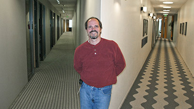
I start off the show by telling a story about one of my adventures in Puerto Vallarta. I then interview Lynn Lampert who had just purchased a Canon Digital Rebel XT. She talked about upgrading to a DSLR and trying to master it on location. Then, Don Tillman steps up to the mic and discusses his Kodak point and shoot. Don had some excellent traveler tips. He's been on four cruises. Then I had a nice chat with Ben Long, who is a friend of mine and who spent the day with me in Puerto Vallarta. Ben is a photographer and writer who contributes to Macworld Magazine and has authored some great books. The photo on this page is me interviewing Ben on the ship (That's Ben on the right).

One of the tools we talked about in the show was an image editor called Graphic Converter by Lemkesoft. I wanted to make sure you got the correct link to this cool app. You can download and try it for free. If you like Graphic Converter, it costs $30.

Listen to the Podcast

Now that I've piqued your curiosity, it's time to listen to today's audio show titled, "Talking to the Shooters." You can download the podcast here (48 minutes).

Technorati Tags: , , ,

Program Mode

Don't get me wrong, I like program mode. I like my 24-85mm zoom lens too, but I don't want to use it for every shot I take. Sometimes I want a different look than what that lens can provide. The same goes for program mode.

In this week's podcast I discuss some of the situations where I prefer to use shutter priority, aperture priority, and manual exposure modes. Why? Because those modes give me a little more control in those situations so I can get exactly the shot I want. Here are a few examples.

Aperture Priority
This is a great mode for controlling depth of field. Aperture priority lets you set the f-stop, then the camera sets the corresponding shutter speed to make a good exposure. I like to use this mode for portraits with soft backgrounds (f-2, f-2.8) and for landscapes with extended depth of field (f-16, f-22).

Shutter Priority
When I need to freeze action, this is my choice. Shutter priority lets you set the shutter speed and the camera sets the correct aperture for you. I use shutter priority for outdoor sports (1/500, 1/1000, 1/2000) and to freeze moving water in its tracks (1/250, 1/500). If I want moving water to have a flowing, angel hair like appearance, then I slow the shutter speed way down (1 second, 2 seconds).

Manual Mode
This mode is the choice when I want complete control over both the shutter and aperture settings. My favorite use for manual mode is indoor flash photography at wedding receptions. I set the aperture to f-5.6 and the shutter speed to 1/30. This allows me to capture the ambient light in the surrounding environment so my subjects aren't illuminated against a black background.

Listen to the Podcast

Now that I've piqued your curiosity, it's time to listen to today's audio show titled, "Life Beyond Program Mode." You can download the podcast here (30 minutes).

Technorati Tags: , ,

"Scanning Tips" - Podcast 17

Canoscan 9950F

How do you best set up your scanner when archiving all of those prints and slides that you have in storage? It's really not too bad once you know the numbers you have to plug in, and the resulting digital files they produce. That's what this podcast is about.

The first thing I want to mention is how much flatbed scanners have improved since I last bought one (which was about 5 years ago). While working on an article for Macworld Magazine, I got to test a number of scanners and really took a liking to the Canon 9950F scanner. The 9950F is both Mac and PC compatible, provides both USB 2.0 and FireWire connectivity, and scans many different sizes of film as well as prints. I use its driver with Photoshop, and when in the "Advanced" mode, have complete control over the scanning process. The results have been beautiful.

As easy as the interface was to use, I still had to make decisions about what numbers to plug into the "Output Resolution" box. Here's where a lot of people get confused. Do you put 150, 300, 600, or 1200? And what are the ramifications of each of those settings?

The general rule of thumb is that if you want to make photo-quality prints the same size or smaller than your hardcopy source material, choose 300 dpi. (I actually prefer "ppi" pixels per inch, but used the older term "dpi" dots per inch because that's what the scanning software used.) So if your original photo is 4"x6", then if you scan at 300 dpi, you'll be able to make photo quality 4"x6"s. Actually, I think you can go up to 5"x7" at that setting, so that's what I list in Table 1.

As you increase "Output Resolution," let's say to 600 dpi, you can then make bigger prints from your source material. The tradeoff is that the file size gets much larger too. So the trick is to find the balance between having enough Output Resolution to make the prints you want and controlling the file sizes so you have enough storage to handle all of this digitized material. Take a look at the following tables to help you choose the settings best for you.

Print Scanning Guide

------------------

Film Scanning Guide

------------------

In the Macworld article that comes out in a month or two, I get into the whole process from scanning, to cataloging, to output. But for now, you can begin to digitize with confidence some of those great shots you have from the "old film days."

Listen to the Podcast

Now that I've piqued your curiosity, it's time to listen to today's audio show titled, "Scanning Tips" You can download the podcast here (33 minutes).

Technorati Tags: , , ,

iPhoto 6

iPhoto 6 is arguably the most exciting release of Apple's venerable digital shoebox. New features in the current version includes:

  • 250,000 photo library capacity.
  • Full screen editing.
  • Online publishing with iWeb.
  • Non-managed library option for images on your hard drive.
  • Direct connect to Adobe Camera Raw.
  • Photocasting.
  • Lots of output options.
  • Included in the iLife '06 suite for $79.

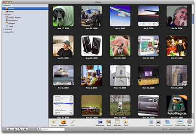
One of the most notable new features in iPhoto 6 is that you can point to images already organized in the file system on your hard drive. This is a big change from its "managed library system" that has been your only option in the past. I've posted more details about this in What Happens When You Edit an Image Stored Outside of iPhoto 6. I've also published a more extensive piece titled iPhoto 6 First Impressions where I cover some of my favorite features in iPhoto 6, including Full Screen Editing mode. Here's what I had to say:

"Just click once on any thumbnail, tap the Full Screen button, and watch your image fill up the screen against a black background. You have all of your editing tools hiding on the bottom and the thumbnails hiding on top. A simple mouse-over reveals them.

"CMD-click up to 8 images in thumbnail mode, then tap the Full Screen button and compare them all at once. You can magnify each image using the slider at the bottom of the screen, or by simply pressing the 1 key (100%), 2 key (200%), or the 0 key to return to "fit in screen" size. You can rate your photos using the floating info box (and add comments too). Everything works great in full screen mode. If you have really big Photoshop images, they may take a few seconds to reach full resolution. But for my cameras, including the Canon 5D, the performance was excellent."

In the podcast, I also discuss one of my favorite 3rd party plug-ins for iPhoto: iPhoto Library Manager. I think this handy app helps you keep your iPhoto libraries to a manageable size. If you'd like to read about more of my favorite iPhoto add ons, take a look at iPhoto 6 and 3rd Party Apps.

=====================

Listen to the Podcast

Now that I've piqued your curiosity, it's time to listen to today's audio show titled, "Is iPhoto 6 Right for You?" You can download the podcast here (31 minutes).

Technorati Tags: ,

"White Balance" - Podcast 15

White Balance Menu

The White Balance menu on your digital camera is one of your most powerful tools. Regardless if you have a compact or a DSLR, you can compensate for many difficult lighting situations by simply changing settings in this menu.

I often say that the white balance menu is like having an entire set of filters built right into your camera. The cool thing is, unlike glass filters, you don't have to buy, store, or clean white balance settings. You just have to find the settings.

The easiest way to talk about color temperature, which is what white balance is all about, is in degrees Kelvin. This helps you correlate numbers to lighting situations and the controls on your camera. Most camera manuals will list the lighting situations in degrees Kelvin that their white balance menu items are designed to compensate for. To give you a taste of degrees Kelvin, here are some examples. (This information is from page 146 of the Digital Photography Pocket Guide, 3rd Ed).

Dawn, dusk, candle flame -- 1800-2200K
100W incandescent bulb -- 2800-3000K
Photographic daylight -- 5500K
Open shade outdoors, overcast sky -- 8000-9000K

At the lower end of the Kelvin scale, the light is recorded as warmish red, and at the higher end the camera sees coolish blue.

Our eyes naturally compensate for these varying conditions. But cameras have a more difficult time. That's why we have white balance compensation.

Take a look at the following comparison of a church interior. I captured these images with a Canon Digital Elph with the flash turned off. The image on the left was recorded with the auto white balance setting. For the picture on the right, I turned on the cloudy white balance setting. (Refer to the screen shot at the top of the page to see the actual setting.) Notice that the tones are cool in auto white balance, but warm up considerably in cloudy mode. Which one looks better? That's up to you. But the point is that you have more control over how your camera records color temperature by finding your white balance menu and learning its settings.

White Balance Comparison

=====================

Listen to the Podcast

Now that I have your curiosity piqued, it's time to listen to today's audio show titled, "White Balance." You can download the podcast here (29 minutes).

Technorati Tags: , , , ,

"Lightroom vs Aperture" - Podcast 14

Lightroom (top) & Aperture

Adobe has just announced the public beta Lightroom, right on the heels of the recent Aperture announcement by Apple.

Both applications are robust photo editors, which is different than image editing. Photo editing is the process of choosing the best images from any given shoot. It is comparing and then selecting. Image editing is adjusting the actual pixels of a picture, such as changing its brightness.

Even though Aperture and Lightroom provide solid image editing tools, their real strength is their ability to help you quickly organize and output the best shots from your shoots.

When comparing these two applications, I would say that Aperture has more features and more innovative tools, such as Stacks and the digital loupe. Lightroom gets the nod for its better performance on the average modern laptop and for providing options for managed or unmanaged libraries. A managed library is where your pictures are uploaded into a container (library) that the application maintains. Unmanaged means that you store your pictures wherever you want, and Lightroom will create pointers to them. The advantage of managed libraries is that you can add metadata on import, and even change the format and content of the file names. Aperture favors the managed library approach while Lightroom gives you the option.

You can download a copy of Lightroom here. Anyone wanting to try out the beta should have Mac OS X 10.4.3, a 1GHz PowerPC G4 processor or better, 768MB of RAM, and a 1,024-by-768-resolution screen, according to the beta's tech specs.

After having worked with both applications, my feeling is that each has a place in the world of digital photography. Which one is right for you? Listen to this week's podcast and decide for yourself.

You can download the "Lightroom vs Aperture" podcast here (35 minutes).

Technorati Tags: , ,

Histogram Example

The histogram is a useful tool for determining and correcting exposure on both the camera and in your computer's image editor. The histogram is actually very easy to understand once you learn its basic components. The information on the left side of the graph represents the dark tones in your picture. On the right side you see a graphical representation of the highlight detail. The middle area represents the "gamma," or middle tones.

The Histogram on Your Camera's LCD Monitor

When you take a picture and review the image and its histogram on your camera's LCD monitor, you can accurately determine the exposure by looking at how the information on the histogram is distributed. If, for example, you're shooting a normal outdoor landscape with a broad tonal range, your histogram should have information throughout the graph from left to right. If the information is skewed to the left, however, then your picture is probably underexposed. If the information is tending to the right side of the graph, then your picture is most likely overexposed.

Uncorrected Portrait
Using the Histogram in the Levels control panel can help you easily make exposure adjustments. Here's an uncorrected portrait. Notice the open gap on the right side of the graph information.

The above interpretation works for most shooting situations. But, if you're in very bright conditions or a dark environment, then you have to keep a couple things in mind. A bright scene, such as a skier on a snowy slope, should produce a histogram that is skewed to the right. That's because most of the information in the shot is bright. An evenly distributed histogram would actually produce a dull snowy scene. Same goes for dark interiors. They should be skewed to the left. Once you get the hang of matching histograms to shooting situations, they become a powerful ally in determining the proper exposure.

Using the Histogram in Photoshop

You can also use the histogram to make exposure adjustments in Photoshop (or your favorite image editor) after you've moved the images from your camera to your computer. Generally speaking, you can find the histogram in the "Levels" adjustment panel (Image > Adjustments > Levels).

Corrected Portrait

Using the controls is straightforward. I usually start by moving the highlight pointer (right) to the right edge of the histogram, the shadow detail pointer (left) to the left side of the histogram, then adjusting the gamma (middle pointer) to my taste. This isn't a hard and fast approach, but it's a good starting point. Take a look at the adjusted image and how the histogram pointers have changed.

Photo Assignment

It's official. I've launched the Photo Assignment project. This month's theme is "Ice." You can read all of the details in this weblog post. We're going to have a lot of fun with Photo Assignment, so be sure to join in.

=====================

Listen to the Podcast

Now that I have your curiosity piqued, it's time to listen to today's audio show titled, "Learning the Histogram." You can download the podcast here (30 minutes).

Technorati Tags: , ,

I think being the event photographer is a blessing. Whether I'm at an office party, family gathering, or celebrating with friends, my camera enables me to move effortlessly from one conversation to another. If I'm feeling stuck, I can always say, "Excuse me, but I see a shot over there I need to grab."

The camera also facilitates introductions. "Hi, I'm taking pictures for the host. My name is Derrick. Do you mind if I grab a quick shot of you and your wife?" The next thing you know you're in friendly conversation. The role of holiday photographer is much better than standing there with a drink in your hand wondering how long you have to hang around.

Bounce Flash

Business Card Bounce Flash

I think holiday events are a great time to try the bounce flash technique. Instead of pointing the flash directly at the subject, you "bounce" it off the ceiling. The light is much more diffused, like a cloudy day, and can be very flattering for portraits. One of the reasons that I think holiday parties present a good opportunity for this technique is because they're often in homes with lower ceilings that are painted a shade of white -- perfect for bounce flash.

One drawback to bouncing light is that the subject's eyes can go dark because the illumination is from above. A great trick to fix that is to attach a plain white business card to the flash head with a rubber band as shown in this illustration. It "kicks" just enough light toward the eyes to brighten them up while still getting the benefits of bounce flash.

Generally speaking, I increase the ISO to 400 for bouncing because you do lose some light from the added distance and the surface of the ceiling. Otherwise, you should be able to use Program mode and auto flash. Try it!

Software Links

Windows
QuickTime Pro
Ulead CD and DVD PictureShow
Ulead DVD Workshop

Mac
QuickTime Pro
BetterHTML Export plug-in for iPhoto
Apple iLife Suite includes iPhoto, iMovie, and iDVD

All Platforms
Flickr (I've linked you to my Flickr page so you can see an example).

=====================

Listen to the Podcast

Now that I have your curiosity piqued, it's time to listen to today's audio show titled, "The Holiday Photographer." You can download the podcast here (28 minutes).

Technorati Tags: , , , ,

"Photography Etiquette" - Podcast #11

Portrait Subject
I try to get a model release at the end of every shoot. Plus, I think it's courteous to offer extra prints to the subject if I plan on publishing the shot.

Much of good etiquette, while working as a photographer, comes from common sense. Things like: don't interfere with the action, don't obstruct the mother's view at a wedding, be frugal with your flash in darkened environments, and ask permission to publish photos of people whom you can recognize in the shot.

Photographers who publish, or who are aiming to do so, should carry a model release and business cards with them. The cards are useful for identifying yourself to someone you just photographed. It also provides the subject a way to get a hold of you in the future. The model release is the tool you use to secure permission to publish a photo that shows the subject's likeness.

As I said in the show... I'm not a lawyer. This is not legal advice. But my experience has taught me to get model releases whenever possible -- even for shots of family and friends. If I do publish the photo, I like to let the subjects know where it was published. If possible, it's a nice gesture to send the subject a copy of the publication.

If the photo is going to be used on the label of a commercial product, such as instant coffee, I think it's wise to negotiate a fee with the subject and draft another, more specific model release.

Finally, if the person asks you to send a picture, and you agree to do so, please follow up. All too often photographers get distracted and forget to fulfill their end of the bargain.

Here's a sample model release that I use. I'm sharing this for illustrative purposes only. But you can use the language if you wish.

=====================

Photographic Subject Consent Form

I hereby give my consent for appearing as a photographic subject, and I release to [photographer's name] all rights of any kind included in the media product in which I appear.

This is a full release of all claims whatsoever that I or my heirs, executors, administrators, have now or hereafter against [photographer's name] or his employees, regarding any use that may be made of said photographic reproductions.

I understand that it is the purpose of [photographer's name] to use the material in a legitimate manner not intended to cause embarrassment or harm. Images published on the [photographer's name] web site do not include name or other personal information.

I have read this entire document, understood the contents, and I have willingly agreed to the above conditions.

Print names	
Date	
Signatures 		
Address (optional)	
Phone	
Subject's description		
Location	

=====================

Listen to the Podcast

Now that I have your curiosity piqued, it's time to listen to today's audio show titled, "Photography Etiquette." You can download the podcast here (21 minutes).

Technorati Tags: , ,